VP Productivity 2.0: Excel-Dashboard Champions

Hi Guys/Gals

This is a CALL for Volunteers who have a natural bent for Excel Number crunching and Visualisation. Macros, and all that charting skills, and data aggregating skills! And want to excel in that!!

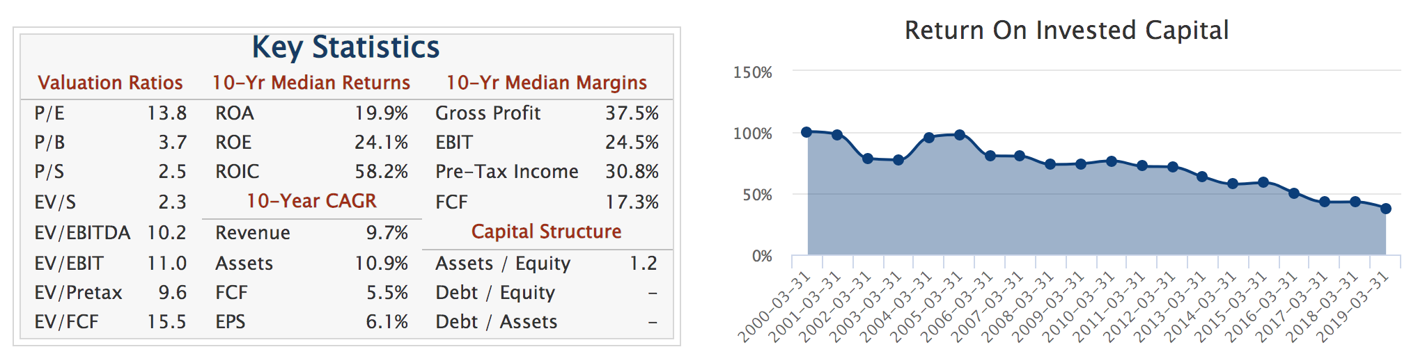
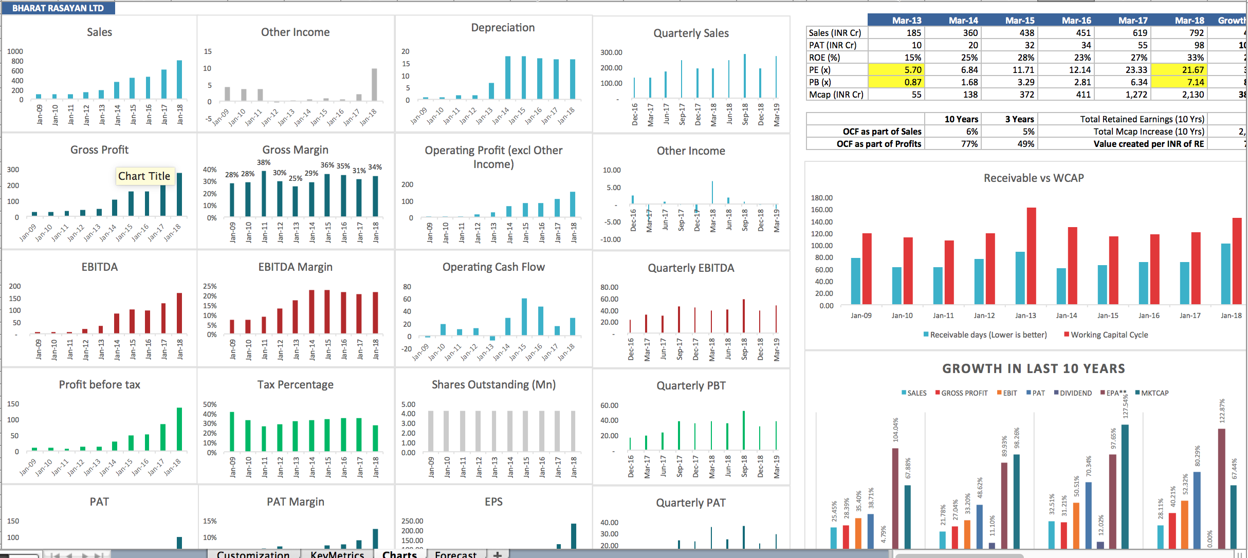
Or, you are like me - and desperate to use excel well for learning faster, better. I was from a completely non-accounts, non-finance background. The important ratios/their impact that I read about in books like Free Cash Flow, ROE, Net Margin, Financial Leverage, Working Capital/Sales, Cash Conversion Cycle, Fixed Asset Turns, Invested Capital, RoIC …all sounded very interesting, but I couldn’t sort of get a solid grip around the linkages between them (or their constituents) - no matter how many times I read; I just had to compute them myself - for the linkages to get established in my mind. I know that for my productivity to improve, I needed things computed and literally thrown up at me e.g. Equity Dilution - I couldn’t run my eye across the numbers in BS (even in a 5 yr/10 yr consolidated summary picture) and get a sense of the equity dilution extent for myself. I had to see a number like 20% flash up!!

Whichever camp you belong to, you will benefit immensely from the extensive number crunching, data visualisation, and data aggregation skills that (at least) four senior VP Contributors have excelled in!! (pun intended :slight_smile:)

Calling @Yogesh_s, @spatel, @crazymama @Prdnt_investor to initiate the excel eager-beavers into some structured exercises, progressively to deliver e.g. an Excel Dashboard for Emerging Moats, Excel Dashboard for Perennials/Large Caps, an Excel Dashboard for Financials, and more -that most folks would admire, find extremely useful, and love to use and show off!! :slight_smile:

This is a much needed essential skill-set, that everyone at VP has to learn to harness well - Be able to talk about the most noticeable aspects of a business that you are analysing - in under 5 minutes! And in the same breath that of its major competitors too, in the next 10 minutes!!

Towards, that end we will actively collaborate (among senior and junior members) at later stages of the practicals, to highlight the most effective way of slicing/dicing the data-sets, towards creating Unified Templates for VP readership, and the larger investment community.

12 Likes

Vishnu sent me this link for a sample clean and concise dashboard look

We can create our own clean & concise dashboards, with a few more!!

3 Likes

Now that was just a appetiser. Brace for what’s coming next
Rudra (Pratap Singh) :slight_smile:, sorry Chowdhury’s slicing/dicing/charting visualisation skills on tap!
(picking up from master blaster Yogesh Sane)

Of course, goes without saying our own Pratyush (@pratyushmittal) & Ayush (@ayushmit) Mittal’s Screener.in custom excel downloads come in very very handy!

That’s as neat/powerful as it gets! But too much visual information together? We need some stats together alongside - break the monotony, perhaps - like in the clear concise dashboard, above?

Not so fast though - I am sure our Excel wizards have brought in further refinements, and will update/educate us more as this exercise catches on - with your whole hearted participation!!

How many of us are even aware that he has shared this template long back in Jun 2019?

Can we start seeing a show of hands? - those who are already good at this, or ASPIRE to become good at this - and want to learn first-hand from accomplished seniors who have spent a lot of passionate-time, refining their skills.

In today’s age, no one gains by re-inventing the wheel; everyone gains by adopting and incorporating best practices. This is another beautiful example!

It can become even more attractive, with your energy, enthusiasm and participation in activities for common-good

5 Likes

Now now, WHAT IF you aggregate Competitive Data (all publicly available) and incorporate visual charts for that in that Excel - okay, with additional source information sheets, and a few master-strokes? Welcome to our cool-dude Sandeep Patel’s Pharma Dashboard for Alembic, that he produced out of thin air in a jiffy, literally :slight_smile:

image


Anyone can see that not only do we save a lot of time, we enhance our understanding of the industry by a few levels with such aggregation & slicing/dicing efforts!

Now some of these are actually Competitive Edges for a few accomplished folks mentioned above. But I am sure they will find a good practical way (generous hearts that they are) to coach newbies and interested learners like me to do a much better job than we currently do with our data slicing/dicing, data aggregation & data visualisation exercises.

2 Likes

Let’s not forget to applaud Vishnu the creator of the first VP Pharma Dashboard.
More on the subject at VP Generics Pharma Dashboard thread

3 Likes

A post was split to a new topic: My Portfolio - Please advise

Finally here’s the original cowboy Yogesh Sane’s (@Yogesh_s) excellent post on extensive use of Charts - A story of a Company in 40 Charts. He has explained beautifully how he uses these charts. Selected excerpt, to kindle your interest!

This screen lets me quickly check how the sales have grown over the years, if the sales growth has trickled down to gross profit, operating profit and net profit, how the book value has grown, if the debt is growing, how has the cashflow kept up with cash profits or has the receivables and inventory ate up all the profits. Cashflow analysis help me analyze if the company is able to fund it capex with CFO or it had to go external funding. DuPont analysis quickly gives an idea how efficiently company has utilized its capital and if the high ROE is a result of higher leverage or higher ROA. I can also check if there any structural change in its asset turnover vs operating margin trade-off. Finally, the market cap chart (on the bottom right corner) shows how market has responded to the developing story.

If a picture is worth thousand words, a chart is worth thousand numbers. 40 charts on this screen tell the story of a company as it unfolded over the last decade. It literally takes me just a few seconds to reject a bad company. I cycle through all the companies in the database either by alphabetical order or by market cap. Sometimes, I end up rejecting few good ones too, but I am OK with that. Within 2 to 3 weeks I am able to scan all the companies in my database. I go thorough this exercise at least once a year.

4 Likes

@Donald I’d love to contribute here - pretty good with Excel/ Google sheets compared to other fundamental analysis among gurus here.

1 Like

Sure @sgkfinance
If you have any ideas on how to proceed on say clean dashboards like above/inspired by above examples, please share more.

If you would love to contribute here, maybe you can search for best practice examples from around the investing world on better presentation of 10 year data on companies.

Meanwhile, I am sure we can get some of the experts to point us to some more material, before they structure in some assignments for us.

Post company analysis if anyone needs valuation views from many angels, attached can be used.Value_Stock_Tankrich_v1.24.xlsx (101.7 KB)

Screen Shot

6 Likes

@sgkfinance and @bharat.jain co-opted in, for the exercise.

Anyone passionate & hardworking - proficient in excel skills, and decent exposure to investing skills? That’s a killer combo. No harm in wishing & asking :slight_smile:
We are a big community, today!!

1 Like

@sensaptarishi co-opted into the Team with both Investing acumen and decent Excel proficiency.

Think we have enough Cooks for now.
Volunteer calls closed!

Let’s see what brew they cook up together, guided by some very proficient seniors.
Watch this space. It may be a while before we have something to show for behind-the-scene-efforts.

We will try to release progressively better versions - Team will define Version Scope, and timelines when we all have a better handle on wishist vs feasibility vs team bandwidth!

Thanks everyone!

2 Likes