Using Pivot Tables/Charts, Slicers & Screener to Semi-Automate Historical Peer Analysis

Firstly, I would like to deeply thank Mr Pratyush Mittal and his team at Screener.in for developing this amazing website and making it freely available to everyone to use, without them this project would not have been possible.

A brief introduction to pivot tables and charts, they are a really handy tool that is a must-learn for sorting and analysing data in Microsoft Excel. I learnt them myself a few weeks back, it is something that almost everyone should be able to use after watching a few videos on Youtube. I have already created a blank template for this tool, and even people who do not fully know how to use these tools can simply copy and paste the raw data and be ready to compare any companies of their choice within a few minutes.

If you are already familiar with Pivot Tables, Pivot Charts and Slicers, you can download the data from any of the below links and get started. If you are not, I recommend watching a few videos to familiarize yourself with the tools before using the templates.

Dropbox

Google Drive

One Drive

I will explain the procedure to use the template below. This links above will download a folder named “Company Peer Comparison”, once it is downloaded, open it.

In it, you will find 2 folders and 2 files. Starting with the folders first, the “Industry Wise Data” folder contains the past 10 year and 10 quarter data for major companies in major sectors all ready to analyze. I have included most companies in every sector, which were above the 500 cr market capitalization threshold.

Click on any of the excel sheets and the sheet should open to the “PT Chart” worksheet. Most of the sheets will have 2 charts in this worksheet, one for “%” figures and another for “Absolute” figures. Do not worry if your screen does not show the entire sheet, I have sized the sheets as per my screen size. You will have to resize the charts, slicer tables as per your screen size to make full use of the tool. Your worksheet should look like the image below.

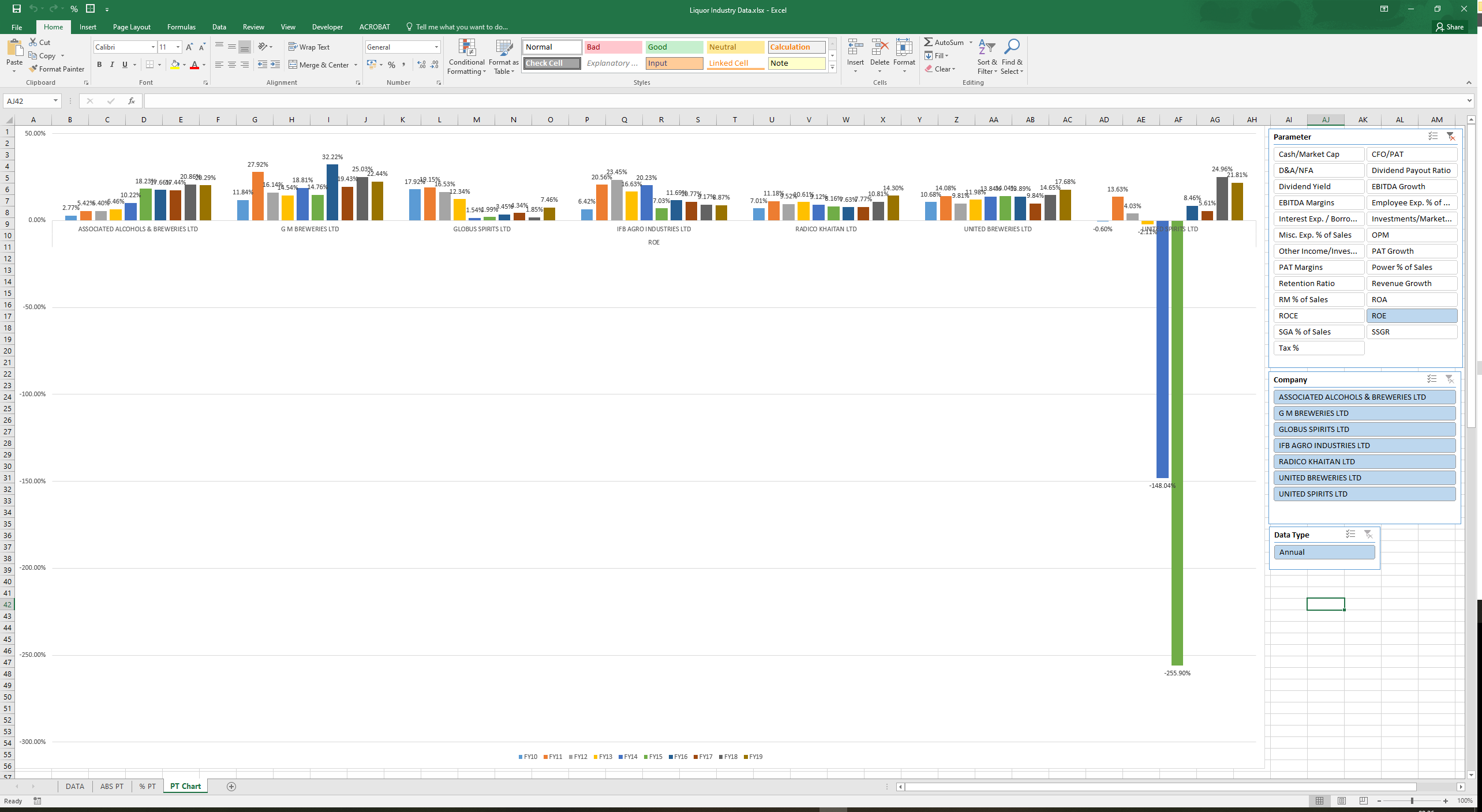
On the right, you will find the slicer tables which you can use to get different parameters on which you can compare the companies. This template has over 50+ parameters to choose from. To select multiple parameters to display in one go you just need to have “ctrl” pressed on your keyboard and select the parameters you wish to display simultaneously. You can do the same for the company slicer table, select anywhere from 1 to all companies to view their historical figures. You can even choose to only view quarterly or annual data or both.

Due to limited screen size and excel capabilities, the template works best for comparison of a few companies, up to a 10 is manageable. Beyond that, you may have to sort the companies into sub-segments for the chart to be readable. I have already done that for a few industries where the number of companies was too many to display at once. Try not to select all the data points at once, that can sometimes make your excel crash if your system is not powerful enough and the chart becomes unreadable anyways.

Although 10 years and 10 quarters is a good enough timeframe to compare companies, as the years pass the time series will grow if one keeps adding the recent data. We are limited by the number of data points that Excel can take. I will test the limitations of the template in the future. Once we have enough data, say for 2 decades, I can revise the template, to slice for specific time periods and view the time series data like a 3 or 5-year moving picture.

Sometimes some company’s particular data will be totally different from the sector due to various underlying factors, and the chart may not display the smaller figures properly. You can use the company slicer tab to remove that particular outlier company to get a standard chart. The “PT Chart” worksheet has 2 charts for most of the industries, one is for absolute figure comparison and another for %. scroll down to see the 2nd chart. In a few industries where segmented data is available, I may put more than 2 charts in this sheet. Be sure to scroll down to see all the charts.

As you will notice I have left out the industry data for financial services industry, including banks, NBFCs, AMCs, Insurance, and Broking. These industries have unique KPIs which need to be manually entered from their respective Investor Presentations. You will find the templates for these in the “WIP” folder. This is a work in progress that I have just started and will take time. I have introduced more segmented data based on loan books, capital sourcing, ticket size, geographic distribution, NPAs etc. in these templates. If you are interested in this sector you can take this forward with these templates. If you want to add just the screener data for these industries you can follow the steps below.

Create your own Customized Comparisons

The other two excel sheets in the folder, namely “Astal Poly” and “Blank Industry Data” is what you will need to customize and compare the data for the companies that you want to analyze.

Just go to the link below and upload the the “Astral Poly” Excel sheet to the screener website.

Screener Excel

Now search for the company you want to compare in the screener, and export its data to Excel via the link on the top right of the website. Repeat for other companies that you want to compare.

Open this downloaded file and the excel should open by default to the “PT Data” worksheet, if it doesn’t, select it. The tabular data should already be selected for you, if it is not, select the data in the table, without the headers.

Open the “Blank Industry Data” excel sheet, it should by default open to the “Data PT” worksheet. Right-click on the cell that reads, “Ambika Cotton Mills” and then paste the data as “Value”. This step is important, paste the data only as value or else it won’t work. The last column in the table, the “Parameter Type” should populate automatically as the data is entered, if it is not, just copy the formula in the 1st row of the column to other rows.

Repeat the same steps above for the data on other companies that you want to compare. Make sure that there are no blank rows in the table, or the pivot table won’t work.

Once you have all the data copied to the “Blank Industry Data” excel sheet, go to either the “ABS PT” or “%PT” worksheet, right-click on the blank pivot table on the top left. Usually, it should be in the cells A4-B6. Click “Refresh” in the drop-down menu, and the pivot table should populate itself with the data that you had copied beforehand.

At this time it would be wise to “Save As” this excel sheet as per the name of your liking. This will save our work up until now. Now just go to the “PT Chart” worksheet and your PivotChart and Slicers should be ready to use.

If the Pivot Chart and Slicers are not all visible together in your screen, just go to the “Blank Industry Data” excel sheet, go to the “PT Chart” worksheet and resize them to fit your screen and save the template. This will ensure that you will not have to resize them again and again for every comparison that you do.

Updating the Comparison Sheet

Updating the old data with new quarterly, Financial Year figures is easy. Just download the respective company excels from screeners at the relevant time. In the “PT Data” worksheet, go to the time period header in the data table, select the data parameter for the latest time period you want to update (ex. Q3FY20 or FY20) and just copy-paste the new data as value to the old comparison sheet. You can copy-paste the data in any order, the pivot table will sort it out.

After you input the new data, just go to any of the pivot table worksheets, right-click on the pivot table and click refresh. The new data should be updated automatically. That is all.

Time Period Sorting

In the template, the data is already sorted for time periods from oldest to recent. This is important as the data needs to be sorted for time periods in the pivot tables worksheet, and this is how it will appear in the Pivot Charts.

If in future while adding new data the sorting is broken follow the steps below.

Firstly, the automatic sort function in excel does not work on these headers. So here is what we do.

If the time periods are totally random - Find the oldest quarter, right-click it, and press first “M” and then “E” on your keyboard to move it to the end. Ex. for recent quarter data the oldest data is for Q1FY18, right-click it and press “M” and “E” on your keyboard. Q1FY18 will shift to the rightmost column. Repeat this for Q2FY18, Q3FY18 and so on until you reach the latest quarter. Repeat the same for financial years if they are not sorted. You can choose to display them to the left of the quarters in the chart like I have or the right. To move the financial years to the left, right-click on the most recent financial year, ex. FY19 and press “M” and then “B” on the keyboard. Repeat the same in descending order.

If only the latest quarter is not in order, just right-click it and press “M” and “E” on your keyboard to move it to the end. If the latest financial year is not in order, right-click it and press “M” and “U” or “D” on your keyboard to move it left or right until it is in its rightful place.

For Power Users who want to Customize

If you know how to use the “INDEX” function in excel you can you can customize and add your own parameters to the screener sheet in the “Formulae” worksheet and link those cells to the table in the “PT Data” worksheet.

I have hidden the columns in the PT Data worksheet which convert the time periods from the Screener’s date format to quarters and financial years. I have tested the formulae and they work for new incoming quarters as well as for some weird data time stamps that some companies may have. If this feature breaks just contact me and I will try my best to sort out the issue.

If you want to add industry-specific KPIs from the relevant Investor Presentations into the pivot data you can do that as well but it has to be done manually. Just make sure to update the legend on the right of the “Data PT” worksheet for the “Parameter Type” column to update itself. If you introduce some new parameter type into the legend, you will need to update it in the pivot table as well. Usually, it will be in the drop-down menu at the top of the pivot table next to the parameter type cell. Make sure to add the absolute figures in the “ABS PT” worksheet and percentage figures in the “%PT” worksheet for optimal use.

I created this template because I was unable to find similar comparison and customizability options anywhere. If you find this tool useful, please do share it in your investing circles. I believe it will truly benefit the analysis capabilities of all investors.

I also believe that if the data is available the templates can be used in other markets as well. It will open an avenue for comparison and benchmarking with global peers. If you are aware of such semi-automation possibilities in other markets and would like to collaborate contact me on abi.mehrotra@gmail.com

If you face any problems with the template you can contact me on the address above. I will try to solve the issue as soon as I can.

Happy Analysing!!!

Blogpost: Using Pivot Tables/Charts, Slicers & Screener to Semi-Automate Historical Peer Analysis | oldschoolfinance

42 Likes

Looks like a lot of work. Has the analysis helped you make money on your investments and if yes, how ?

2 Likes

Good effort. But I think excel visualisation is not coming out well. Maybe an idea would be to use tableau or power bi or any other good visualisation tool.

2 Likes

Hi Edward,

A valid question from your end but investing is such an endeavour that no one tool or strategy is complete in itself, one needs to blend it with other skills to create value or edge. So I can’t specifically quantify how much this tool alone has contributed to the portion of my returns. One needs to blend quantitative analysis with qualitative analysis to gain an edge.

When I posted this thread, I assumed that everyone knew what peer analysis is and what benefits it brings to the investing process.

I will try to explain in brief how we can use it. As an investor, we have to look at many industries to find suitable investment opportunities, and if someone is new to the industry they might not understand what the average/benchmark returns of the industry are.

So if take the examples of the diagnostics, exchanges and credit-rating industries. All of them have 3 listed players, and with this template, one can quickly compare the 3 companies and find out who is the underperformer and overachiever over various parameters. The visualization of data can help one quickly identify any metric where a company is an outlier and then go through the conference calls and/or annual reports to identify why that is so. Further subjective analysis can then be performed on the durability or susceptibility of that parameter.

Another use is that if you can view the whole industry data of the past decade and tell whether the industry itself is cyclical, and which companies have the pricing power and which don’t.

You are 100% right that performing peer analysis is a lot of work but most of it was due to the tedious data collection that was required before one can even perform the task. With the help of screener.in and this template, the work of data collection become semi-automated and an investor can spend their time analyzing rather than collecting data. In fact, I was able to single-handedly collect and format the data on all these sectors in under a week’s time.

Abhishek Bhai,

The charting worksheet is sized as per my screen size (27 inch), you may need to resize the charts and the slicer tables to fit perfectly for your screen. The bigger is ones screen, the more data they will be able to display in one go.

The visualization becomes unreadable if one selects a lot of data to show in one go. May be you can try to deselect a few parameters or companies to view the data properly.

Yes, Power BI and Tableau were what @suru27 also recommends using, but these are paid software, which along with data-sets like Capital Line the big investors already use.

I was trying to create a free tool that even small investors can use without paying anything and they can have a new tool in their arsenal for analysis which only the big guys had until now.

If you still can’t see the visualization clearly after resizing and deselecting a few parameters and companies, please contact me with a screenshot. I will try to resolve it the best I can.

5 Likes

Hello Abhinav,

Thanks for the great work and nice initiative. The “peer comparison” tool in Screener itself has nicely evolved (not sure if it is available for the free user though).

It would be great if you can do a comparative analysis of what additional aspects you are bringing out in your excel-based methodology which was otherwise missing in Screener so far (exclude the visualization part for the time being) that would be quite useful.

Best
Rudra

1 Like

Hi Rudra,
I saw the comparison feature of screener sometime back when it used to be free. I haven’t yet taken the subscription of screener and thus don’t have access to their current capabilities and features. I have no clue how it is developed. Earlier they used to have some figures based on P&L and B/S for comparison but didnt have charting functionality back then.

Comparing to the older version of screener, this template definitely has more parameters to compare on, plus one can easily add their custom parameters as they wish.

A few weaknesses of the template is that it is dependent on screener keeping their export to excel feature free to use. The screener data does not work for the custom KPIs of financial services industry, i.e., banks, nbfcs, insurance, AMCs etc. If one is inclined they can collect this data from the respective company’s investor presentation.

I am collecting the data for such industries manually, to hopefully find the best underwriters of risk. I am yet to commit whether I would collect the data quarterly or annually.

If the @pratyushmittal’s screener team can provide a sample screenshot of their comparison feature maybe we can work on a more detailed comparisons between the two.

Thanks for taking the time to answer. My question appears to be rhetoric but probably because I have not found peer comparison to be of much value

Lets say you never heard of cricket and there is betting somewhere where you can bet on highest score. You do a peer comparison and find out that Mr.Tendulkar and Mr Kohli usually score the highest and come to a conclusion that you should bet on them

However the trick from what I know is to find information that is not already discounted as the bets, the betting company will offer you for Tendulkar and Kohli will be much lower than bets on a new batsmen who rest of the market doesnt know about but you have taken the pain to find out about.

Anyway as a sideline, was all your data from screener? If yes, maybe you can try nokogiri, I was able to download much faster without jamming screener servers as I slowed the script to one query every x miliseconds. A ruby script can even populate your excel without an export from screener and if should screener stop working at some point, you should be able to populate from other sources just as easily.

Besides I also found out that sometimes screener and other online databases are not accurate. If you want to look, check shivalik eps versus eps reported on screener. On screener the eps includes without minority interest however on their annual report the eps correctly excludes minority interest.

So if purely relying on screener or online databases you might find their company cheaper than what it actually is if you were to buy

1 Like

Another anology you might look at is say its monsoon and you want to bet it will rain.
You come to me and say I bet its going to rain. I am not going to disagree. You will want to say give me 100 rupees if it rains and i will give you 100 rupees if it doesnt

I wont take that bet. If you were in my shoes you wont take that bet.

In the end in stocks you are betting, not gambling. You hope your bets will pay off. I think we also need to consider the person at the other end of the bet.

1 Like

Hi Edward, you are right about most bets being unfavourably priced most of the times. That is the nature of markets. In games like horse betting, blackjack, roulette the payoff is just not in your favour. House always wins in the long run.

Everyone will agree that in a casino the payoff on the bets are priced by rational people and it is the gambler who is irrational in games like roulette. Yes people do win sometimes but that is just pure luck and Ole Peters work on Ergodicity, Ensemble and Time probabilities explain this beautifully.

Markets are beautiful in a way that one can do the groundwork beforehand on many bets and wait for the odds to come to you. The payoffs are ever-changing in the market system and sometimes, just sometimes the pay-offs are priced irrationally. Whether one has the wherewithal to wait for the payoffs to come in your favour is an edge in today’s high-speed world. That said, all sorts of people both make/lose money in the markets in all sorts of ways. Society underappreciates the role luck plays in its endeavours. I just believe some bit of work can position one in the direction of luck.

Data In the Sheets

I just provided the historical valuations in the sheets so that one can be careful buying at market highs. People who are interested in cyclical companies can also use the historic P/B to find optimum entry/exit points.

Thanks for the suggestion about the tools that can further automate this exercise. I will try and use them if I can. I exported the company excel files manually so there was no worry of crowding out the screener’s servers.

You are right about screener data not being always right, I don’t use it always to value companies. But most of the time the data is in the ballpark, and all valuation exercises should be range approximations anyway.

For historical PE/PB I used to use rate star for quick reference or just download the historical price data from the exchanges, sort out the annual, highs, lows and averages and use them with the data from annual reports or investor presentations. All inconsistencies in the data of the data provider get highlighted when one does a deep dive into the company through the actual company reports.

The majority of manual data input work is in the financial services industry, where the KPIs are customized. Even companies in the same sub-segment of the industry report the KPIs with different names. I doubt there is any way to automate this process of picking up the data from the company’s investor presentations and moving it to excel. The data is just not structured. If you have any inputs that can help with this, it will be greatly appreciated.

Other Strategies

To sum it up, probability of finding good bets/investments reduces dramatically near market peaks when you could pick majority of new bets and be down in the medium term and vice versa in market bottoms.

If one believes this is like finding a needle in a haystack they can just do a simple momentum investing strategy believing that it is all in the price and outperform the index.

I have seen other strategies outperform the above strategy but yes there is a survivor-ship/luck bias here. Though the % of total people outperforming with momentum will be higher than the % in other stock-picking strategies. One can speculate on the quantum of out-performance.

To hedge against this luck factor one should ideally run both or more type of strategies in their portfolio. But only do as much as one can with full effectiveness.

2 Likes

A brief update, a VP user, has highlighted discrepancy in the per share data such as P/E & P/B for some companies.

The data of companies with recent corporate actions like bonus, split are affected and the per share figures may not be accurate depending on the age of the corporate action and the updating of relevant data from Screener website.

The Screener website is accurately showing the figures however when the same are exported to excel the per share data does not reflect the latest corporate action.

I am not yet sure with what frequency they update their data in the excel tool, perhaps they do it once every financial year, until then please do not completely rely on these comparison sheets for per share data and refer to other data sources as well if the per share data seems suspect.

I am going to make this thread a repository of all the investing tool kits that I create for myself.

Here is the 2nd tool kit. A google sheet that provides in-depth analysis of a stock’s price history.

Functionalities as of today include:

  1. Return and CAGR since listing.
  2. All-Time high, 52-week High/Low and % difference between CMP and these milestones.
  3. Drawdown % and days.
  4. Average, Median, Standard Deviation, Maximum, Minimum, of Monthly/1/3/5/7/10 year rolling return periods.
  5. Win/Loss scenario on the basis of +ve and -ve returns in the above periods.
  6. Win/Loss scenario and win probability on the basis of a certain % returns (by default 12%).
  7. Includes charts of Price, Volume and 20/50/100/200 DMAs, Drawdown %/Days, and Monthly/1/3/5/7/10 year rolling return periods.
6 Likes

Here is a database that I update from time to time about companies, corporate governance issues etc. There is a legend available at the end, not all companies present in the list have CG issues. Most of these observations come after the fraud is exposed.

Sharing a Dropbox link that will update itself as I update the sheet. A natural evolution of this exercise would be to track down the BOD, promoters, auditors, KMPs of the company with CG issues and create a watch list of offenders to avoid in the future.

This is surely not a comprehensive list, but with collaboration we can make it more extensive. So if you find any old or new additions that deserve a place on this list, then do contact me here.

4 Likes

This is good list, thank you
I was asking Manish and Donald to allow threads on negative value (deletion) companies where people can be warned on cash flow discrepancies and promoter dishonesty

There are many thread already existing for that

Yes and no, these threads are running over many many posts. If I want to find out, if Vikas ecotech financials are solid, do you propose I read through all the above threads ?
Someone might have already found discrepancies, and might want to put it as a thread with something like “Vikas ecotech - problems” and give a proper analysis of where those are

Ofcourse most of us can find these ourselves.

Look at Shivalik rasayan - big issue is they have a subsidiary called medicamen biotech in which they own 60-70pc. On consolidated p&l they take the entire profit of medicamen without showing minority interest on profit and loss account

What you suggest is put all in one thread is not practical although a bit more aesthetic as the site is not cluttered.

Each company has a thread in which forensics are posted or cross referenced… I normally read the entire thread of the company that I want to invest. One can always use the search function for bigger threads.

Perhaps I don’t understand your requirement correctly.

https://abimehrotra.wixsite.com/mysite/momentum-rankings

https://abimehrotra.wixsite.com/mysite/blog

1 Like

This is very interesting. However page is not rendering fully at least for me. Screenshot attached. Using Chrome Browser