[Tool Launch] Free Chrome Extension: Transform Screener.in Data Into Professional Charts Instantly (Zero Data Collection)

Finmagine update — two extensions shipped this week.

Chart Builder v2.5.0
Perplexity Finance now supported as a fourth data source
(alongside Screener.in, Google Finance, StockAnalysis.com).
Same one-click charting, now works directly on Perplexity’s
company pages.
Finmagine Chart Builder - Free Chrome Extension for Screener.in Financial Visualization


Finmagine Trader v1.1.0 — IPO Breakout tab
New 7th tab for a structurally distinct setup:

Recently listed stocks (no SMA-200 = listed < ~10 months)
within 2% of their ALL-TIME HIGH on above-average volume.

For a recently listed stock, the 52-week high IS the all-time
high. No buyers exist above this level. No overhead supply.
Pure price discovery territory.

The scanner returns zero results most days. That’s by design —
the rarity is the signal. When it fires, the structural setup is
cleaner than most.

Full engineering breakdown (dual-fetch architecture, why NOT
operator limitation required client-side intersection, all 7
conditions explained):
The IPO Breakout Scanner: How to Find 'Zero Baggage' Stocks Before They Explode | Finmagine Trader

Install Trader:
Finmagine Trader - Free Chrome Extension for Indian Stock Momentum Scanning

Both free, no login needed.

2 Likes

I just suggested Idea.
You being the developer & us being a non-technical investor community, how to accommodate the information is totally at your own discretion.

Only one thing to add.
Why QoQ% growth rate matters along with native YoY% is to judge the non-cyclical companies/sectors like banking, IT, NBFC’s, etc.

1 Like

@vivek_lakhani — spot on, and thank you for articulating that so precisely.

That’s exactly the thinking behind building QoQ % alongside YoY %: for non-cyclical businesses — banking, IT, NBFC, pharma — where seasonality is low, quarter-on-quarter growth (or deceleration) is often the leading signal. YoY tells you the trend; QoQ tells you the momentum right now.

In v2.6.0 of the extension (submitted for review, pending Chrome Web Store approval), the Charts tab has four display modes:

Values → raw data, unchanged
YoY % → year-on-year change for every metric
QoQ % → sequential quarter-on-quarter change
% of Sales → every line item as a margin

The growth view sits above the original tables in a separate dark-green panel — original data is never touched, all checkboxes and charting still work as before.

Here’s AFFLE showing YoY % and then QoQ % for the same quarterly P&L:


For an IT or NBFC, you’d switch to QoQ % and immediately see if the latest quarter’s revenue/PAT momentum is accelerating or fading — without waiting for the full YoY comparison to catch up.

v2.6.0 is currently in Chrome Web Store review — once approved, the Charts tab will have four display modes as mentioned above.

Appreciate the nudge — it’s this kind of use-case clarity that shapes what gets built next.

Is there any option to have everything in line chart format instead of bar chart? It would be great

Thanks for the feedback! In v2.8.0 (yet to be submitted to Google for review), there’s now a “Lines” button in the chart toolbar — click it to switch all metrics to line format at once. For more control, you can also click the “Bar” / “Line” badge on any individual metric in the legend to toggle just that one. The defaults stay as bar charts for absolute values and line for ratios/margins. Hope that works!


2 Likes

Finmagine Financial Chart Builder v2.6.0 released and v2.7.0 submitted for review :tada:

For those who haven’t tried it yet — this extension embeds directly into Screener.in (and Google Finance, stockanalysis.com, Perplexity Finance) and lets you chart any financial metric without leaving the page.

v2.6.0 + v2.7.0 together brought a major upgrade to how you read financial tables:

:bar_chart: Four Display Modes (v2.6.0)
The Charts tab now has four ways to look at the same data:
• Values — raw numbers as Screener shows them
• YoY % — year-on-year change, oldest → newest, with a base anchor column
• QoQ % — sequential change, quarter by quarter
• % of Sales — every metric as a margin %, great for spotting compression/expansion

These render in a separate dark-green table above the original — the original tables and checkboxes are untouched.

:high_voltage: New in v2.7.0
• Lines / Bars global toggle — switch all charts in one click; override per metric via
the legend badge
• ACC / DEC badges — QoQ % automatically flags :high_voltage: ACC (3 consecutive quarters of
accelerating growth) and :warning: DEC (3 consecutive quarters of deceleration)
• Period Filter — Last 3 / Last 5 / Last 7 / All reporting periods
• CSV Export — download the growth view as a clean, spreadsheet-ready file
• % of Sales delta — shows YoY pp change inline (e.g. 23.4% ↑+1.2pp)

Full tutorial covering both versions (35 flashcards):
:backhand_index_pointing_right: Display Modes, Period Filters & Chart Type Flexibility in Finmagine v2.6.0 & v2.7.0 | Finmagine

Extension landing page & install guide:
:backhand_index_pointing_right: Finmagine Chart Builder - Free Chrome Extension for Screener.in Financial Visualization

Direct Chrome Web Store link:
:backhand_index_pointing_right: https://chromewebstore.google.com/detail/finmagine-financial-chart/cbofenapnholmmipokepempcpnjpfccd

Works on Screener.in, stockanalysis.com, Google Finance, and Perplexity Finance.
No login needed, no data collected.

1 Like

@Gopalan_Suresh_Raj
the tool looks more refined & many data points incorporated as suggested.
Kudos for fast implementation.

2 Queries:
1.) Any updates regarding its usability with stockscans.in ?
2.) If someone has screener premium or stocscans premium, can it have added functionality for segmental analysis ?

@vivek_lakhani — thank you, great questions both!

  1. stockscans.in support

Not currently supported. The extension runs on Screener.in, Google Finance, stockanalysis.com, and Perplexity Finance. Stockscans has a different page structure and API, so it would need a separate extractor built from scratch. It’s on the radar but not in the near-term roadmap.

  1. Screener premium — segmental analysis and more

Spent some time auditing what Screener actually exposes on premium pages — and it’s considerably richer than the public view. A few things that become available:

Product Segments — Both the Profit & Loss section and the Quarterly Results section have a “Product Segments” button. Clicking it injects a full table directly into the page (not a popup — actual DOM rows, same as the regular financial tables). For a large conglomerate like Reliance, that’s 87 rows of annual segment data going back to Mar 2014, and 59 rows of quarterly data across 12 quarters, broken down by segment (O2C, Retail, Digital Services, Oil & Gas, etc.) with Sales, Profit before Tax, Capital Employed, and toggle options for Growth %/Margin %/ROCE %. This is exactly the kind of structured table the extension can parse — it’s on the roadmap.

Corporate Actions — The Balance Sheet section has a “Corporate Actions” button that opens a modal with 7 tabs: Equity History, ESOPs, Dividend, Bonus, Merger, Rights, Buy Back. Useful reference data though modal-based extraction is a different challenge.

Shareholding Trades — The Shareholding Pattern section has a “Trades” button that opens a modal with 4 tabs: Insider Trades, Bulk Deals, Block Deals, and SAST Trades — showing Person, Quantity, Avg Price, and Value in Rs. Lacs grouped by date. Again modal-based, but rich data.

So to directly answer your question: yes, Screener premium opens up meaningful additional data surfaces. The Product Segments table in particular is structurally identical to the existing P&L and Quarterly tables — extracting and visualising segment-level revenue and margin trends in the Charts tab is feasible and something I want to add. The modal-based data (Corporate Actions, Trades) is a separate extraction problem but worth solving too.

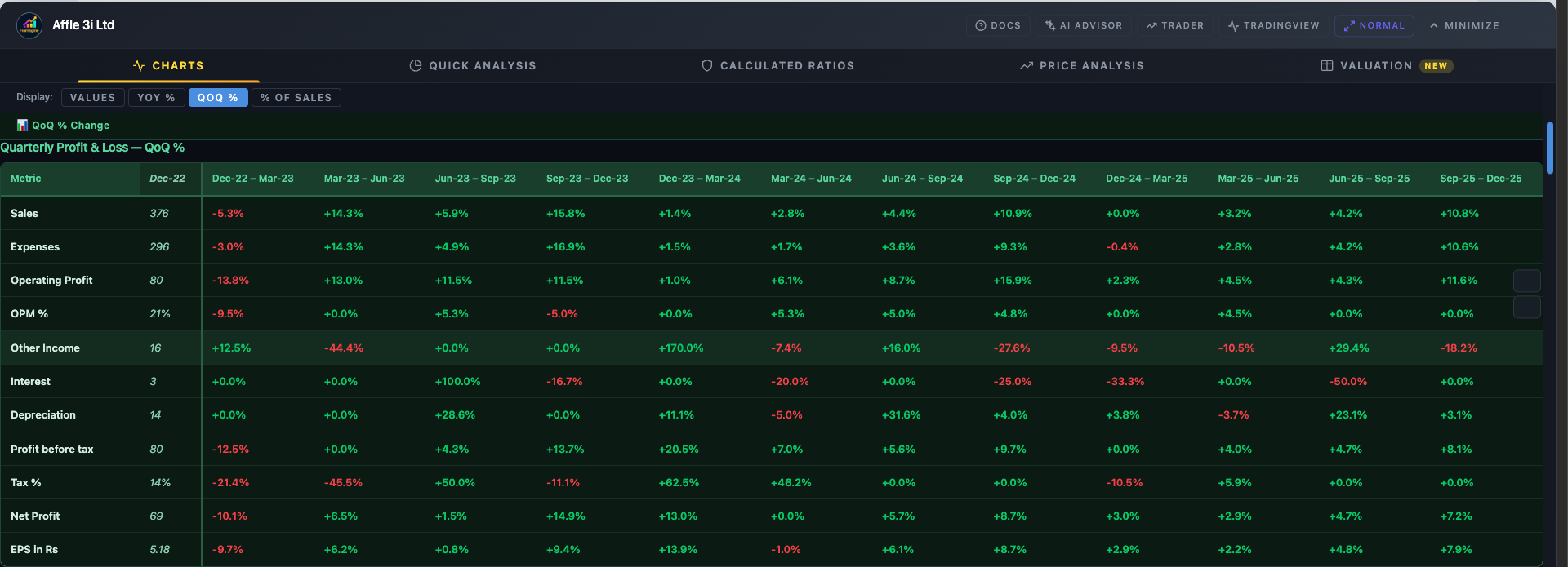
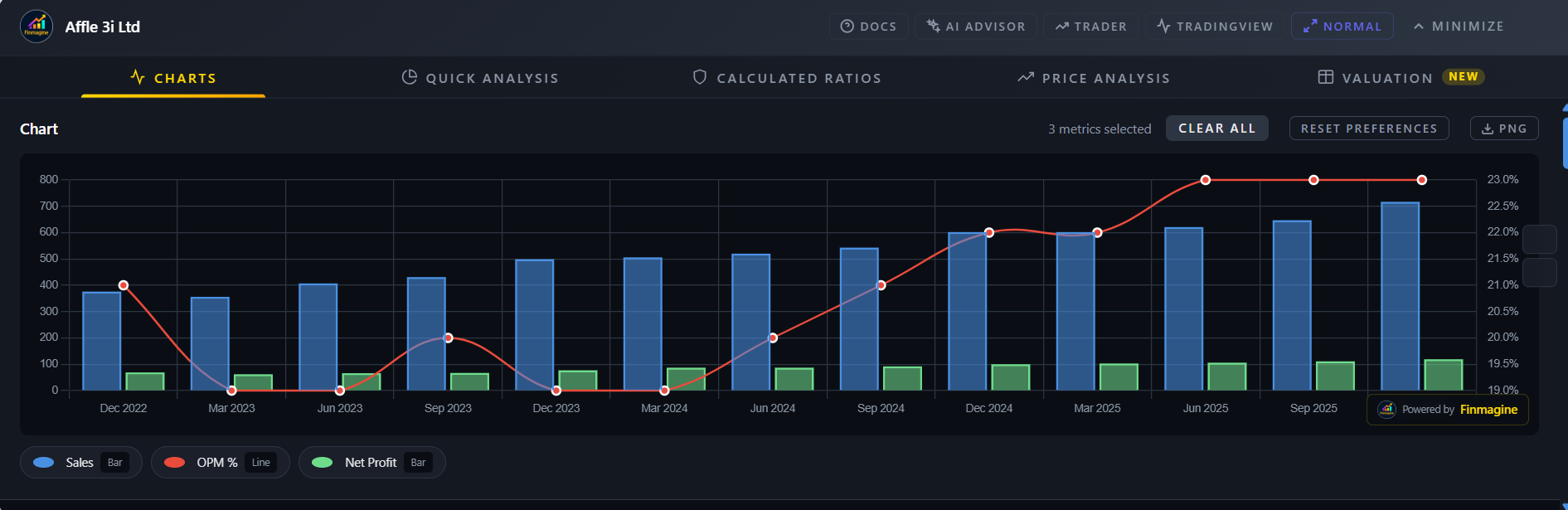
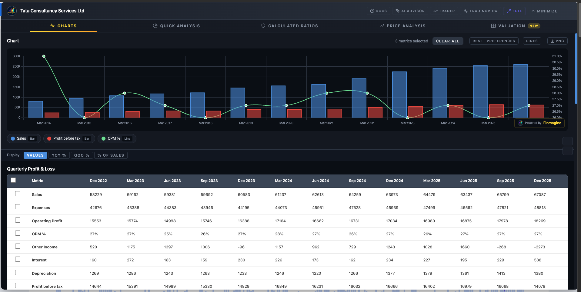
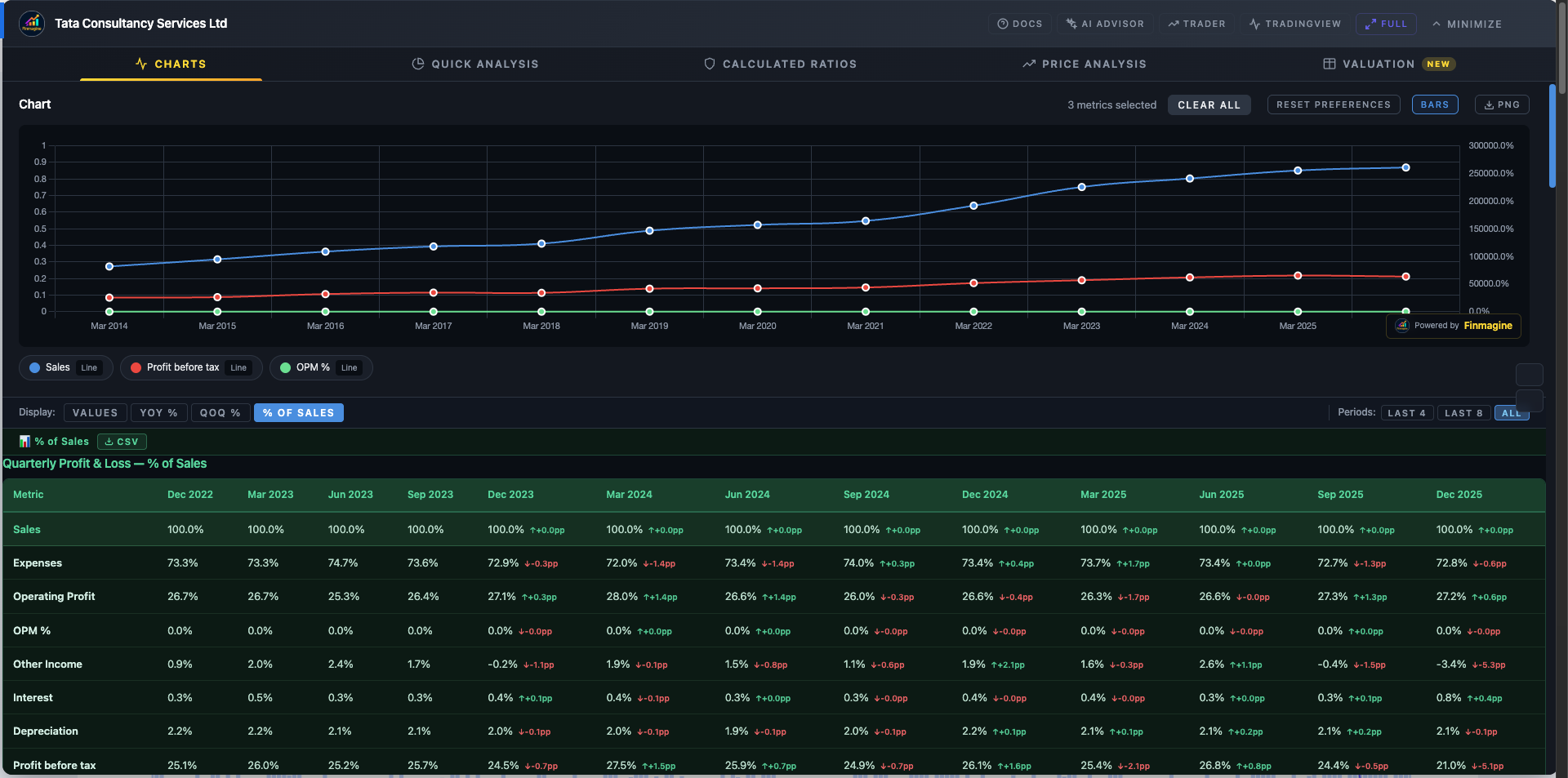
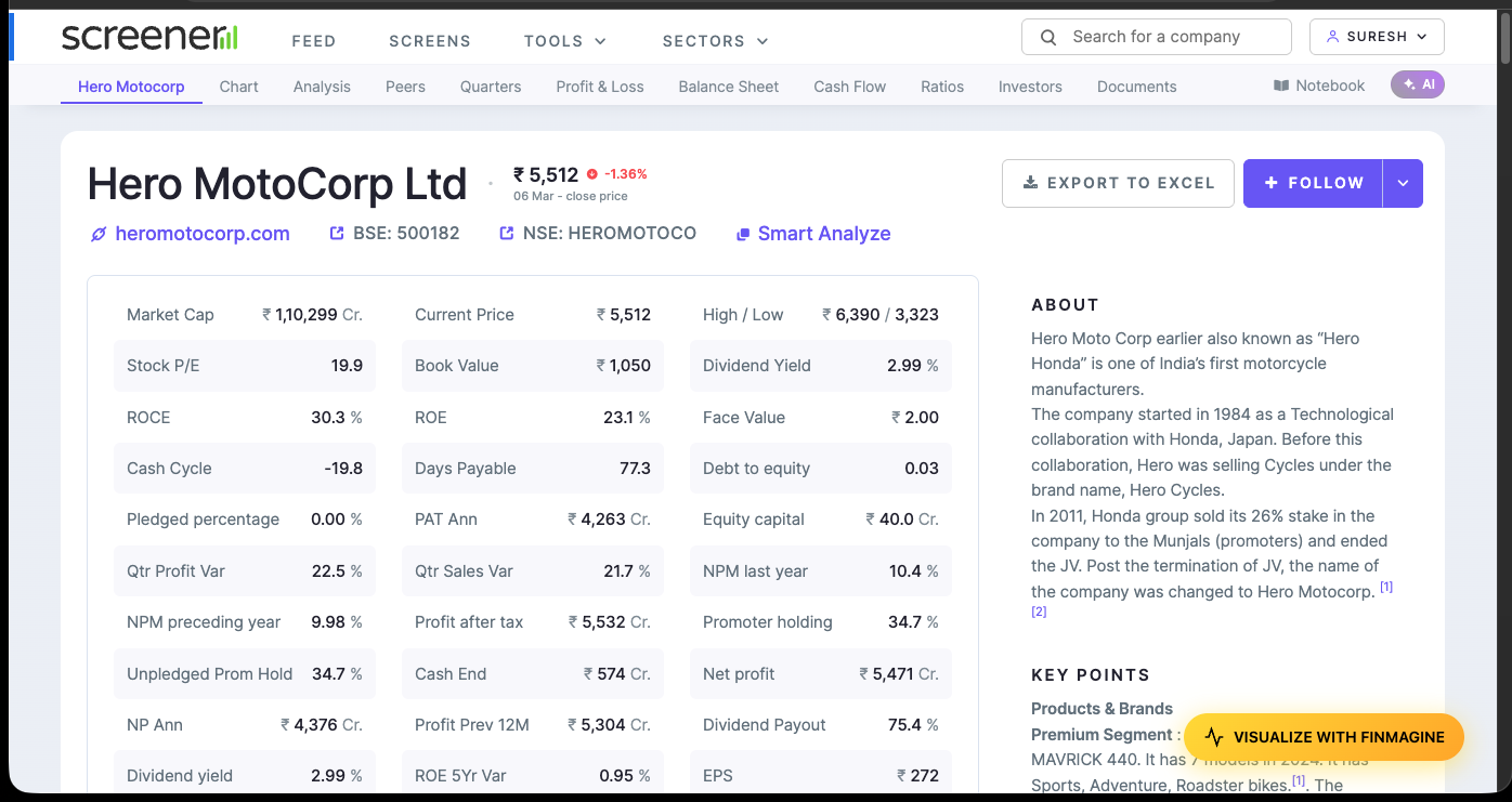
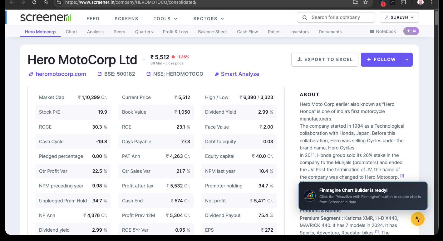
For now, if you’re on Screener premium, the extension will already use all the standard tables (P&L, Quarterly, Balance Sheet, Cash Flow, Ratios, Shareholding — all 5 sections). The segment tables and modals are the next frontier.

Extension landing page: Finmagine Chart Builder - Free Chrome Extension for Screener.in Financial Visualization
Display Modes guide (v2.6 + v2.7): Display Modes, Period Filters & Chart Type Flexibility in Finmagine v2.6.0 & v2.7.0 | Finmagine

1 Like

@Gopalan_Suresh_Raj thanks for the tool.

On stockanalysis.com - Finmagine Chart Builder (overlay icon - yellow bar) doesn’t appear for Indian stocks.

It does appear for US stocks.

Is that a feature or a bug or user-ignorance (if so, what is the procedure to generate the analysis icon) please ?

@PavanM — good catch, this is a real bug, not by design.
The Chart Builder on stockanalysis.com currently only activates on US stock pages (/stocks/AAPL/ URL format). Indian stocks on stockanalysis.com use a different URL structure (/quote/nse/RELIANCE/) that the extension doesn’t detect yet — so the button never appears for NSE stocks there.

For Indian stocks the right tool is Screener.in — open any company page there and Chart Builder activates automatically with full data (Charts, Quick Analysis, Calculated Ratios, Price Analysis, Valuation).

Extending stockanalysis.com support to NSE/BSE stocks is on the roadmap — noted as a feature request.

Full details: Finmagine Chart Builder - Free Chrome Extension for Screener.in Financial Visualization

(Also from Finmagine: NSE Momentum Scanner · AI Stock Analysis Prompts)

1 Like

Finmagine Financial Chart Builder v2.7.0 — New Release

For those who haven’t used this yet: it’s a free Chrome extension that
overlays financial charts directly on Screener.in and stockanalysis.com
pages, so you don’t have to copy data into Excel.

What’s new in v2.6.0 + v2.7.0:

Four ways to view the same data
─────────────────────────────────
The Charts tab now has four Display Modes — switching between them
reveals patterns that the raw numbers hide:

• Values — the standard table (revenue, PAT, OPM in absolute ₹)
• YoY% — every cell shows year-on-year growth rate instantly; you can
spot a growth inflection without doing any math
• QoQ% — quarter-on-quarter momentum with :up_arrow: Accelerating / :down_arrow:
Decelerating / → Stable badges so trend reversals are impossible to
miss
• % of Sales — every line item as a % of revenue with a ↑+1.2pp /
↓-0.8pp delta, so margin expansion or compression shows up visually

Lines/Bars toggle (v2.7.0)
─────────────────────────────────
Switch the entire chart view between bar and line charts globally, or
override individual metrics via the legend. Useful when you want to see
a trend line for revenue alongside bars for PAT.

Period filter
─────────────────────────────────
Last 3 / Last 5 / Last 7 / All years — keeps the chart uncluttered when
you only care about recent history.

CSV export
─────────────────────────────────
Export any table in any display mode to CSV with one click.

Full writeup with examples:
Display Modes, Period Filters & Chart Type Flexibility in Finmagine v2.6.0 & v2.7.0 | Finmagine

Install / update (free):
https://chromewebstore.google.com/detail/finmagine-financial-chart/cbofenapnholmmipokepempcpnjpfccd

Landing page:
Finmagine Chart Builder - Free Chrome Extension for Screener.in Financial Visualization