[Tool Launch] Free Chrome Extension: Transform Screener.in Data Into Professional Charts Instantly (Zero Data Collection)

Hi Investments community,

I’ve just launched a free Chrome extension that solves a problem I’ve personally faced: Screener.in has excellent financial data, but analyzing trends from tables alone is mentally exhausting.

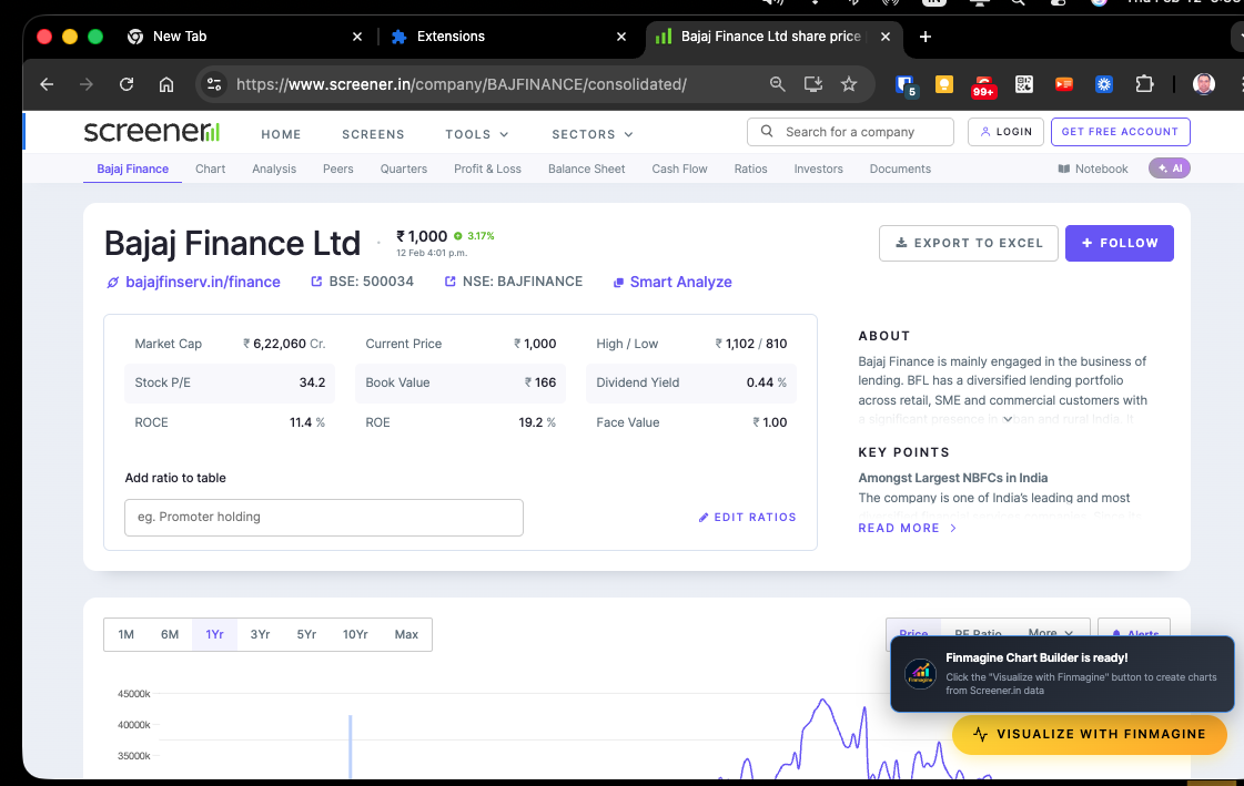
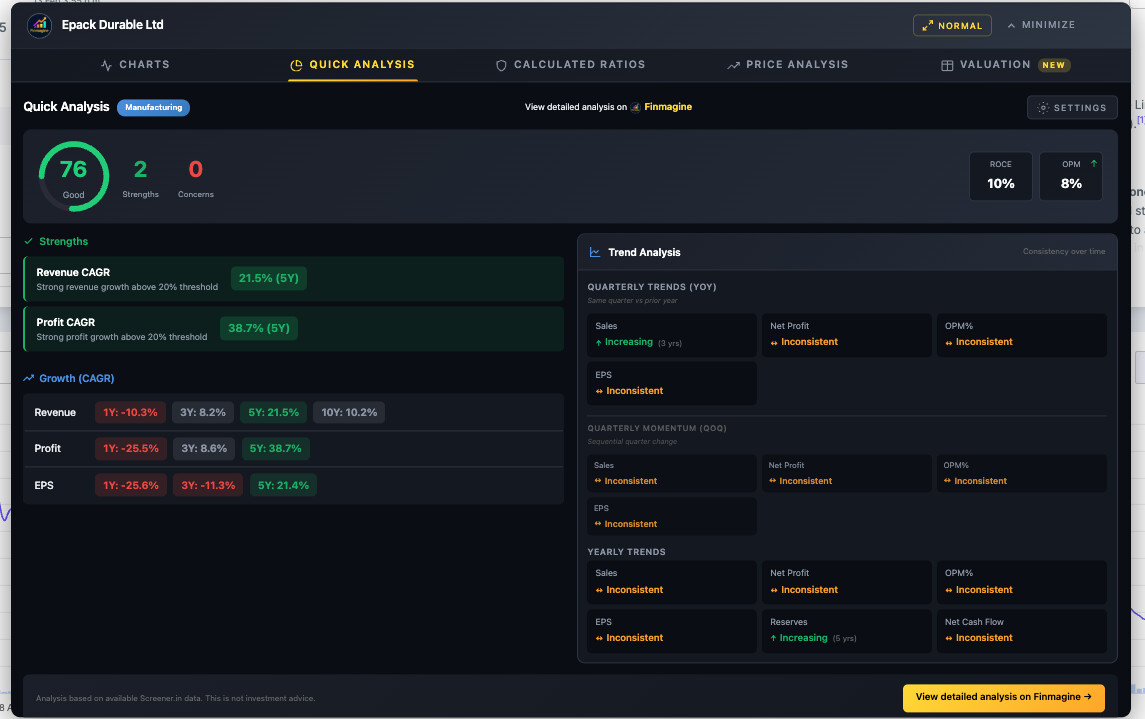
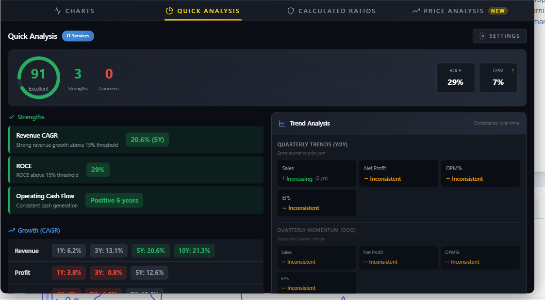
Finmagine Chart Builder transforms any Screener.in company page into interactive charts with one click.


What It Does

When you visit a Screener.in company page (e.g., HDFC Bank, Reliance, TCS), a golden “Visualize with Finmagine” button appears. Click it, select your metrics, and instantly get professional-grade charts.

Supported Metrics (40+):

  • P&L: Revenue, Expenses, OPM, NPM, PAT
  • Ratios: ROE, ROCE, ROA, Asset Turnover
  • Balance Sheet: Debt, Equity, Reserves, Fixed Assets
  • Cash Flow: Operating CF, Investing CF, Free Cash Flow
  • Working Capital: Debtor Days, Inventory Days, Cash Conversion Cycle
  • Valuation: P/E, P/B, EV/EBITDA, Dividend Yield

Key Features

1. Dual Y-Axis Support
Compare metrics with different scales on one chart:

  • Revenue (₹ crores) vs Profit Margin (%)
  • Debt (₹ crores) vs Debt/Equity (ratio)
  • Working Capital Days vs ROCE (%)

Without dual axes, percentage lines appear flat at the bottom when plotted with absolute values. This feature solves that.

2. Mix Quarterly & Annual Data
Plot 10 years of annual data alongside recent quarterly results to spot inflection points before they appear in full-year reports.

3. Interactive Analysis

  • Click legend items to hide/show metrics
  • Hover for exact values and dates
  • Export charts as PNG for presentations

4. Zero Data Collection
Everything runs locally in your browser. No tracking, no analytics, no external API calls. I’m not collecting ANY data.

Full privacy policy: Privacy Policy - Finmagine Chart Builder Chrome Extension


Real-World Use Case: Spotting Margin Compression

I tested this on Bajaj Finance:

  • Revenue bars trending UP :up_right_arrow:
  • Financing Margin % line trending DOWN :down_right_arrow:

This divergence signals that growth is coming at the cost of pricing power—something you’d miss scanning a table. The chart makes it obvious instantly.

[Screenshot: blogs/assets/images/chartbuilder/image010.png]


Why I Built This

I’m a fundamental investor who uses Screener.in daily. I was frustrated by:

  1. Mental overhead: Converting rows of numbers into trends in my head
  2. Excel gymnastics: Copy-pasting into spreadsheets for every company
  3. Time waste: 10 minutes per company just to see basic trends

This extension reduces that to 10 seconds. Chart any company with 3 clicks.


Installation & Usage

Install (5 seconds):

Tutorial:

Video Demo:


Technical Details (for the curious)

  • Tech Stack: Manifest V3, Chart.js, vanilla JavaScript
  • Permissions: Only host_permissions for www.screener.in (required to read financial tables)
  • Data Processing: 100% client-side. HTML parsing → JSON structuring → Chart.js rendering
  • Browser Support: Chrome, Edge, Brave, Opera (all Chromium-based browsers)
  • No account required: Install and start using immediately

Pricing

100% free forever. No trials, no subscriptions, no “premium” features locked behind paywalls.


Feedback Welcome

This is v1.0 specifically for Screener.in. I’m considering adding support for Yahoo Finance and Google Finance in future versions.

If you use it, I’d love to hear:

  • What worked well?
  • What’s missing?
  • Which metric combinations do you find most useful?

Resources

Happy investing! Let me know if you have questions.


32 Likes

🚀 Finmagine Chart Builder Update!

The Chrome extension that turns Screener.in data into beautiful charts is now going GLOBAL! :globe_showing_europe_africa:

:white_check_mark: Available NOW: Screener.in support
:hourglass_not_done: Coming soon: Google Finance support (submitted for review)

This means you’ll soon be able to visualize AAPL, GOOG, NVDA, TSLA - any global stock - with the same one-click charts!

:backhand_index_pointing_right: Install now: https://chromewebstore.google.com/detail/cbofenapnholmmipokepempcpnjpfccd

Already have it? It’ll auto-update when v2.0 is approved (1-7 days).

100% free. No sign-up. Works instantly.

2 Likes

Excellent tool. Thanks.
Is there any possibility to do peer comparison as well?
Is there any way to check ratios as well?

1 Like

Excellent Tool.

A request : Currently the option selected is not persistent. Everytime i select a different stock on screener.in i have to reselect the options on Finmagine . Can this be fixed for the tool to remember the options once selected . Note : I am using Edge browser.

1 Like

Hi @Sudhir_Shetty,

Thank you for the feedback! You’re absolutely right - a smoother workflow where metrics persist across companies makes total sense.

Great news: Metric persistence is now implemented and will be available in the next update (v2.1.0).

How it works:

  • Select your preferred metrics (e.g., Sales, OPM%, Profit Before Tax) on any company
  • Navigate to a different company → same metrics are auto-selected
  • Works across all Chromium browsers (Chrome, Edge, Brave)

Smart features:

  • Section awareness - If you select from Annual P&L, it stays in Annual P&L (won’t jump to Quarterly)
  • Name aliasing - Handles variations like Revenue/Sales, Net Profit/PAT automatically
  • Graceful handling - If a metric doesn’t exist on the new company (e.g., OPM% on banking stocks), it’s silently skipped

Two buttons:

  • “Clear All” - clears current chart only
  • “Reset Preferences” - clears your saved selections if you want to start fresh

Currently v2.0.0 (with Google Finance support) is pending Chrome Web Store review. Once approved, v2.1.0 with persistence will follow shortly.

Thanks again for helping make the extension better!

Hi @vavazzodu,

Thank you for the feature suggestions!

Ratio Analysis - Good news, this is already available! The extension extracts the “Financial Ratios” section from Screener.in, so you can visualize metrics like ROCE, ROE, Debt to Equity, and other ratios over time. Just scroll down to the “Financial Ratios” table in the panel and select the ratios you want to chart.

Peer Comparison - This is a great idea and definitely on the roadmap. It’s a bit more complex to implement since it would require either:

  • Storing data from previously visited companies, or
  • Fetching data from multiple company pages simultaneously

I’m exploring the best approach to make this seamless. Would love to hear how you’d envision using it - comparing 2-3 specific competitors, or broader sector comparisons?

Coming soon in v2.1.0: A Quick Analysis tab (Screener.in only) with sector-aware benchmarks and a health score that considers industry context.

Thanks for helping shape the extension!

2 Likes

Hello @vavazzodu

Once again, I wanted to Thank you for the kind words and great questions!

Here’s an update Regarding ratios — YES! :tada:

Version 2.1.0 (currently pending Chrome Web Store review) introduces a brand new “Calculated Ratios” tab that computes 11+ financial ratios automatically from Screener.in data:

Solvency Ratios:

  • Interest Coverage Ratio
  • Debt-to-Equity Ratio
  • Debt-to-Assets Ratio
  • Current Ratio
  • Quick Ratio (Acid Test)

Profitability Ratios:

  • EBITDA (absolute value)
  • EBITDA Margin
  • Net Profit Margin

Efficiency Ratios:

  • Asset Turnover
  • Fixed Asset Turnover
  • Equity Multiplier

Plus DuPont Analysis:
The tab includes a visual DuPont breakdown showing exactly how a company generates its ROE:
ROE = Net Profit Margin × Asset Turnover × Equity Multiplier

Each ratio displays a color-coded rating (Excellent/Good/Average/Poor) so you can instantly spot strengths and red flags. This helps you identify whether a company is a quality compounder (high margins, low debt) or a
leveraged growth story (ROE inflated by debt).

:books: Detailed Tutorial: Is Your Stock a Zombie or a Compounder? How to Use Calculated Ratios & DuPont Analysis | Finmagine

Regarding peer comparison:

Direct side-by-side peer comparison isn’t built into the extension yet, but you can:

  1. Open multiple browser tabs with different companies on Screener.in
  2. Click the extension on each to see their Calculated Ratios
  3. Compare the DuPont profiles and rating badges visually

This actually works quite well for comparing 2-3 peers. We’re noting your request for a dedicated peer comparison feature in future versions!

Other v2.1.0 Features:

Full Chart Builder Hub: Finmagine Chart Builder - Free Chrome Extension for Screener.in Financial Visualization

Hope this helps! Let me know if you have any other questions.

2 Likes

Thank you @Gopalan_Suresh_Raj for the great development.
Currently, I am using V1.0.2
I am not sure if that is the correct version I am using. Also I am not sure whether the version will update automatically. I am using it in brave browser.

Regarding the peer comparison, there is already a tab for it under the screener page for a company. If we can make use of it. There, we can edit the column for the desired ratios or parameters. We can design it something like this, at a time only one ratio or parameter can be compared among the peers.

Otherwise, I must appreciate the hard work of the backend team. Keep doing good work

Hi @vavazzodu

Thanks for sharing this! You’ve highlighted a great point about Screener.in’s native Peer Comparison.

V1.0.2 is currently the publicly released version but V2.0.0 is under review by Google. Once approved, we’ll immediately submit V2.1.0. Here’s a preview of what’s coming:

For your ratios question → V2.1.0 has a dedicated Calculated Ratios tab with 12+ derived ratios including DuPont Analysis (ROE = NPM × Asset Turnover × Equity Multiplier), Interest Coverage, D/E, Current Ratio, EBITDA Margin,
and more - computed automatically for any company on Screener.in.

For peer comparison → As you’ve shown, Screener.in’s native table is useful for quick current snapshots (P/E, ROCE, Qtr Sales Var %, etc.).

However, we’re thinking about features that go beyond current metrics:

  • Overlay charts – Plot Revenue or Profit trends of Polycab vs KEI vs R R Kabel on the same chart over 5-10 years
  • Ratio comparison – Side-by-side DuPont decomposition across peers (who has better margins vs asset efficiency?)
  • Relative performance – Normalized charts showing % growth from a common base year (who’s compounding faster?)

The challenge: Screener.in’s peer table only shows current snapshot data. To build these features, we’d need to fetch historical data from each peer’s individual page - technically doable but adds complexity.

Question for you: Which of these would be most useful for your analysis? Or do you have other ideas? Would love your input before we prioritize!

2 Likes

Hi, Its nice! Thank you for this. One suggestion - Please see if one level drill down row can be captured. For example, it captures Expenses but does not capture Material Cost / Employee Cost individually. That would be helpful.

1 Like

Hi @Chandragupta
Thanks for the suggestion @Chandragupta! You’re right - currently the extension captures top-level line items like “Expenses” but not the drill-down components (Material Cost, Employee
Cost, etc.).

This is a great idea for deeper analysis - tracking Material Cost as % of Revenue over time, or Employee Cost trends, can reveal a lot about margin dynamics.

We’ll add this to our feature roadmap. The implementation would involve:

  • Detecting expandable rows in Screener.in’s P&L/Balance Sheet
  • Extracting sub-line items as separate chartable metrics
  • Possibly showing them as indented options in the metric selector

Noted for a future release! Thanks for the feedback.

5 Likes

Hi everyone,

Quick update on the Finmagine Financial Chart Builder. Version 2.0.0 is now live on the Chrome Web Store with a major addition: Google Finance support.

What’s new:

  • Chart global stocks (AAPL, GOOG, NVDA, TSLA, etc.) directly on Google Finance
  • Same dual-axis charting, interactive legends, and metric persistence you already use on Screener.in
  • Minimize-Restore workflow designed specifically for Google Finance’s dynamic page loading
  • All processing remains 100% client-side — zero data collection

What hasn’t changed:

  • Screener.in support works exactly as before
  • Still free, still no account required
  • Your existing metric preferences are preserved

Tutorials:

Install/Update: https://chromewebstore.google.com/detail/finmagine-financial-chart/cbofenapnholmmipokepempcpnjpfccd

If you already have the extension installed, it will auto-update. Feedback welcome as always.

2 Likes

A couple of people are trying to run this extension on their mobile devices and this is for them,

Thanks for your interest in Finmagine Financial Chart Builder! Unfortunately, Chrome extensions are not supported on mobile browsers — this is a limitation set by Google, not something specific to our extension.

Chrome extensions only work on desktop/laptop versions of Chrome (Windows, macOS, Linux, ChromeOS). Neither Chrome for Android nor Chrome for iOS supports extensions.

Here’s Google’s official documentation on this: Extensions / Get started  |  Chrome for Developers

To use the extension:

  1. Open Chrome on your desktop or laptop
  2. Visit the https://chromewebstore.google.com/detail/finmagine-financial-chart/cbofenapnholmmipokepempcpnjpfccd
  3. Click “Add to Chrome”
  4. Navigate to any company on https://www.screener.in or https://www.google.com/finance and look for the golden “Visualize with Finmagine” button
1 Like

Hi Gopalan ji, thank you for this amazing extension. It helps a lot in lowering the cognitive load when looking at the numbers.

However, a small suggestion to change the position of this popup(maybe bottom/top left) because it keeps popping up when I try to reach the search box as soon as the page loads or sometime my mouse is hovering over the search box area waiting for the page to open and that popup getting in the way became a little annoying. So I have started using / shortcut to reach the search box instead.

Hope this feedback is helpful and adds value to your product.

Hi @Rahul_Behera ji, thank you for the kind words and for taking the time to share this feedback — really appreciate it!

You’re absolutely right about the notification popup. It was positioned at the top-right corner, which directly overlaps with Screener.in’s search box. I can see how that would get
annoying, especially when navigating between companies.

I’ve already fixed this in the next update:

  • Notification moved to bottom-right — now appears just above the “Visualize with Finmagine” button, well away from the search area
  • Auto-dismiss reduced from 5 seconds to 3 seconds — gets out of your way faster
  • Click to dismiss still works if you want it gone immediately

This fix will be part of v2.2.0 which is coming soon. Until then, the / shortcut is a great workaround!

Feedback like this is exactly what helps improve the tool — please keep it coming.

1 Like

Hey everyone,

I’ve been building this free Chrome extension called Finmagine Financial Chart Builder. Version 2.1.0 just got approved on the Chrome Web Store, and I wanted to share it here since it’s built
specifically for Indian stock analysis.

What it does:

You know how Screener.in gives you incredible data but the visualization is… basic? This extension adds a floating panel with 4 tabs:

  1. Charts — Select up to 10 metrics, get instant dual-axis charts. Bars for Revenue/Profit, lines for margins/ratios. Your selections persist across companies.

  2. Quick Analysis — One-click health score (0-100). It’s sector-aware, so it won’t flag negative CFO as a concern for banks. Adjustable strictness from Conservative (for blue-chips) to
    Aggressive (for turnarounds).

  3. Calculated Ratios — Computes 12+ ratios from raw financial data including full DuPont Analysis. Tells you whether a company’s ROE comes from margins, asset efficiency, or just
    leverage.

  4. Price Analysis [NEW] — Compares price growth vs profit growth and tells you if the stock is Catching Up, Fairly Valued, or Running Ahead. Also detects cyclical quarters and shows
    max drawdown.

Privacy: Everything runs in your browser. Zero data sent anywhere. No account needed.

Also works on Google Finance for global stocks (US, Europe, Asia) — Charts tab only.

Install: chrome.google.com/webstore/detail/cbofenapnholmmipokepempcpnjpfccd

Detailed tutorials:

Would love feedback from this community. What features would make your analysis workflow better?

1 Like

Need to fix the industry tag

Hi @Arash_Mishra, good catch!

You’re right — EPACK Durable is being tagged as FMCG when it should be Manufacturing (Consumer Durables). The extension currently groups “Consumer Durables” under FMCG, but appliance
manufacturers like EPACK, Voltas, Blue Star etc. are fundamentally different businesses and deserve the Manufacturing sector profile.

Immediate workaround: In the Quick Analysis tab, click the gear icon (Settings) → change the Sector dropdown from “Auto-detect” to Manufacturing → click Apply. This will recalculate the
health score with the correct sector thresholds.

Fix: This is already patched in our codebase and will ship in the next update after v2.2.0 (currently in review). Consumer Durables and Household Appliances will correctly map to
Manufacturing going forward.

Thanks for reporting this — feedback like this makes the tool better for everyone!

1 Like

@Gopalan_Suresh_Raj Thanks for the update.
I was exploring the new update. I see that the newly added tabs do not have the scroll bar.
I am not sure if it is an issue with only me or

attaching the image for reference

Hi Gopalan,

Thanks for creating this.

The pop up window can’t be dragged or maximise to full screen (if the need be). Am I missing something?

1 Like