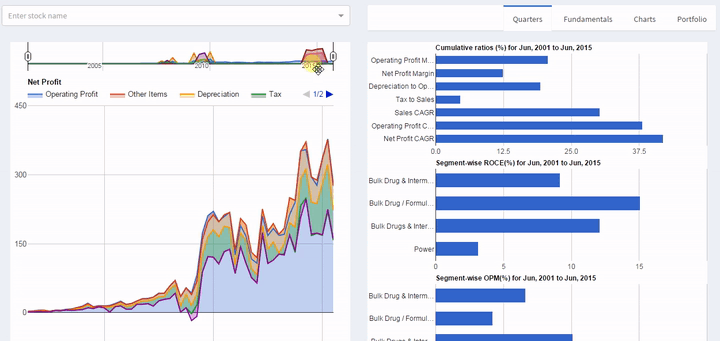
Added about 13 years worth of quarterly reports under a new Quarters tab under stocks - it’s also got segment-wise ROCE and OPM wherever data is available. Experimenting with a new user-interface,
You can select a time period and the metrics will update accordingly - good for studying trends.
You can also drag the window around. So, for instance, you wanted to look at 3-year time-windows, then select a 3 year time period and just drag the window left or right.
@crazymama: Tip of the hat . Got depreciation now - not easily copy/pasteable but getting there… @pankajs: Glad you found it useful. No need for the formality
You can lookup either by market-cap of individual sectors, or by traded value. Click on the chart to get extra details - month-by-month, or to list the stocks in that sector.
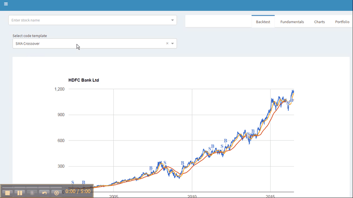
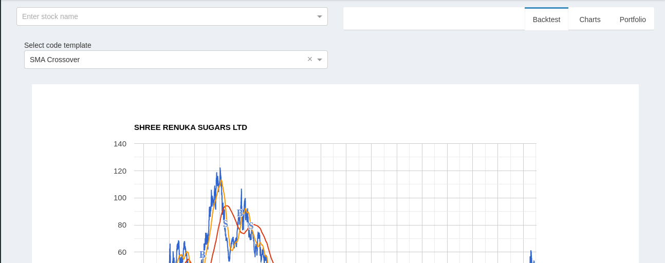
I am testing out a new backtesting framework. You can write strategies in a version of Lua. I’ve added templates for MACD, RSI, Bollinger bands, SMA crossover and a few others - more to serve as examples.
All programs run within the browser, so it could take 2 to 10 seconds to run. It helps to use the latest version of Google Chrome of Firefox as your browser.
Hello… Vimal
Thanks for such a wonderful tool
Can you add export to excel function or sort out Holding By INR (http://www.bajaar.me/investors)
If we serch Anil Kumar Goel or Colly Khanna it shows long list and become difficult to track by only Graph
Thanks
Good Luck
@vml im sure your site has jobs to run for tracking portfolio changes and earnings data. how often do they run?
example: adanipower / apollotyre has announced their results today. so when can i expect the data to be updated in your site.
Thanks for a great tool … 2 small queries ( sorry its a repeat )
for business with multiple segments - can we have the data separately ( in numbers) like topline etc … in this tool i see graphs showing separate data but i use numbers for some analysis and couldn’t find - eg Freshtrop fruits
a novice query - in this or you can recommend any other - how can one see volume and price movement ( graph & numbers )
Segment Info : You can access the raw data for segments. For FreshTrop, for instance, open http://www.bajaar.me/qoq/FRSHTRP . For any stock, use the “Security ID” (instead of FRSHTRP) for the stock as available from www.bseindia.com
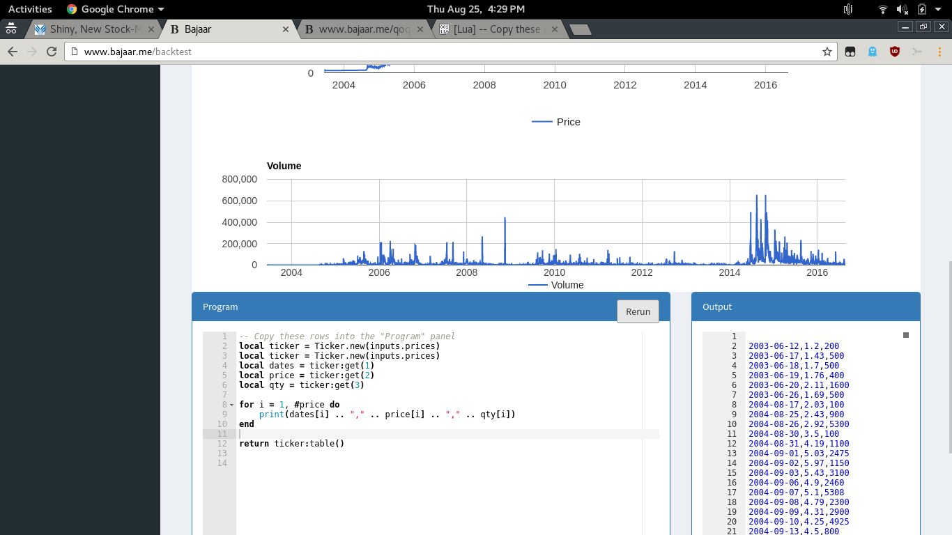
Price/Volume data : This is exactly what the backtest tool is for. Just open http://www.bajaar.me/backtest , go to the program panel and replace the contents with
local ticker = Ticker.new(inputs.prices)
local dates = ticker:get(1)
local price = ticker:get(2)
local qty = ticker:get(3)
for i = 1, #price do
print(dates[i] … “,” … price[i] … “,” … qty[i])
end
return ticker:table()
and click the “Rerun” button. You will get something like this
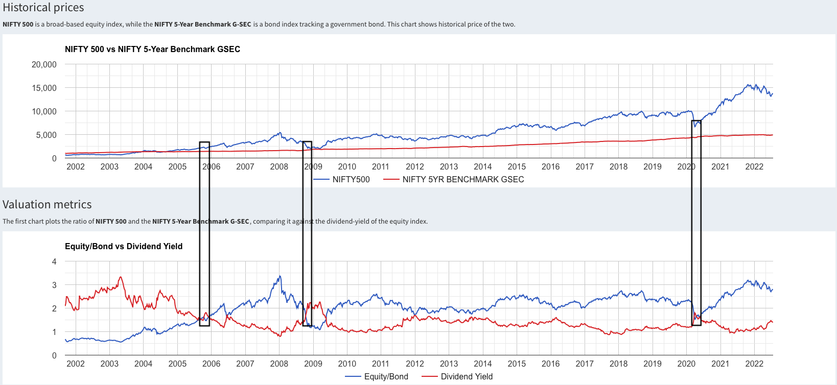
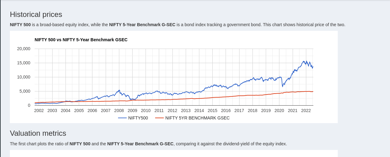
But the charts have to be interpreted as a group. For instance the Equity/Bond shows the current state of the market as expensive, but less so on the Price/Book chart. Also with the capex indicators starting to move after over 10 years, it gets interesting. The final chart (predicting market returns) is a way to combine multiple indicators into a single number.
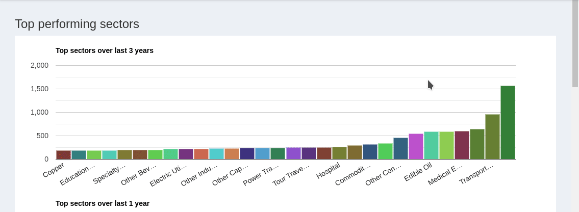
Trends may look a little different. I have updated recent sector information from BSE, and am in the process of some cleanups. Also removed 500+ stocks that haven’t traded for over a year.
Trends now includes top performing sectors for trailing 3-year, 1-year and 6 month periods. The Historical Sectors charts can be used to dive in deeper and identify individual stocks. Charts updated weekly.
Looks like an earlier post was deleted. Reposting:
I created a new page : Indicators that tracks the general health of the stock market. I compare the NIFTY-500 versus government bonds (5-Year GSEC). For valuation, I compare the Equity/Bond ratio against the dividend yield of the NIFTY-500. The chart for the Price/Book is another historical valuation indicator.
I came across two indicators : Dividend/Book and Earnings/Book which appear to be correlated with the capex cycle.
To combine multiple indicators into a single number, I trained a machine learning model to predict the 200-day lookahead returns. It was trained on pre-2015 data. The last chart shows the actual vs predicted return. It currently predicts a flat to slightly positive return.