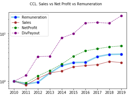
I wanted to see the historical trend of the management performance by comparing the sales, net profit, dividend payout and management remuneration.
Please let me know what you think about this approach.
Here is a chart of the numbers, base lined to 1 starting from FY 2010.
Source code:
import pandas as pd
import matplotlib.pyplot as plt
FY_2010 =  4.2287324
FY_2011 =  2.2851753 + 1.41
FY_2012 =  3.7037 +  0.3458
FY_2013 =  5.9259 + 0.3298
FY_2014 =  8.68 + 0.3298
FY_2015 =  9.5535 + 0.1245 + 0.4500 +  0.3298
FY_2016 = 10.6035
FY_2017 = 13.8955
FY_2018 = 15.487
FY_2019 = 15.6846


data = {
'Remuneration':[FY_2010, FY_2011, FY_2012, FY_2013, FY_2014, FY_2015, FY_2016, FY_2017, FY_2018, FY_2019],
'Sales':[ 437, 	364, 	502, 	651, 	717, 	881, 	932, 	976, 	1138, 	1081],
'NetProfit':[28, 	26, 	36, 	47, 	64, 	94, 	122, 	135, 	148, 	155],
'DivPayoutPct':[7, 	10, 	18, 	14, 	25, 	21, 	27, 	25, 	22, 	30],
'Year':['2010', '2011', '2012', '2013', '2014', '2015', '2016', '2017', '2018', '2019']
}

df = pd.DataFrame(data, columns = ['Remuneration', 'Sales', 'NetProfit',  'Year','DivPayoutPct'])
df['DivPayout'] = df.NetProfit * df.DivPayoutPct * 0.01
df.Remuneration = df.Remuneration / df.Remuneration.iloc[0]
df.DivPayout = df.DivPayout / df.DivPayout.iloc[0]
df.Sales = df.Sales / df.Sales.iloc[0]
df.NetProfit = df.NetProfit / df.NetProfit.iloc[0]

# multiple line plot
fig = plt.figure()
fig.suptitle('CCL. Sales vs Net Profit vs Remuneration', fontsize=10)
plt.plot(  'Year','Remuneration', data=df, marker='o', markerfacecolor='blue', markersize=8, color='skyblue', linewidth=4)
plt.plot(  'Year','Sales', data=df, marker='o', color='brown', linewidth=1)
plt.plot(  'Year','NetProfit', data=df, marker='o', color='green', linewidth=1, linestyle='dashed')
plt.plot(  'Year','DivPayout', data=df, marker='o', color='purple', linewidth=1, linestyle='dashed')
plt.legend()
plt.yscale("log")
plt.draw()
Not a Recommendation.
Disc: Invested (about 5% of portfolio).