
any views on Honeywell automation
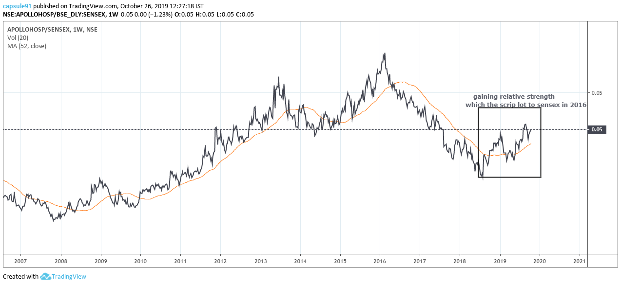
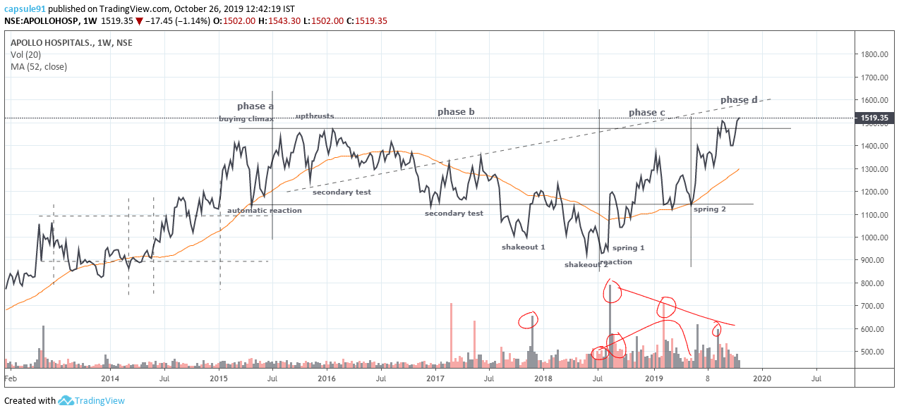
apollo hospitals
fellow memebers please share ur views regarding this scrip…
why i am interested in this technically is, it is showing relative strength to the sensex finally since 2016…
but what is very puzzling is… this base structure has a very atypical volume signature
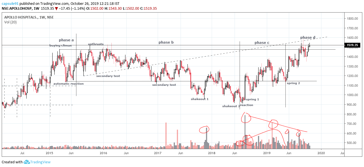
generally the supply is high in phase b, which the institutions try and absorb , hence due to their acquisitions from weaker hands, the volume stays higher … as we move into phase c, the institutions instill panic among the weak hands and they are shaken out… so in phase b gradually the volume on the reactions and the rallies soften as the price goes through those events… this one in phase c, demonstrates a higher volume on the reactions of 2019 early compared to late 2018 shakeouts… although the price dosent go back down and there is a effort vs reward mismatch, still this is confusing…
although the last reaction at the end of phase c , had a very slow volume, and that generated spring#2, which is an indication phase c is done and phase d is started with major sign of strength…
although i am kind of sure this is accumulation that has happened, but this is one of the rare instances i find that volume increasing at the end of the trading range, before breakout, the opposite is more expected, as the stock is mainly in the institutional hand at the end of phase c/d, and there is very less supply left with the weak/retail hands…
in phase d , the volume texture is as expected for nearly absorbed supply situtation, lower volumes on rallies, atleast compared to rallies on phase c…
this might have been the case as 2018 induced general market volatility, but that would be a qualitative explanation for it…
views welcomed on the chart,
thank you…
disclaimer… no positions yet, might consider a small exposure, not at all a fan of such capital intensive business
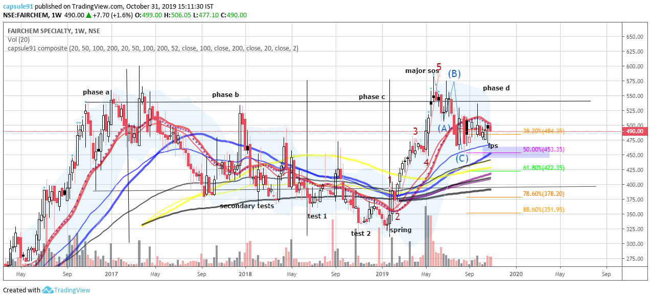
one just the price signature, this one very well mimics a textbook reaccumulation schematic
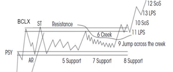
now at 5-6 transition in the schematic reference
2 Likes
hdfc amc…
looks like the institutions are stopping the trend, for another reaccumulation trading range…
price action is very overbought in a throw over beyond the supply line of the trading channel
the repeated volume surges at the top of the trend, might be institutions selling for the upcoming cause building in the trading range
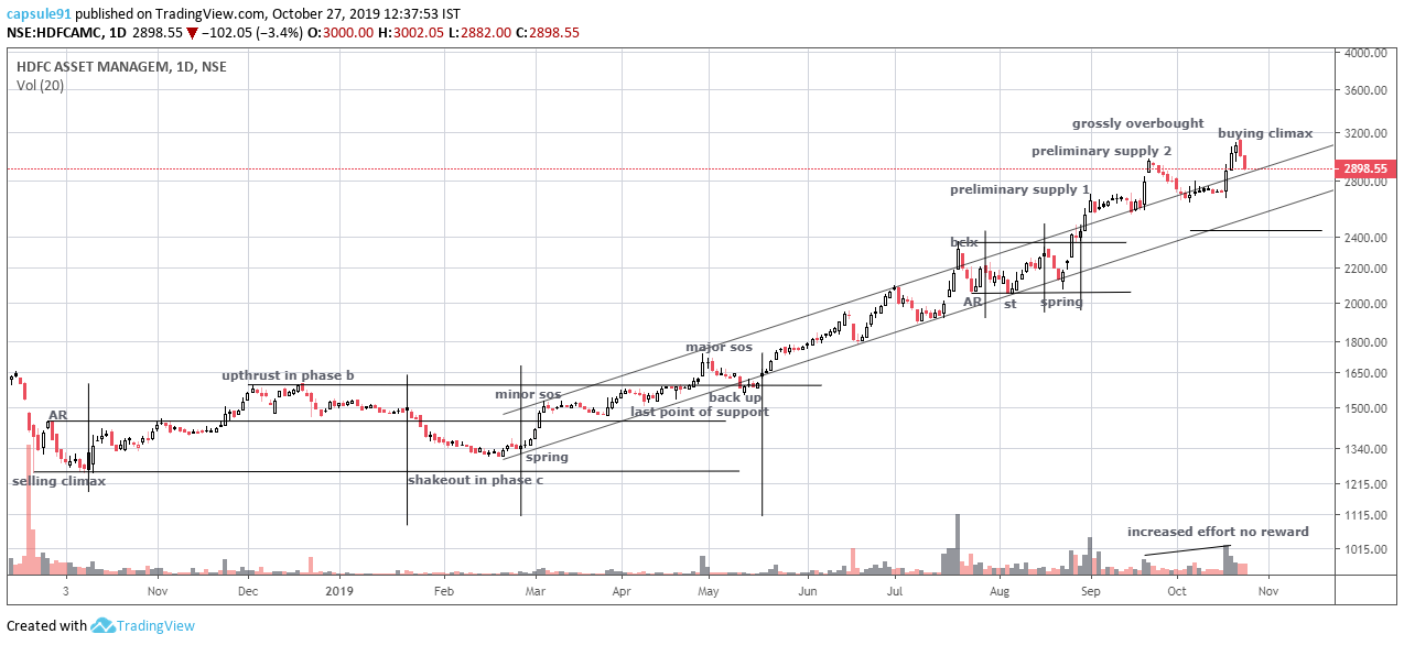
i closed positions early in the trade, thought the huge volume surge leading to the throw over in september early was an upthrust in the trading range when the trend was stopped in july , stock went up another 20percent from there…
disclaimer… interested to open positions from 2440 if it comes and at phase d if another trading range forms…
3 Likes
ION EXCHANGE…
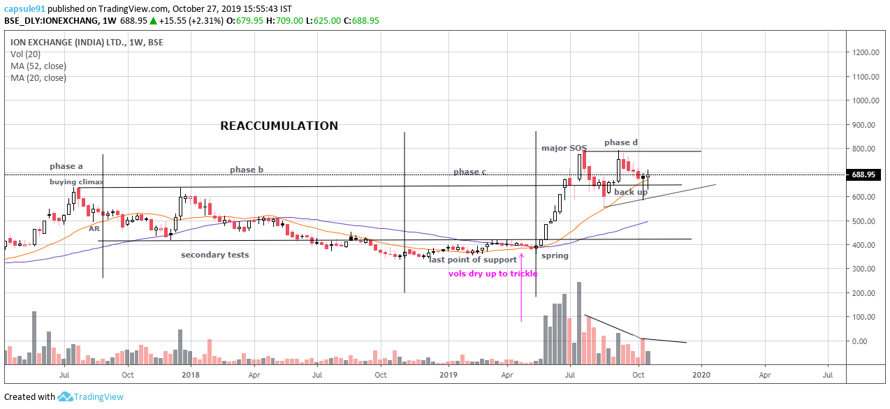
disclaimer… just spotted, need to dig the fundamentals…
attaching @dineshssairam 's presentation…
what a wonderful job…!
4 Likes
i noted a twitter post…
and i cant argue with roman, i learnt the little i know of wyckoff from him and his colleagues…
question is, would the market scenario of today hold the fractal analogy?
as of now looking at the sp500 market structure…
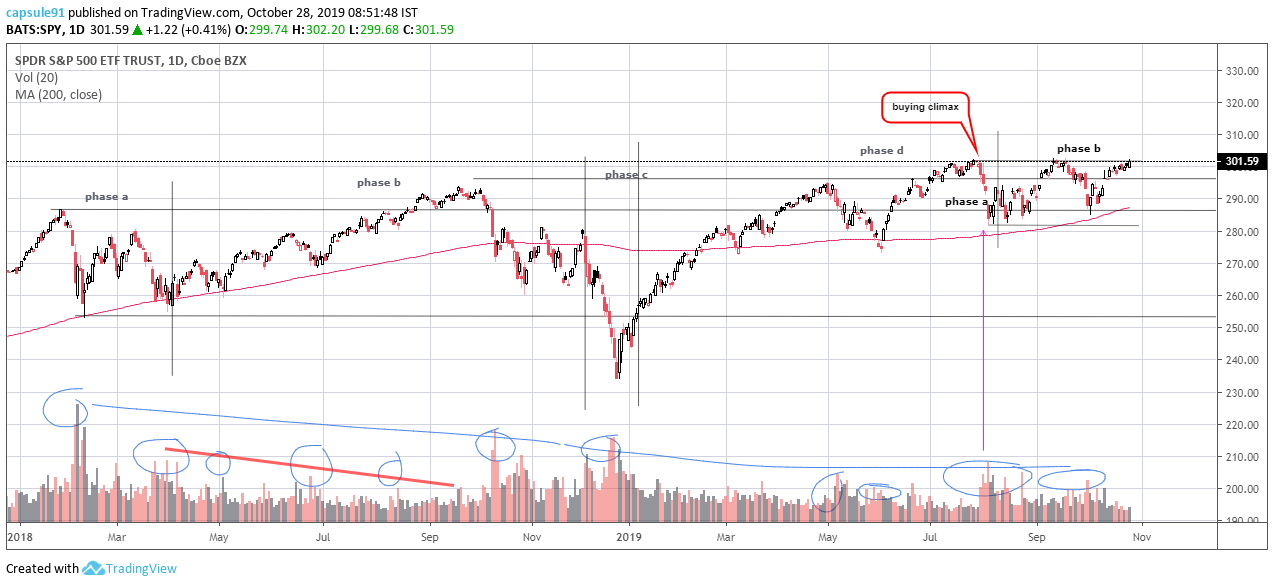
the us index has shown good absorption of supply from the volume signatures so far, the sudden rise of volumes in august is atypical and that was actually a stopping action into another trading range, so far looks like still in phase b/ phase c if the top is broken up to for a major sign of strength…
5 Likes
manappuram finanace
an excellent proxy for gold investors…
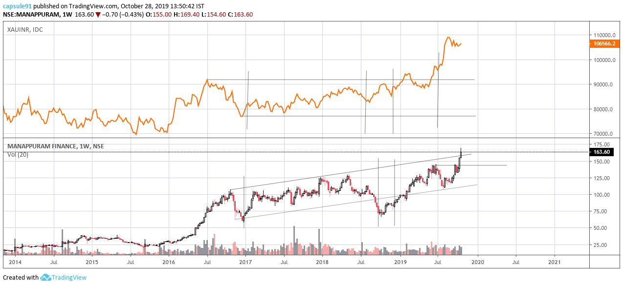
gold has completed its accumulation , and is in full blown markup, and this is only a start…
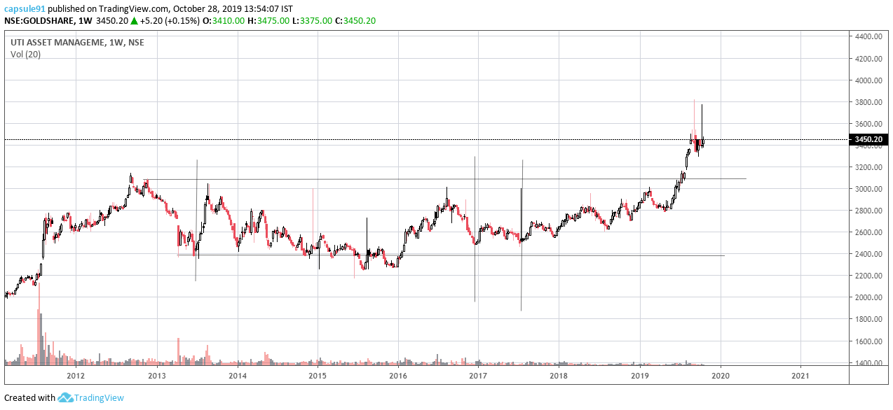
disclaimer… no positions at present in the stock, would wait for 140s to come on a flat correction, holding gold etf units in goldshare uti gold etf
one of the best bases so far in the market
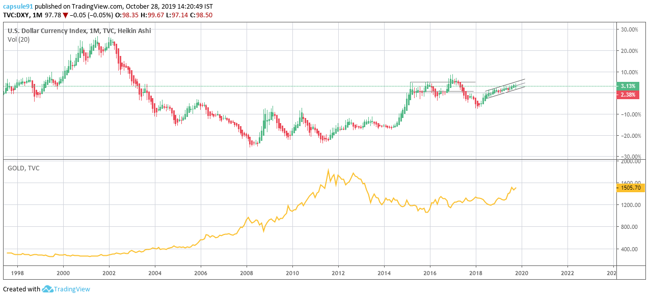
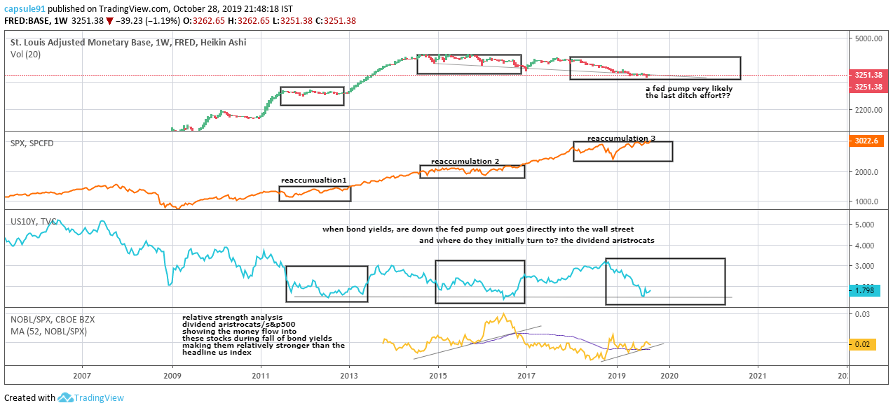
This is one of the rare instances where dollar and gold has be moving along side dollar…
a comparison of fed’s money low and sp500, seems a fed pumping out is very likely and sp500’s bubble to inflate further…
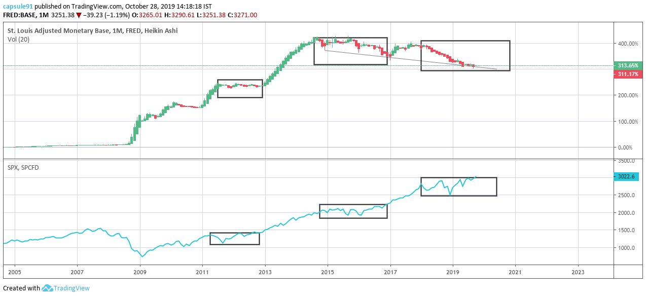
this should indirectly trigger a decrease in dollar value and gold breakout of the relationship with dollar
6 Likes
one more point to add to the previous post…
to quantify a bubble in very basic technical terms with relative strengths, using a chart relating the valuation of sp500 per unit feds monetory base out there…
there should be a lot of head room and a mammoth sized inflation in general…
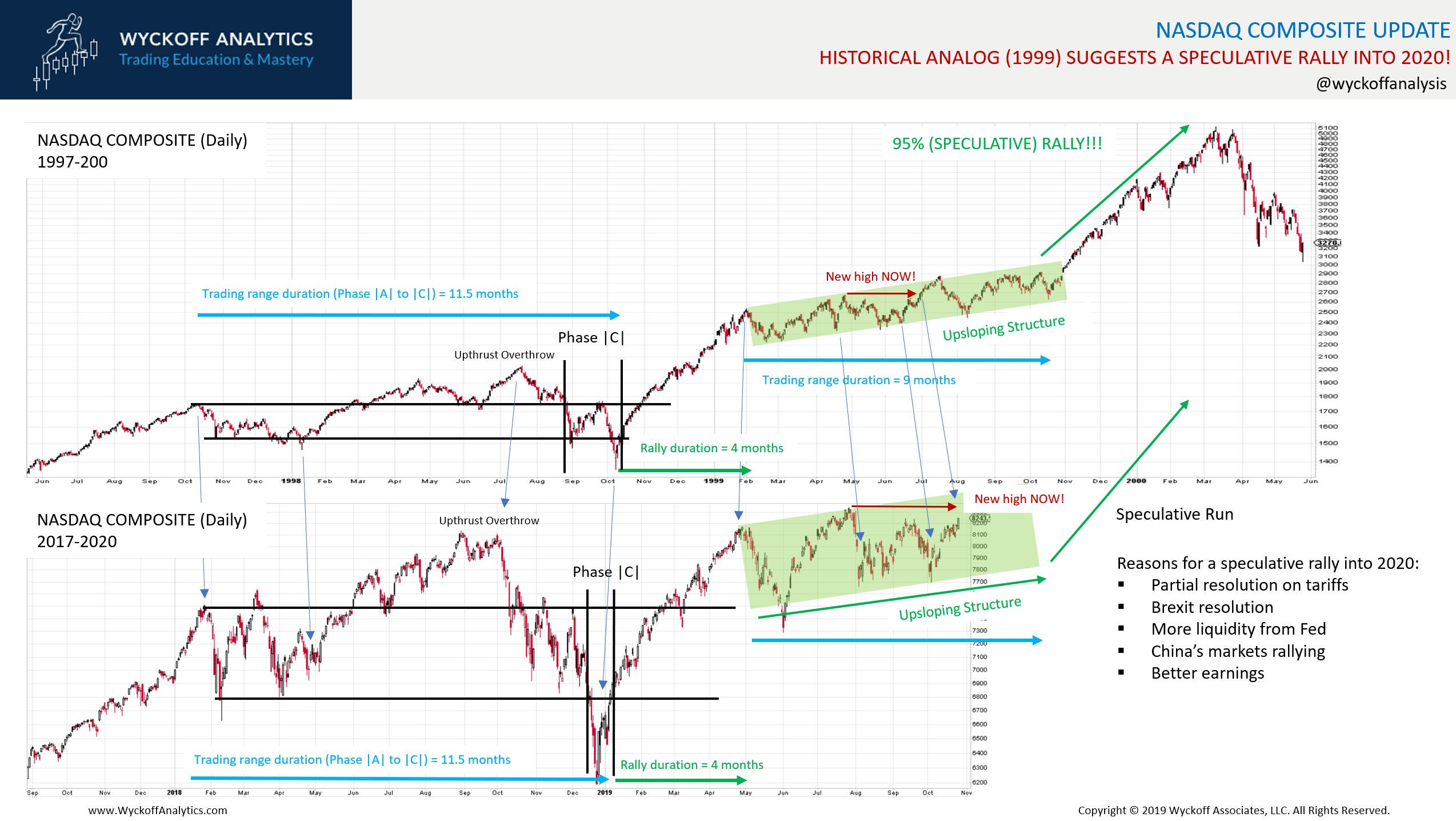
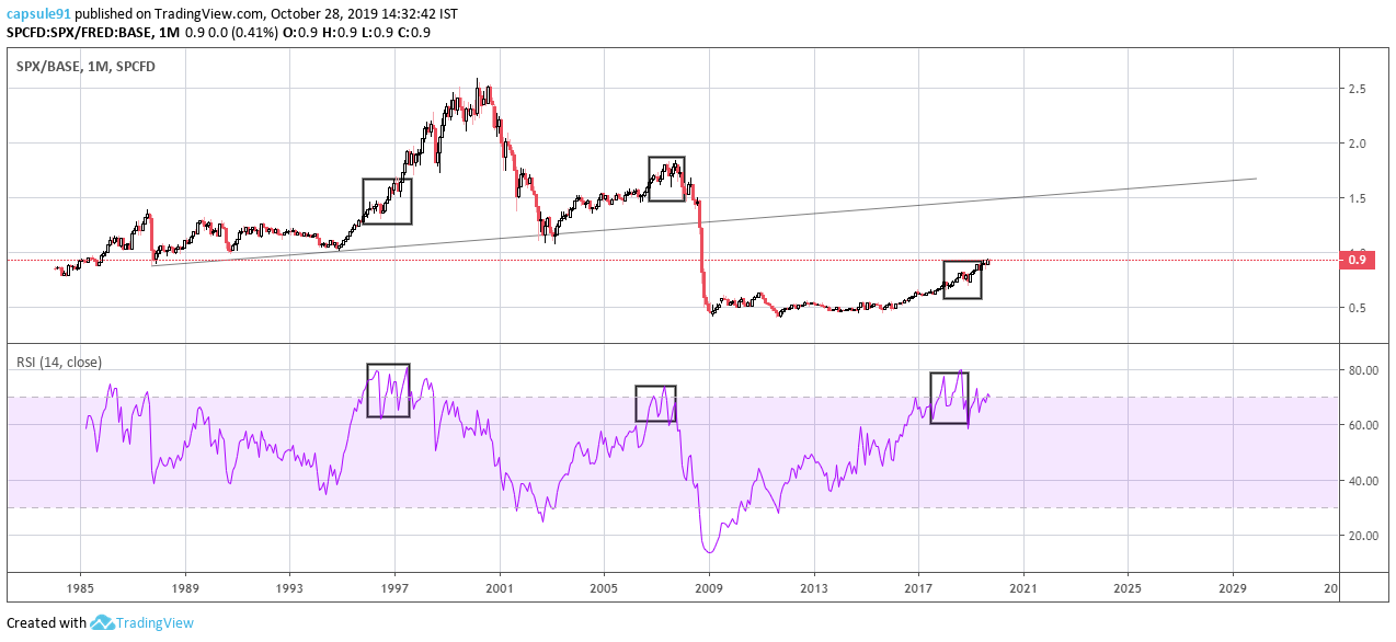
earlier today i shared an expert’s comparison of present nasdaq’s market structure with 1997-
the relative strength curve [rsi] of the spx/base chart shows , such a situation comparable with 1997-2000 period,
purely on technical analysis…
a botton for the bond yields may be…
2 Likes
Update on this:
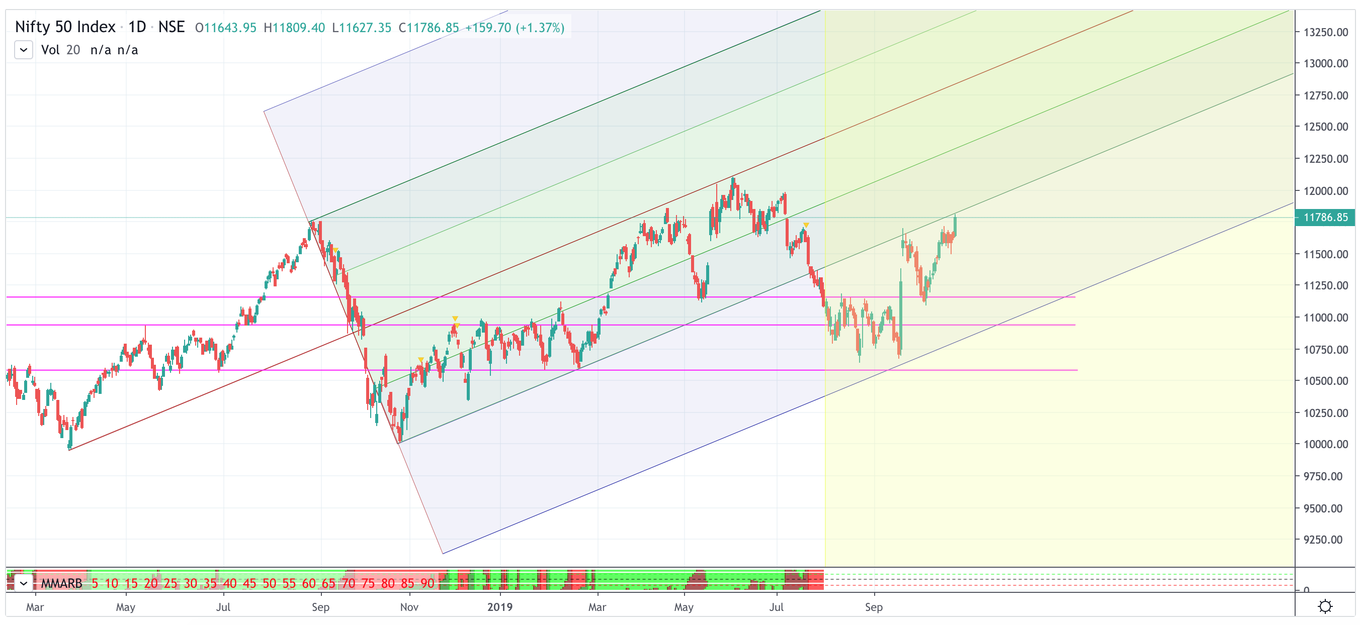
Nifty at the resistance now and in overbought zone, apparently looks nice on the contraction pattern.
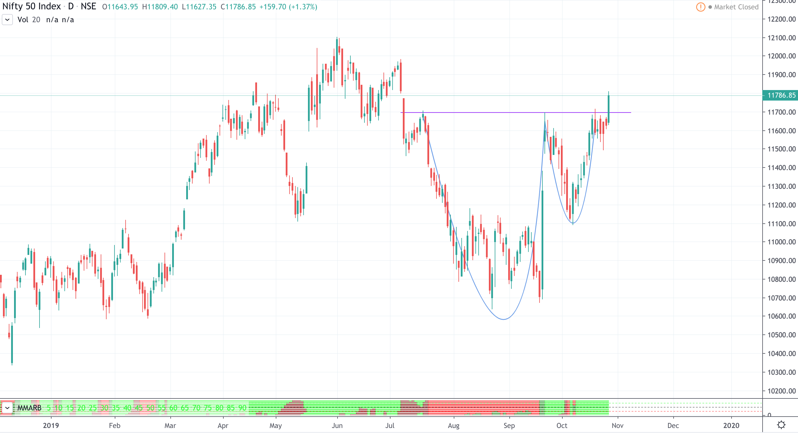
Guess the nifty rallied on the hope/speculation of govt withdrawing dividend distribution tax, LTCG.
2 Likes
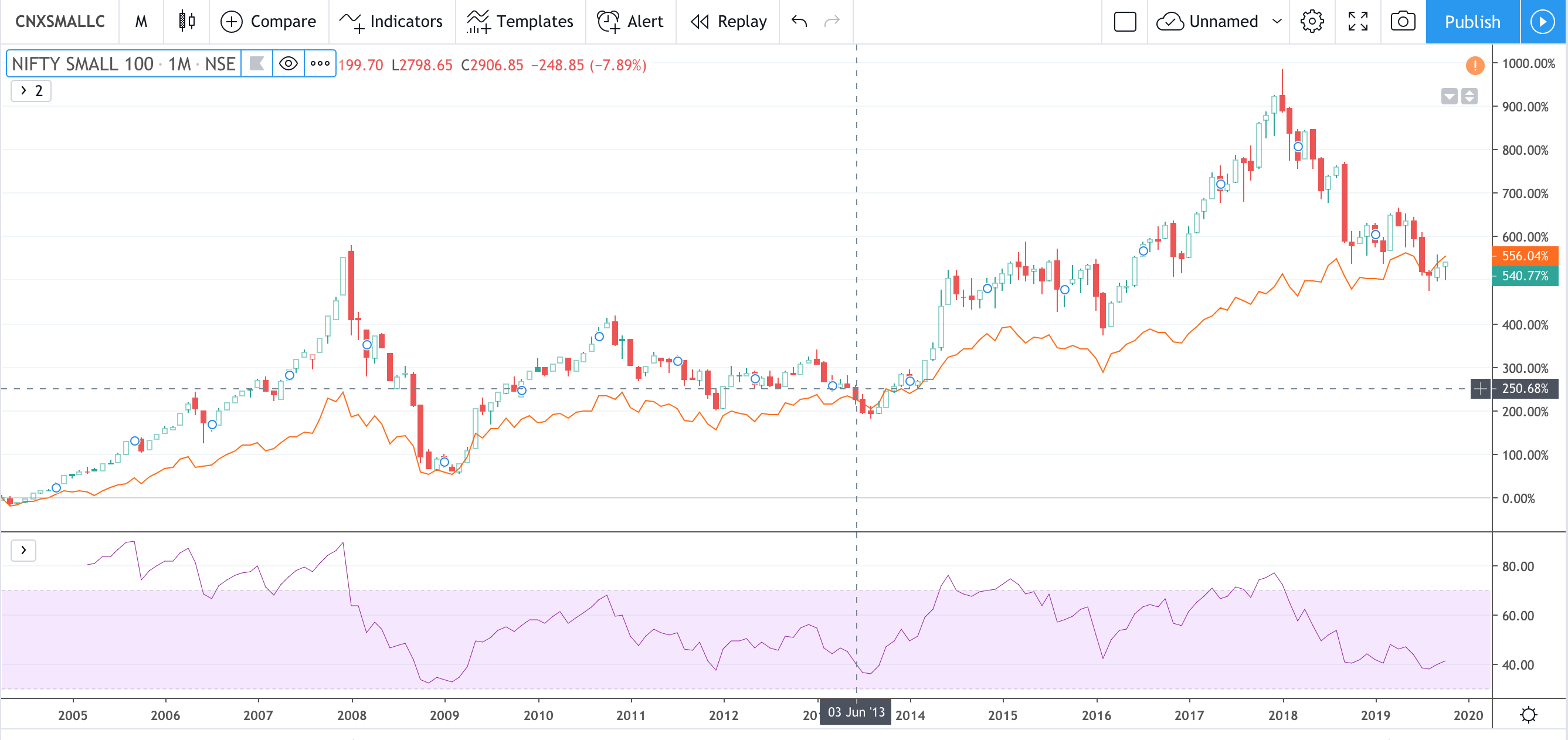
CNXSmallCap Vs Nifty50
Jan2018:Small cap kept rising but Nifty was correcting. This started the 1.5 yr painful smallcap correction. Now this has reversed.
Now: Smallcap below Nifty50. Historically indicates start of bull run in small caps giving 3x to 7x returns for smallcaps.
I believe time of the small caps have come. I have rejigged my portfolio now doing SIPs on a bunch of small caps where I see some value & growth
2 Likes
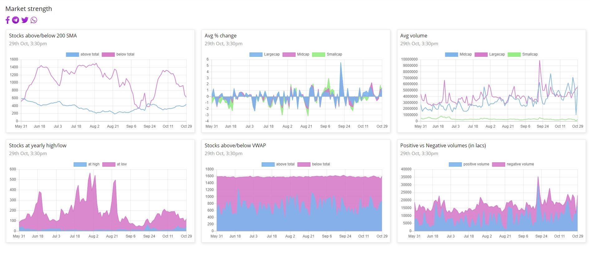
After couple of quarters, the broader market is showing some strength. Whether it will revert to mean or lead to a breakout, your guess is as good as mine.
4 Likes
Kei ,accumulation complete phase e starting
should trend now
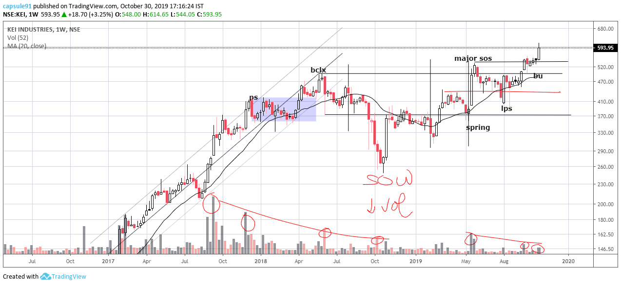
the problem here is with the point and figure count, since that SOW show of weakness, is kind of a shakeout, i dont not know if i should take it into consideration while counting the base, if i dont, then one should be very much on the look out for climactic volumes in this scrip around 600…
disclaimer… took tracking positions today, will add on dips
1 Like
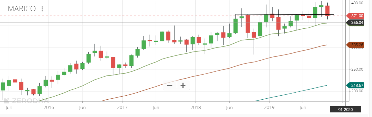
Marico (Monthly) - Re-testing support that’s over a year old in consolidation. Yesterday’s selloff felt like an over-reaction, so took a position to study the business
4 Likes
Hi
Please could you explain the terminology in your analysis. I don’t understand chart analysis very well. Thanks.
Rgds
1 Like
@phreakv6
marico seems like distribution to me…
too early to comment, but i do not see any absorption of supply here, yet…
fairchem…reaccumulation
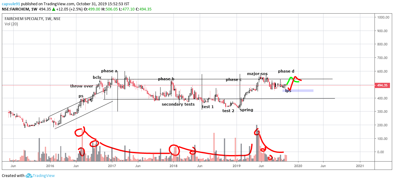
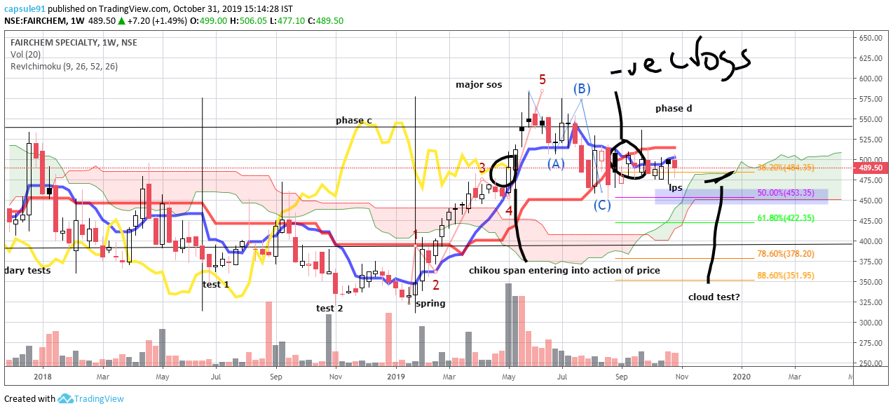
seems like last point of support going on here, before it starts trending, price correction most likely over, ichimoku chart hints at time correction still left…
disclaimer… no positions in any
3 Likes
it would be better if u can refer to this article…
regards…
8 Likes
torrent pharma…
monthly chart…
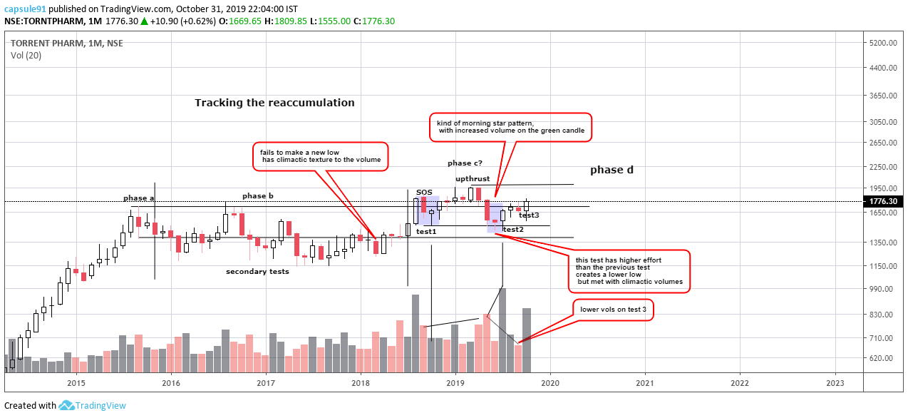
still in the trading range, what looks like is phase c action, 2 tests of supply after a show Of strength last year which took out the top resistance of the trading range,
the second test was very interesting giving rise to a kind of morning star pattern, the middle candle was not that star , rather a gravestone doji, which is a reversal candle if found near support…
i like that the second test was met with climactic quality, the volumes increased compared to last year’s test, implying the weaker hands who had taken positions in the stock last year, have ben capitulated for the second time…
expecting a spring action which leads us to a phase d , where the previous upthrust high should be broken out to form the major sign of strength {SOS}and retested for a last point of support formation…
this scrip has been a favourites of the institutions, as evidenced by the relative strength curve…
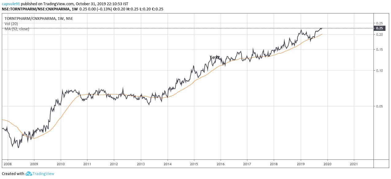
never once dipped below the average, thoughout last 10years, and specially since 2016 when it went into a range…
a definite show of price support by the institutions/strong , i wont mind the valuations the stock continues to trade in, may be , the returns will be less, but should definitely reduce beta if we are going to have a volatile times…
disclaimer… continue to hold and add in sip
also have to add, pharma is not a sector where the institutional money is flowing in in this consolidation of the index,
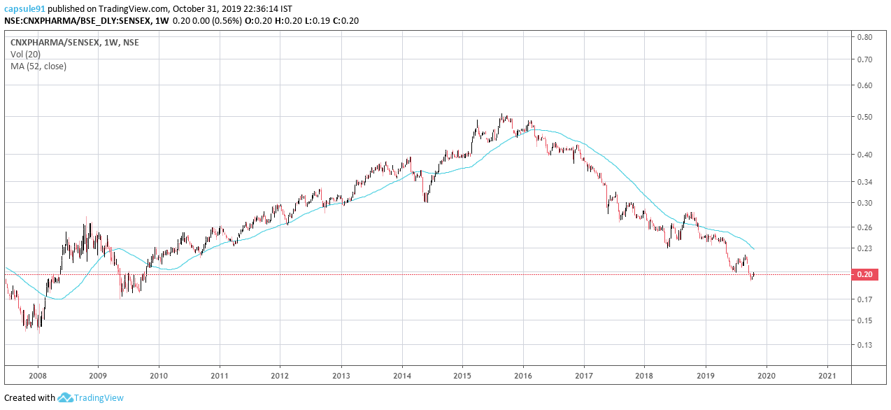
the relative strength curve is in a downtrend…
2 Likes
akzo nobel
reaccumulation
phase c complete, in phase d, showing major sign of strength at the back of ongoing buyback
should cool down to form the last point of support post JAK [jump across creek(resistance, long term)]…

using weiss waves, give a better picture regarding, lack of supply post shakeout in phase b
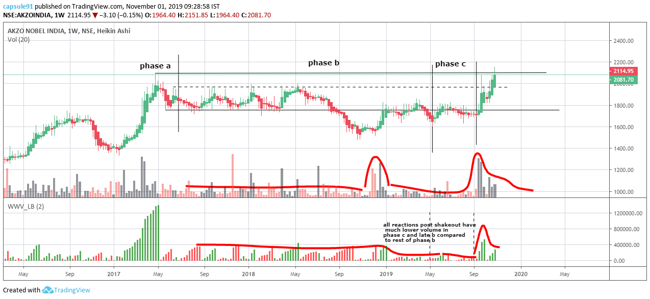
last 5 years and 8 quarters, growth is very lukewarm in this scrip…
the scrip has gained momentum on buy back news since early this year,
gained leadership compared to sensex only recently…
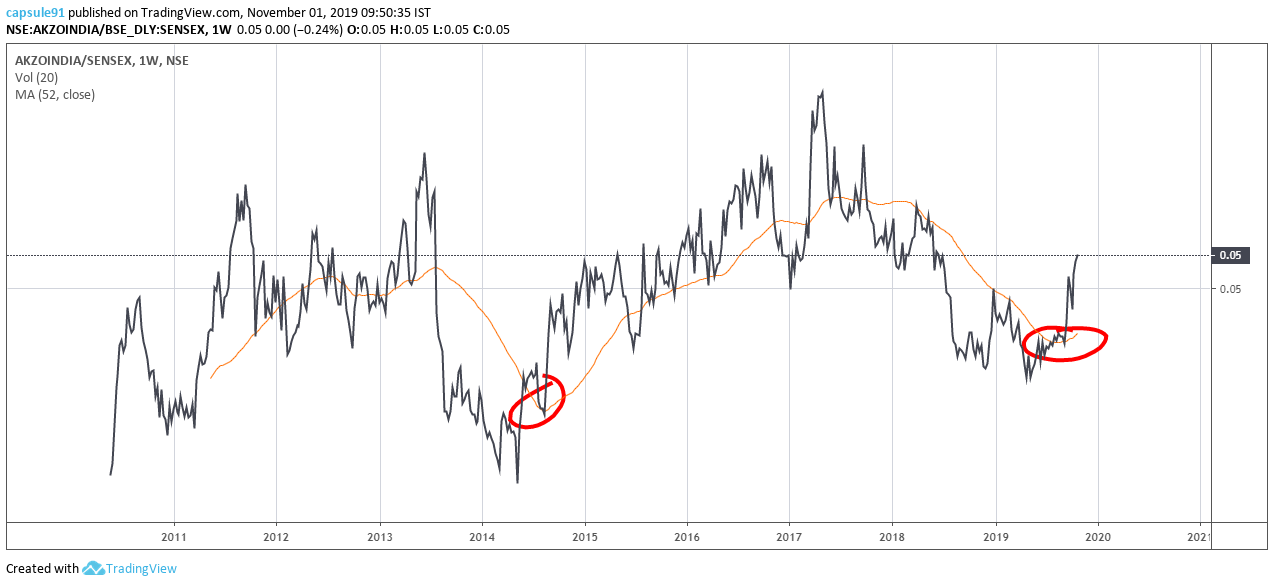
a comparison with kansai nerolac (which is also in the process of base formation i believe)
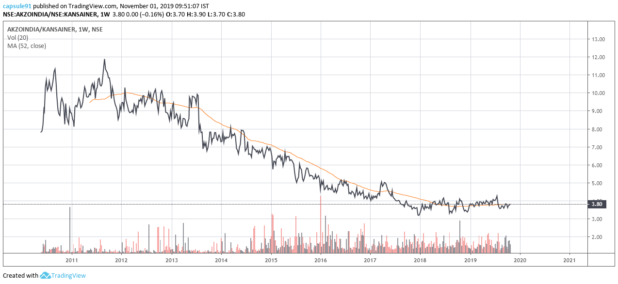
akzo has been historically much weaker…
ideally, nerolac is a better choice looking back…
but somehow i like the base formation better here, may be due to lack of experience in handling bases like kansai
disclaimer… invested in kansai, no positions yet in akzo would consider at lps
2 Likes
This doesn’t seem to be the classical tri star as generally it’s a series of three dojis. However it does appear to be some sort of temporary pause in the prevailing trend.
2 Likes