
Chart below shows Nifty 50 PE and PB from 1999 until today. It shows that until 2008, PE and PB moved by same margin but since 2009 PE has gone much more than PB. If market is expensive in terms of PE, it should be expensive in terms of PB as well but that is not the case.
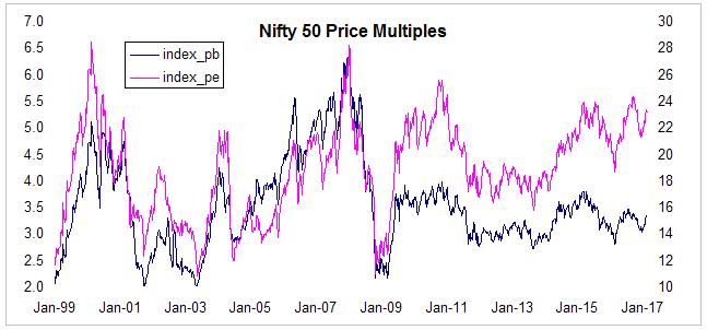
Source: NSE
Similarly, I have also included a Price to Dividend chart along with the Price to Earning chart. Price to Dividend is just the reciprocal of dividend yield. Even here, market does not appear to be expensive in terms of dividend yield. Two ratios started diverging since 2009.
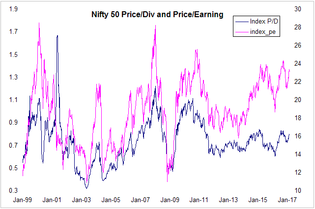
Source: NSE
In both cases P/B and dividend yield are not even close to the bubble high levels in 2008. These ratios are even lower than highs of 2010-11. P/E on the other hand has drifted upwards. This could be because of how NSE calculates PE ratios based on stanadalone yearend numbers rather than consolidated TTM numbers.
current P/B and Dividend yield are close to their long term average indicating market is fairly valued. Even if you take a look at simple trend vs actual analysis market looks fairly valued (grey zone).
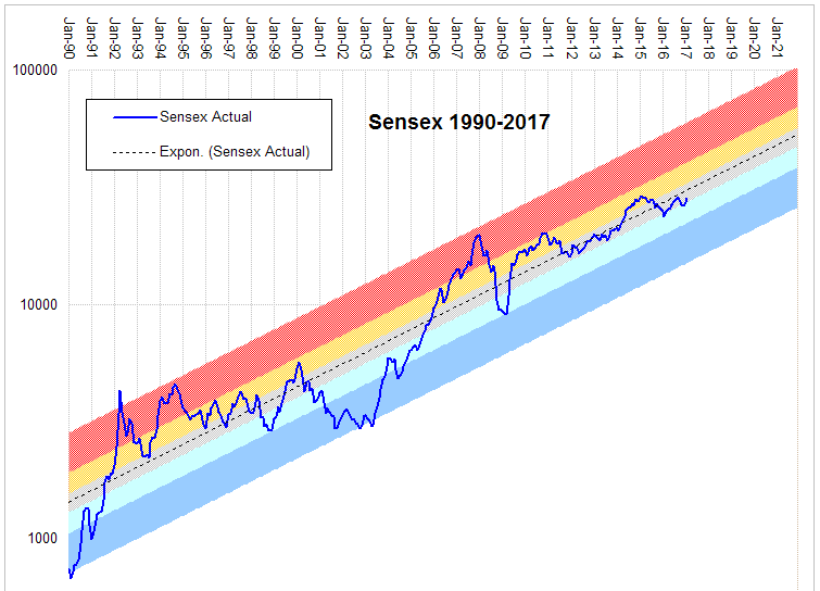
Source: BSE