Hello everyone!
Hope everyone is healthy and safe.
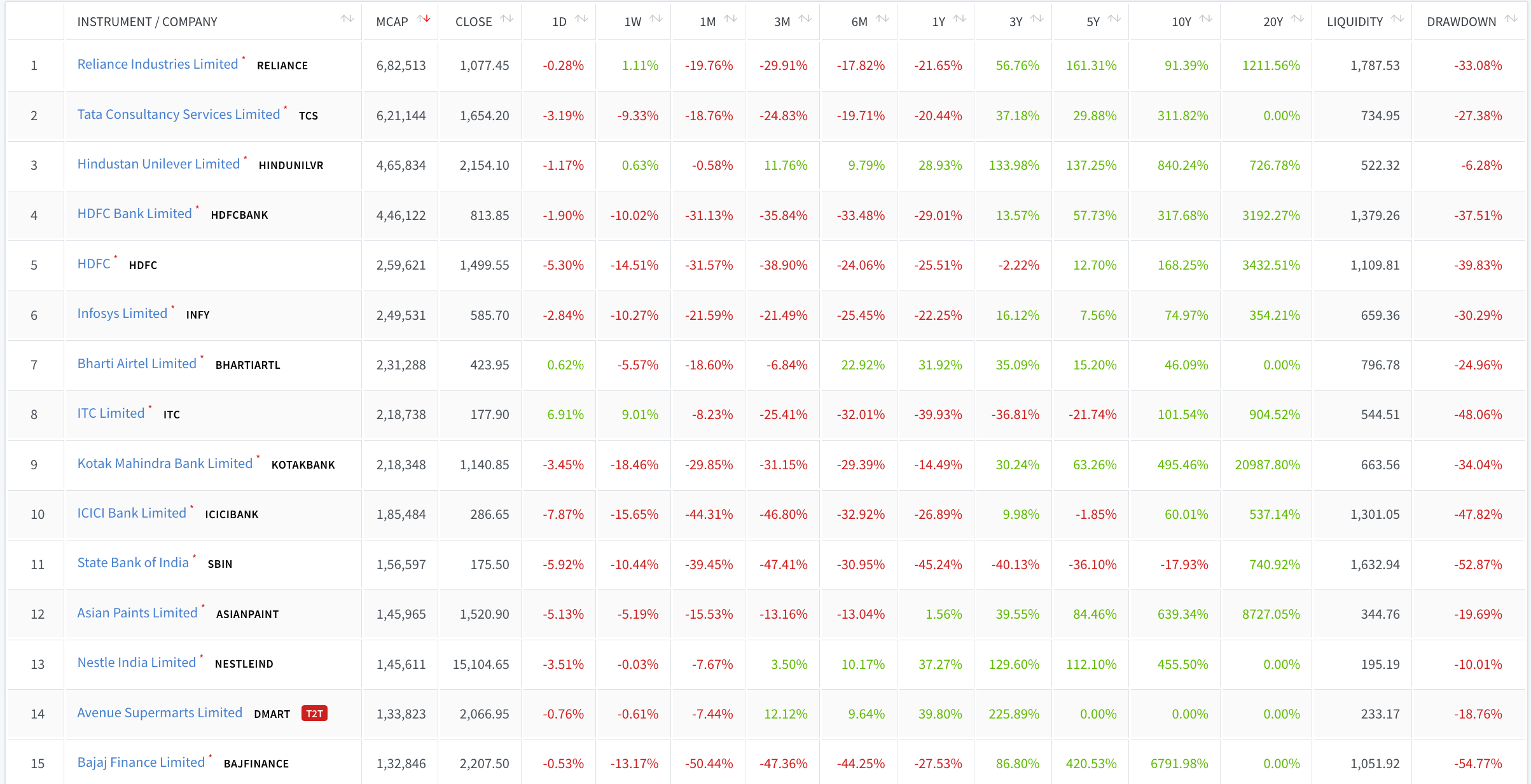
I am sharing a tool that I use to visualize stocks and their returns over multiple timeframes along with other information like market caps and drawdowns on a single page like this -
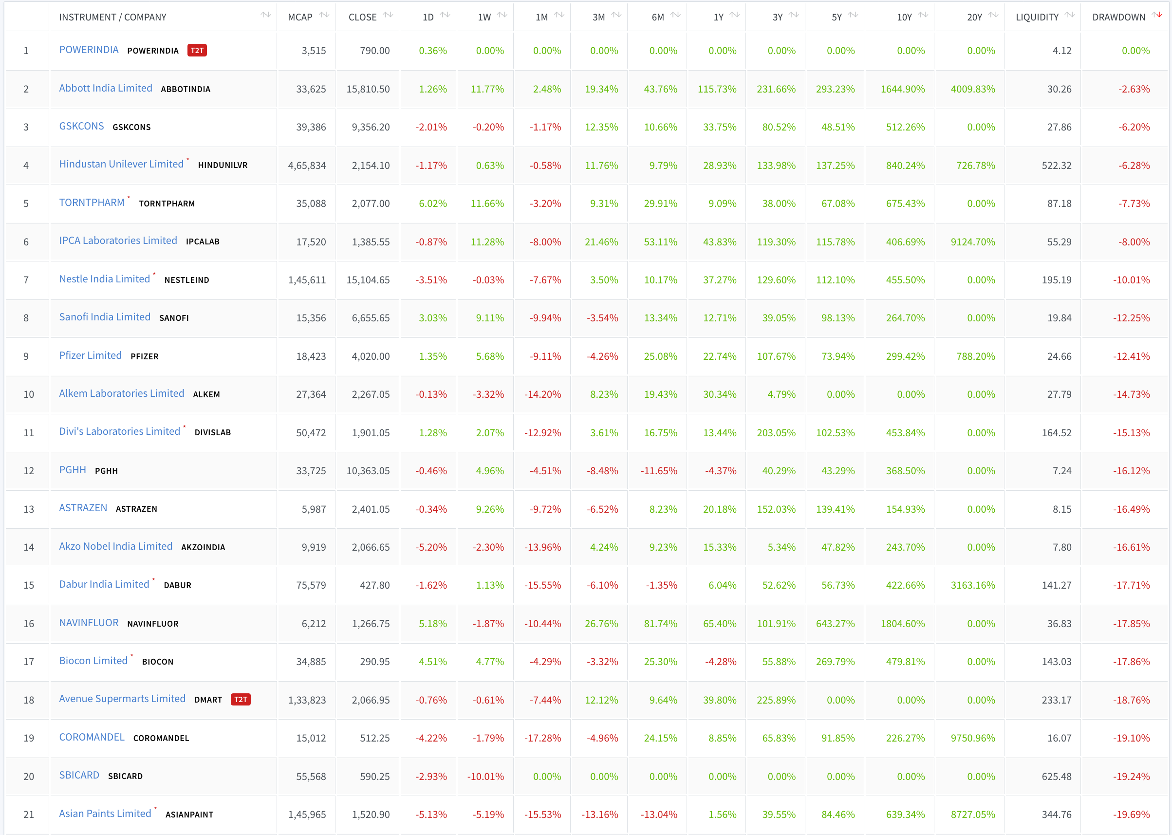
You can use it to quickly view the list of stocks with least drawdowns. Unsurprisingly, Pharma and FMCG stocks are having least drawdowns.
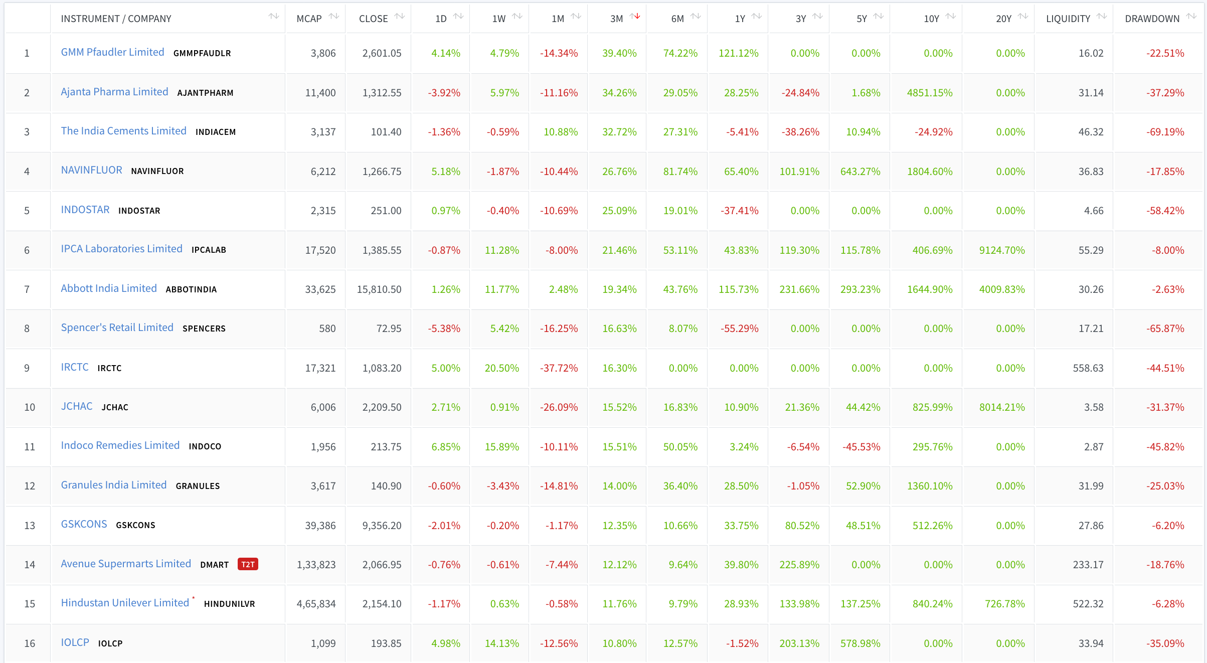
Or, to view the list of stocks with highest returns during last 3 months.
Or, last 10 years.

Or any other period.
I view this data using my custom application but you can use Excel or any other spreadsheet program to view the attached file.
nse_return_matrix-stocks-2020-04-03.xlxs (75.7 KB)
The data in the sheet is using latest prices as of 03-Apr-2020 and consists of liquid instruments only (i.e instruments with average turnover over last 50 days above 1 crore).
The data is adjusted for bonus shares, stock splits and rights issues. However, it is not adjusted for demergers.