
I have done a PRELIMINARY analysis on the key financials and valuation multiples of the top 20 paper companies that are listed today and the same is presented below. The returns are calculated until 3rd Jan 2022. I understand that this data is slightly dated, I sincerely hope that there are several other things in this post that forum members may find useful. If not, feel free to report to mods so that this post is removed
Before delving into the numbers, lets start with a story.
The year is 2002. In Mumbai a reputed consultancy firm - ManecKji & Company released a report on the extremely rosy prospects of the paper industry due to increasing literacy, increasing office documentation needs, higher demand due to urbanization, high GDP growth, etc…etc and even showed how the (proverbial) current per capita consumption in India is so low when compared to that of developed countries. In Kolkata, the smart people at the BhattaCharya Group also came to the same conclusions. Another consulting firm in Delhi- Badrinath & Company in Delhi arrived at the same inference. Amazingly, all these firms arrived at their conclusions independently. Thereafter, various brokers put bullish equity research reports highlighting this great compounding opportunity and pitched it to their clients. One such client (who was a MBA) was impressed with the thorough research and decided to put a significant chunk of his money in this superb opportunity but his old uncle, a seasoned stock market veteran, convinced him otherwise and ultimately the client, grudgingly, put only a reasonable sum of money in the top stocks in the sector. However his MBA training convinced him that this was a compounding opportunity and he decided that he will buy and forget about these stocks.
Many years passed and ultimately one fine day in 2022, the client calls his broker and asks him what return did the aforesaid investment generate. The broker does the calculation and proudly informs the client that return was 15% CAGR. The client was ecstatic and promises the broker to celebrate this return with a fancy Scotch whisky with him. He goes to a premium liquor shop that was owned by his friend and decides to buy a Macallan 15 triple cask matured (and not the horrendous ‘Macallan Quest’ usually sold at Duty-Free outlets). The friend asks the client the reason for the celebration and the client proudly announces that because of his research he invested and had the conviction to hold onto an opportunity that generated a 15% CAGR from 2001 onwards. The friend checks the returns made on his passive/low cost mutual funds that were also invested since 2001 and informs the client that his funds returned around 16-17% CAGR over the same period. The client, crestfallen and ego bruised, buys a McDowells instead of the Macallan and decides to go home and analyze the returns in detail.
Luckily, like most MBAs, the client was an Microsoft Excel monkey (the only thing MBAs are good at, apart from acting like experts) and he looked at the current top 20 companies and downloaded the data until from 2001 until 2022. He realized (with great sadness) that his friend was correct on the returns earned by him on the index funds. The Nifty TRI earned between 16-17% CAGR over the same period. He also observed that in 2001 the P/B of most companies was less than 0.5 and by the year 2005 it moved to 1. If he purchased the shares in 2005 his return was would be only 11%. Then, upon observing the market cap over the years he saw that the general direction of the stock prices of almost all the paper companies was the same. Furthermore if one paid at the top of the cycle he would have to wait for many years to recover even his cost price. Thereafter he calculated the ROIC for these companies. Over their history most of these companies earned below/close to their cost of capital! Thus, despite the growing consumption narrative, the entire sector behaved like a cyclical and earned below/close to their cost of capital. He was shocked how the consultancy firms, who hired MBAs in great numbers, got it wrong.
Like most MBAs, the client used only P/E, EV/EBITDA and the P/B for doing his valuation and disliked DCFs as it made him work too much. He observed that his favourite two metrics P/E and EV/EBITDA did not even give consistent indicators as to whether a company is cheap or not i.e. When the stock prices were beaten down these multiples ought to be at near their lows as well and vice versa but this was not so. He also observed that, while P/B was directionally consistent, the P/B multiple is extremely volatile. He was at a fix on what to do. He thought of doing a DCF, but wanted an easier way out. Then he vaguely remembered from his MBA days that there also another ratio called Enterprise Value / Invested Capital (he remembered it because the dean was sitting in the class that day and he had to be half-alert atleast!). He looked up the definition online since he had sold his MBA textbooks to the juniors after passing his exams. Unfortunately, no website/service calculates this ratio by default and the Client cursing his luck he calculated the metric for all the years starting from 2002 until 2022 but being the lazy MBA he calculated only 1 data point per year. Upon calculating the numbers, he observed that EV/Inv Cap was the best metric to track. Furthermore, the current time (as at 3rd Jan 2022) was neither the best time nor the worst time to buy a paper stock. Half the stocks in the list were over their long term median while the other half were around their median value. Thus the margin of safety that could be obtained by getting a stock at a lower multiple was not there and ultimately one would have to take some kind of a view on the earnings growth and especially that in the medium terms earnings and its sustainability.
Coincidentally his old uncle was around to visit him. The client, confident with his (so-called) detailed analysis, started giving his ‘gyan’ on the paper industry to his uncle. To his great chagrin, his uncle told him that this data was quite useful but when the industry is not available at cheap multiples you would need to get a better understanding of the industry and would have to consider other factors including (but limited to) comparison of EBITDA/ton of Indian manufacturers against each other and also against International manufacturers (Indonesian and Chinese); recent capex expansions as well as future announcements by the Indian, Indonesian and Chinese companies; historical trend of international pulp prices and their outlook; import data (qty & price) of pulp and finished paper; management commentary on conf calls; and thereafter if the sector STILL remained interesting then segregate the companies having integrated pulping capability vs those who do not and ALSO see corporate governance standards of the companies.
Being used to giving targets based on medium term history of earnings and multiples, the Client felt he already has gone above and beyond his usual work and groaned inwardly at the further amount of work to be done. This was becoming like a Netflix show which you do not like but still are watching because you already spent so much time on it.
TO BE CONTINUED…… HOPEFULLY
NOTE: Feel free to replace the word MBA with CFA. Also feel free to change paper industry to any other industry with low entry barriers ![]()
The above story, essentially, conveys the (BASIC) conclusions that are presented below
WHAT HAVE BEEN THE STOCK RETURNS GENERATED BY THE PAPER COMPANIES
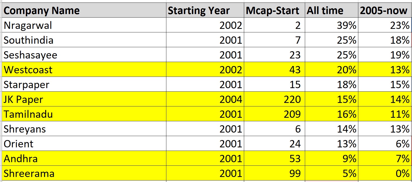
The table above lists the companies that were in existence & listed prior to 2004. It calculates the returns from the 2001 (or later whenever applicable) until 3rd Jan 2022 on a CAGR basis. The returns calculated consider stock returns, dividends & buybacks (less stock issuances & warrants). The 5 biggest companies (without Ballarpur) are highlighted in yellow.
The median return is 15%. As you can see in the table above, the highest returns were given by NR Agarwal at 39% and South India at 25% but both these companies were microcaps back then with their market caps being Rs 2 crore and Rs 7 crore respectively and it unlikely that anyone would have allotted a large portion of their capital to them at that time and not even the promoters would have dreamed that their companies would have these kind of returns. The biggest companies 5 companies (without Ballarpur) are highlighted in yellow. They generated a return ranging from 5% to 20% with the same median of 15% and lets assume that the MBA was a ‘GYANI’ and managed to avoid Ballarpur (which was amongst the top companies at that time) and earned the median of 15%. When seen in isolation, a 15% CAGR returns seems decent.
However, the returns are not so great vis-à-vis the Index or if the starting period is changed to 2005
The Nifty TRI gave a return of 16-17% if invested in the year 2001. Hence the median return of paper companies was below that of the index!
Now you can argue that the MBA was a ‘PARAMGYANI’ and managed to identify the top 3 paper companies (NR Agarwal, Southindia, Seshasayee) and ALSO managed to put in substantial sums in them and thereby beat the index. But I have not come across such paramgyanis in real life. Having said that, just like NSE’s Himalayan Yogi, I have been graced with their ‘digital’ presence through the screenshots of their ‘purported’ profit that they have posted on twitter. Interestingly, even these paramgyanis only showoff the PERCENTAGE return of a particular stock and fail to mention how much of this % return of a particular stock has translated to the portfolio level ![]()
Secondly and very importantly, the period between 2001-2004 was one when paper companies traded at cheap valuations. South India and NR Agarwal (the best performers in the table above) traded at a P/B less than 0.3! By the year 2005, most of the companies were trading near P/B of 1. So, if we see returns from 2005 onwards, the median return fall to 13% and for the biggest 5 companies (without Ballarpur) it falls to an even more pedestrian 11%. These returns are also below the Nifty TRI which gave a return of 14-15% if invested in this period
Returns of all paper Companies
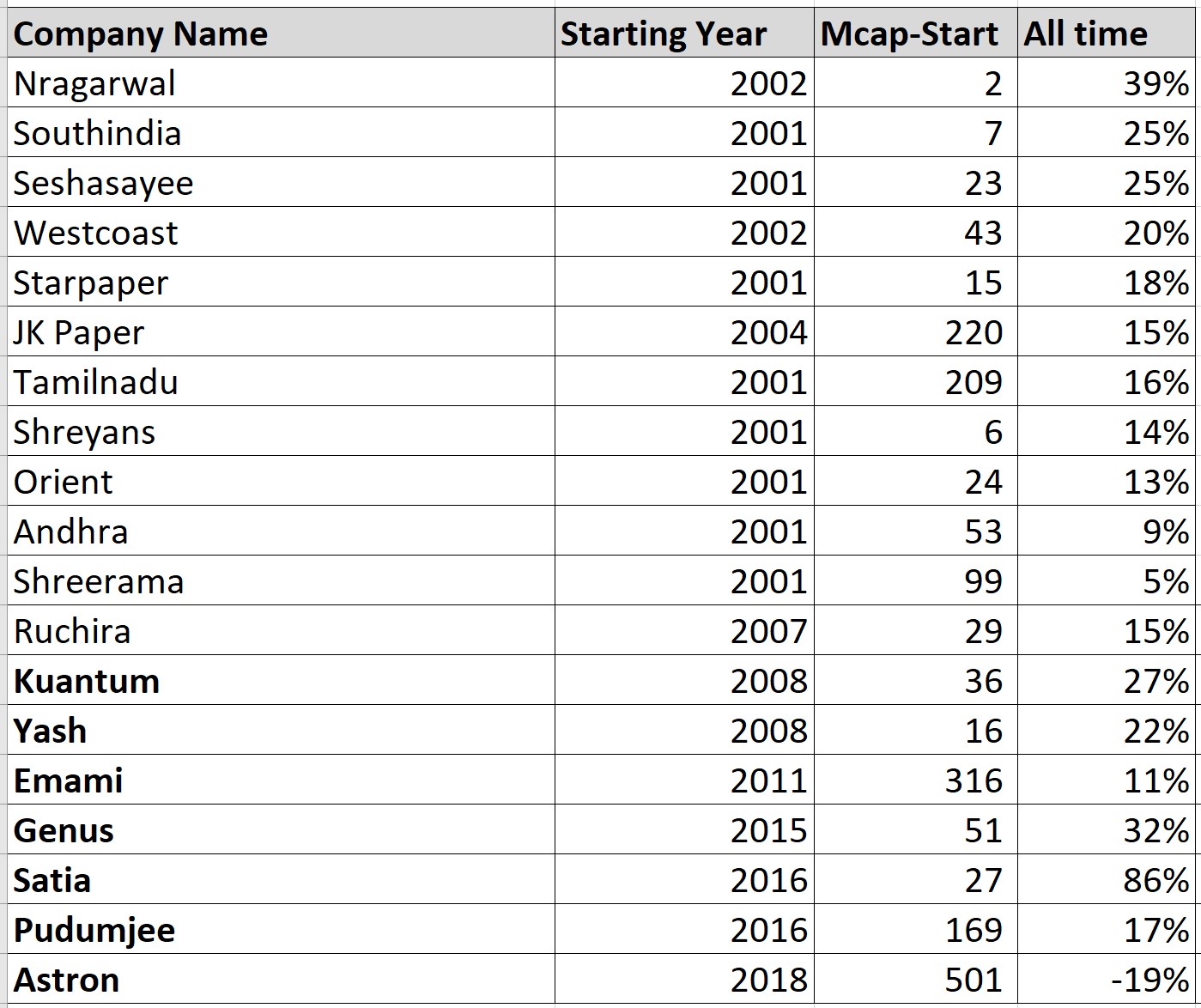
The table above gives the CAGR return for all the paper companies. The companies at the bottom of the above list (that are shown in bold) are the ones listed AFTER 2007. While their returns maybe better they have not been listed for as many years and hence one cannot simply extrapolate their returns
HOW DOES THE MARKET CAP OF PAPER COMPANIES MOVED FROM 2001 UNTIL NOW

The chart above shows how the market cap of JK Paper, Westcoast, and Tamilnadunewsprint has moved over the years : 1) There is a steady rise in market cap from 2001 until 2006. 2) Stagnation from 2006 until 2008. 3) A drop in 2009 followed by rise until 2011 4) Decline/stagnation until 2013 4) Spectacular rise until 2018 5) Drop due to COVID in 2020 followed by great recovery until now
Now one can argue that the above analysis has been done by taking only 1 data point/year and hence it will not provide a full picture. While this observation is correct, the BASIC profile/GENERAL direction does not change
The above profile tells a few things:
• Surprisingly (maybe not surprisingly for experienced investors), the above profile/general direction matches for ALMOST all other companies in this sector. I checked each company. Again, the keyword is BASIC PROFILE AND GENERAL DIRECTION. Thus, even for not-so-efficient operators, the BASIC profile/general direction looks similar. Naturally the variations are more pronounced in the poorly operated companies/highly leveraged companies.
• If we pay too much at the top of the cycle it will be a long time till we recover. For e.g. If you entered the market in 2006, you would have wait 4 years (until 2010) to even recover your purchase price. Same situation applies from 2011 until 2015. If you entered into 2018 (when there were bullish reports on paper companies), you have still not recovered in most of the companies or have earned sub-par returns compared to the index.
• If we have some basic sense of where the industry is in terms of its market cycle we can even ride the same stock in different time periods to extract good returns. However, it is easier said than done. One has to keep a close watch on valuations AND an eagle eye on the operational metrics of the industry AND competitive behaviour of the companies (domestic and international). Even then we can never time the top and bottom. But if we get it roughly right it is likely to be enough.
VALUATION MULTIPLES
Before seeing the valuation multiples for the companies in this sector, we must see which valuation metric is most useful. For cyclical industries all experienced market participants know that earnings based metrics such as P/E or EV/EBITDA are not the best metrics to track and metrics based on book value/assets are much better. So is that the case even for the paper industry?
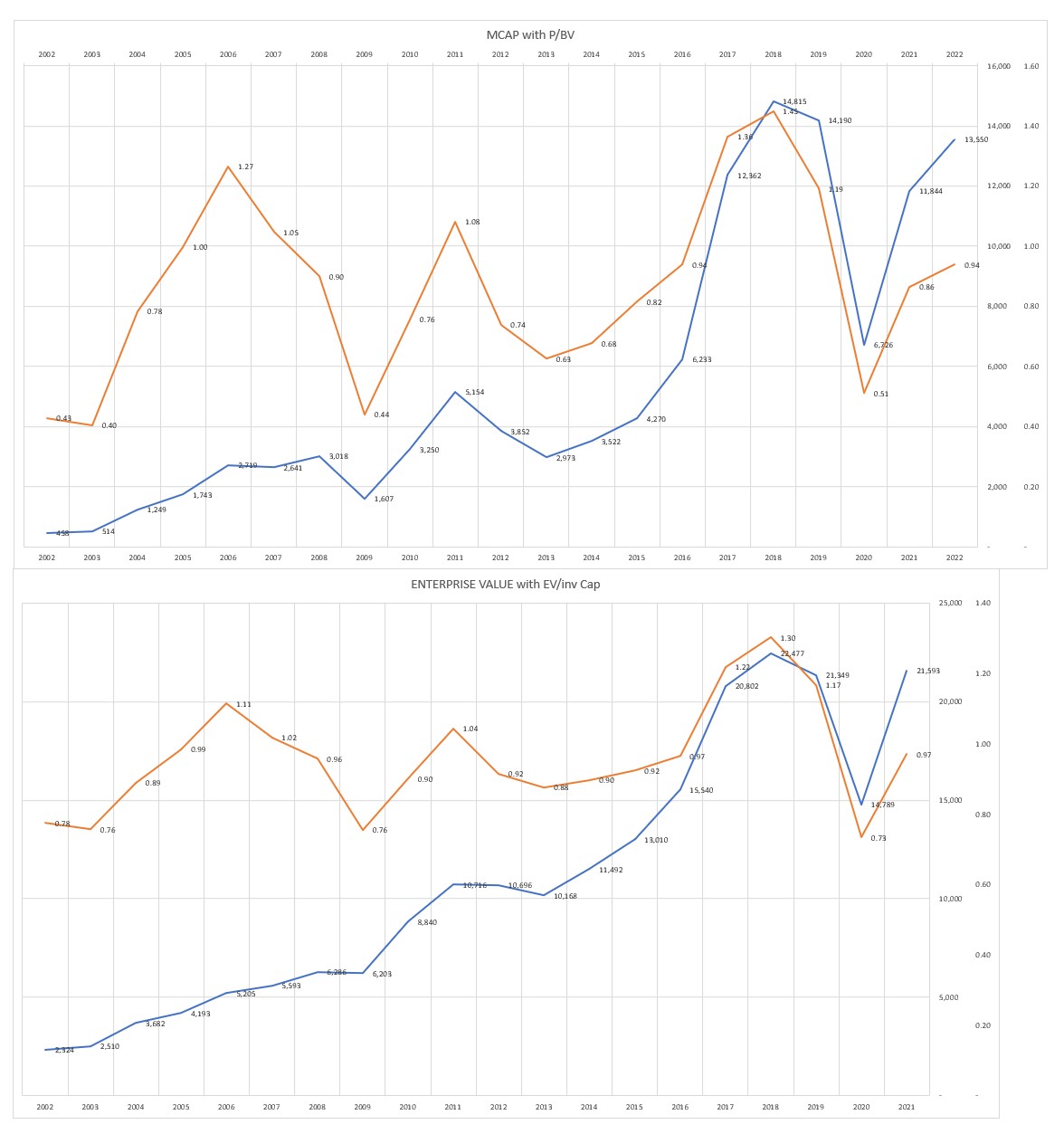
The image above charts P/BV multiple with Market Cap and EV/Inv Capital multiple with Enterprise Value. The orange line indicates the multiple (calculated on LTM basis) and blue line indicates market cap/enterprise value. We can see both these metrics mirror the movement of the market i.e. when Market Cap/Enterprise Value falls then the corresponding metric also fall. Thus, these metrics give proper directional indication of how the market cap of the stock has changed as compared to its past history.
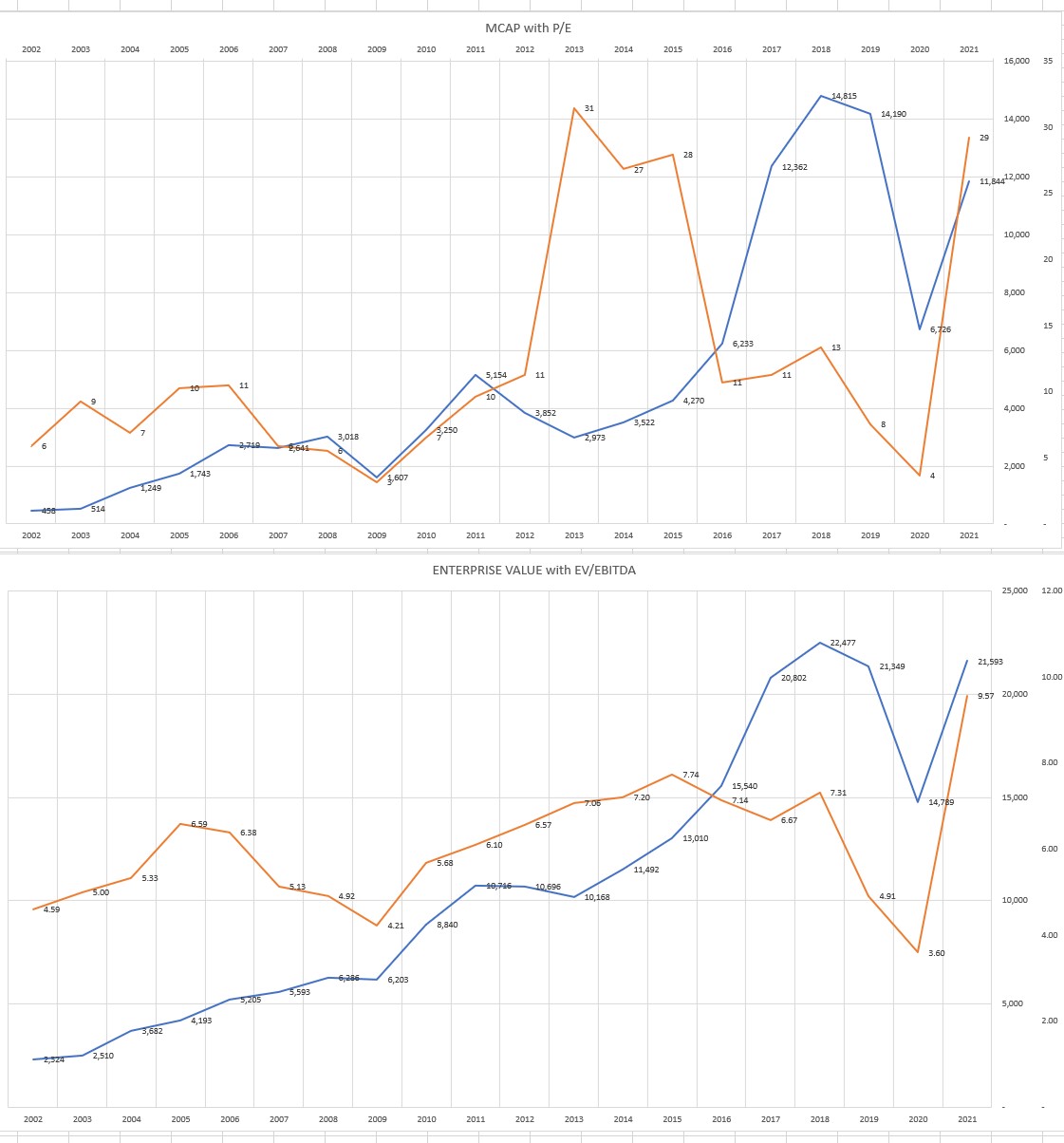
Now observe the second image. It charts P/E with Market Cap and EV/EBITDA with Enterprise Value. Again, the orange line indicates the multiple and blue line indicates market cap/enterprise value. We observe that the P/E multiple diverges significantly at crucial time periods. For e.g. The years 2014, 2014, 2015 were a good time to buy paper stocks as but the P/E was the highest and conversely in the 2018 and 2019 the stocks were at highs but the P/E was NOWHERE close to its highs.
Now lets look at EV/EBITDA. This metric is definitely much better than P/E and prima facie does look consistent for most years. However if we look closely we will see that the period from 2011 to 2014, which was a good time to buy paper stocks, the EV/EBITDA multiples kept rising despite the fact that the enterprise value was fairly constant and for the years 2017 and 2018, when enterprise value was very high the multiple dropped instead of rising.
Hence both the earnings based metrics give directionally inconsistent indications.
Now that we know P/BV and EV/Inv Cap are better metrics which one to use. According to me the EV/Inv Cap is a much better metric to use because most of the companies in this sector use modest to large amounts of debt for their business and these debt levels not only change across companies but they also change across time even for the same company and that makes comparisons difficult if we use P/BV.
Secondly, as you can see P/BV is much more volatile than EV/Inv Cap. For e.g. the P/BV fell from 0.9 in 2008 to 0.44 (a drop of around 50%) while the EV/Inv Cap fell from 0.96 to 0.76 (a drop of 21%) in the same period. Looking at the P/BV we may be tempted to invested considering its drastic fall but this signal may not be correct. For e.g. If a company is highly leveraged, in bad times, it could be possible that the market is smart enough to recognize the increased risk to the equity shareholders and thereby it assigned a low value to the equity and hence the company may not be necessarily cheap just because the P/BV has become cheap.
Thirdly, the denominator in a multiple is supposed to provide us with a parameter that can be used to compare against the market cap/enterprise value and thereby decide whether a company is cheap/expensive vis-à-vis its competitors and its own past history. However, how CONSISTENT is that parameter in its explanatory power vis-à-vis the market cap/enterprise value ought to be checked. Hence, to understand how much the book value tells us about a companies market cap and whether it is CONSISTENT across the years, I did a regression across companies for each year (from 2003 till 2021) for Book Value against Market cap. The same exercise was done for Invested Capital against Enterprise Value. The regression shows the clearly shows that the explanatory power of book value over the market cap is not very consistent as it ranges from 45% to 98%. In contrast the explanatory power of invested capital over enterprise value is much more consistent.

I also did a regression of the earnings based metrics. Even here EBITDA has higher explanatory power over Enterprise Value as compared to Net Profit over Market Cap. Now, if we observe the above table you might tell me that EBITDA over Enterprise Value has higher R2 square than Book Value over Market cap and hence based on regression this should be a better metric. However, as we saw earlier the EV/EBTIDA does not give directionally consistent indications.
Thus, imho, EV/Inv Cap is a better metric to track for paper companies as compared to the other commonly used metrics. The bad news is that none of the websites provide EV/Inv Cap by default. The good news: It is extremely easy to calculate. The numerator being the Enterprise Value is given by all websites and it is the denominator which needs to be calculated. The ratio is defined as:
[Market Value of (Equity + Debt - Cash + Minority Interest + Pref Capital)] / [Book Value of (Equity + Debt - Cash + Minority Interest + Pref Capital)]
SIDE NOTE: It is pertinent to point out that there is a technical flaw in the calculation of Enterprise Value - the numerator used in the calculation of EV/Inv Cap and EV/EBITDA by all websites/services and even by me. All of them, including me, have taken a shortcut by assuming Book value of debt = Market value of debt. This is NOT correct and consequently the ratios calculated above appear more consistent & smooth then they ideally would be. Having said that, even after taking market value of debt the resultant enterprise value would still be less volatile than market cap.
Why didn’t I calculate market value of debt? Because the computational requirements of calculating market value of debt (since its almost never listed) is very high as we would have to compute the cost of capital and debt maturity profile for each company every single year (which is given only in the ARs) and then do a NPV thereby making the entire exercise an extremely time consuming process.
Also, I have taken only 1 data point per year and should take more. However, the idea in this section is see which metric is most useful and for this limited purpose this will not bite us RIGHT NOW but it will do so in the next section as you shall soon see
So what do the multiples tell us?
The table below gives the EV/Inv Cap of 20 paper companies starting from 2001 (when applicable) until 03/01/2022. I have colour coded the cells to indicate how cheap/expensive a company’s multiple as compared to its OWN HISTORY. Darker shades of red indicates that the company’s multiple is more expensive as compared to its past and lighter shades indicate it is cheaper. For e.g. JK Paper’s current multiple (as at 03/01/22) is 1.35 which is more expensive than it was for all years except for 2018. In contrast, Westcoast’s multiple is 0.94, which is its median value, and it is neither cheap nor expensive
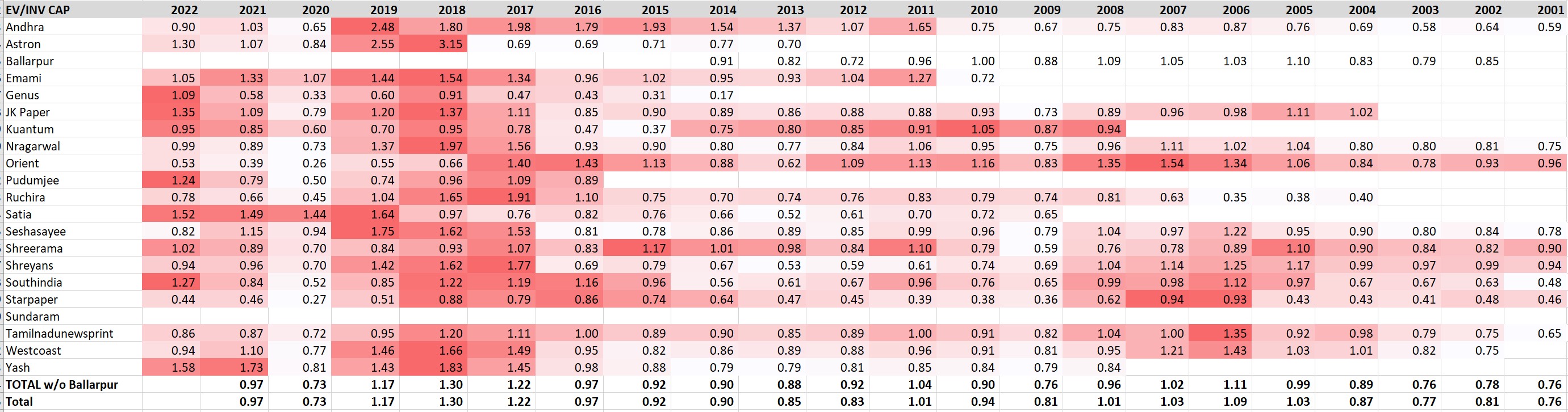
We can also read the table in one more way. When most of companies have darker shades of red then the sector is trading at more expensive multiples compared to history and when most of the companies have lighter shades of red then the sector is trading at cheaper multiples. For e.g. In the year 2018, there are darker shades of red in most of the companies and hence the sector was more expensive (brokers, expectedly, still put out bullish reports by giving a reason that the earnings growth will be strong). For the year 2022 (as at 03/01/22), it’s a mixed bag. As per the multiples, the current time is neither the best time nor the worst time to buy a paper stock. Half the stocks in the list were over their long term median while the other half were around their median value. Thus the margin of safety that could be obtained by getting a stock at a lower multiple is not there and ultimately one would have to take some kind of a view on the industry’s medium terms earnings and its sustainability.
Look for your own paper company in the chart above and see how it compares to its peers across time
CAVEAT: Now, remember that I took only 1 data point per year. This is where this lack of information (or to be honest: my laziness) bites us. We ought to calculate at least 12 data points/year. Hence, while the information presented in the table definitely has some value, one cannot CONFIDENTLY say that a stock (or the sector) is trading at cheap/expensive multiples as per its past history. In any case, multiples are only one of the methods of valuations and should not be the sole method.
RETURN ON CAPITAL
In cyclical industries the Profitability Margins (such as EBITDA/EBIT margins) are volatile as the selling price can vary a lot while the costs, which are usually dependent on the quantity sold, do not vary as much. In an ideal scenario a ROC could be broken down into margin x asset turnover, but due to the volatility of the profit margin we directly see the ROIC
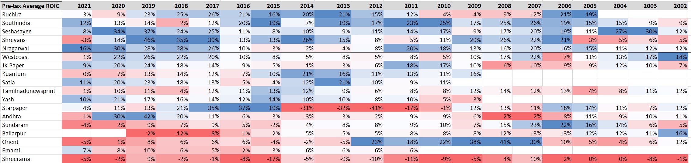
The charts above captures the pretax ROIC (calculated on average invested capital basis) from 2002 until 2021. I have also colour coded ROIC for each year. Thus, in a particular year, the highest ROIC company will have the colour dark blue, medium would be white, and the lowest would be dark red. Such colour coding allows us to easily see how consistent was the ROIC of the company as compared to its peers each year across time. Then I segregated the data into three divisions. The first one has a median pretax ROIC of more than 15%, the second one has ROIC above 10% and the third one has below 10%. I did not consider the year 2021 for calculating the median being the COVID-19 year. Thus the first division will have more blues, the second will have lighter blues, white and some reds, the third division will have whites and various shades of reds. Kindly note after making the three divisions, within each division I arranged companies having more blues at the top
You will observe that Ruchira, Southindia, Seshasayee, Shreyans and Nrgarwal were the best operators. However you will also observe that most of these companies are the smaller market cap companies. In this context, the ROICs of Westcoast and JK Paper are impressive since they are the bigger companies in the list. At the other end of the spectrum Andhra, Sundaram, Ballarpur, Orient, Emami and Shreerama were the worst operators
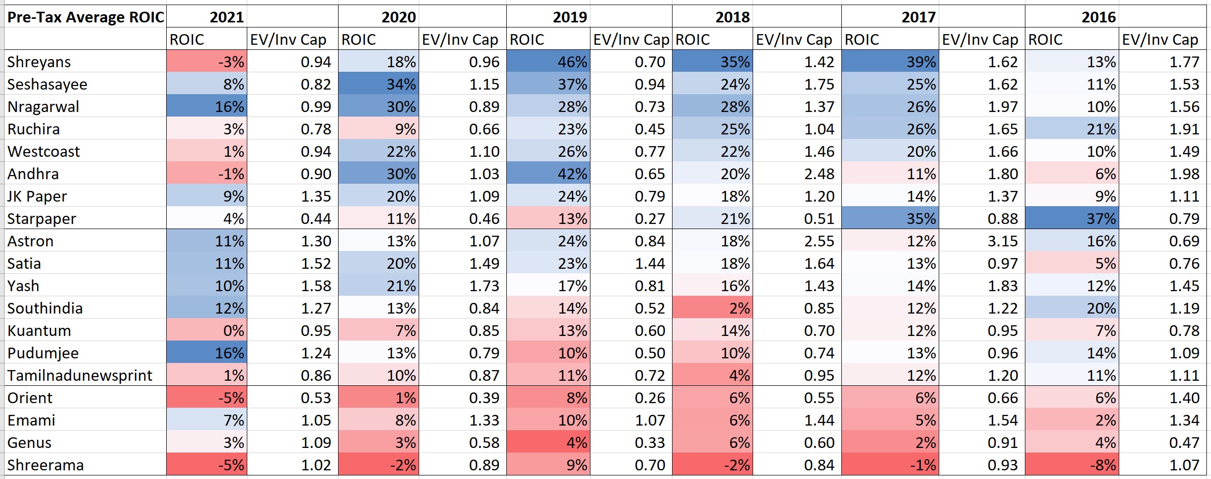
However, 20 years is a long time and good companies can become bad and vice-versa. Hence the chart above captures the pretax ROIC (also calculated on average invested capital basis) for 6 years - from 2016 until 2021 and used the same colour coding method as earlier. The first division is more larger than the previous chart and also the order of the names are different. Ruchira, while being in the first category, is not the first name. Furthermore JK Paper and Westcoast also make it to the first category.
Look for your own paper company in the chart above and see how it compares to its peers across time
Do companies with higher ROICs trade at higher multiples?
When you see the chart above, you will see that I have also put in the EV/Inv Cap multiple that the company is trading at next to the ROIC. I wanted to check whether higher ROIC companies trade aat higher multiples. I did a regression for each year with ROIC as the independent variable and the multiple as the dependent variable. The regression results showed a low R2 and that too varied significantly from year to year. Hence the answer to this question is a NO and even a cursory look at the table will tell you so. I also tried the regression with rolling 3 year average ROIC but again the R2 was very low. In short, it is definitely better to buy a company with higher ROIC especially if it is trading at a lower multiple but remember that the ROIC has to be just one of the several parameters
Average ROIC over history

The table above shows the average pre-tax ROIC earned by the companies over their history. The post tax ROIC was calculated using a tax rate of 30%. While the tax rate has reduced to 25.17% it has been done so only from 2020 and for most of the time it was above 30%. You will note that most of the companies earned below their cost of capital and even the outperformers earned only marginally over the cost of capital.
All-in-all the conclusion, as of now and with this level of PRELIMINARY analysis, is what I posted at the end of the story earlier that valuations are neither expensive nor cheap and thus the margin of safety available at buying at cheap multiples is not there and therefore one needs to do a deeper dive to understand the industry outlook.
TO BE CONTINUED…………….hopefully