
Since the Nifty PE graph is a combination of 2 graphs - the Nifty Index graph and the EPS graph, these individual graphs are as follows (NIFTY50 - Nifty 50 PE (trendlyne.com))
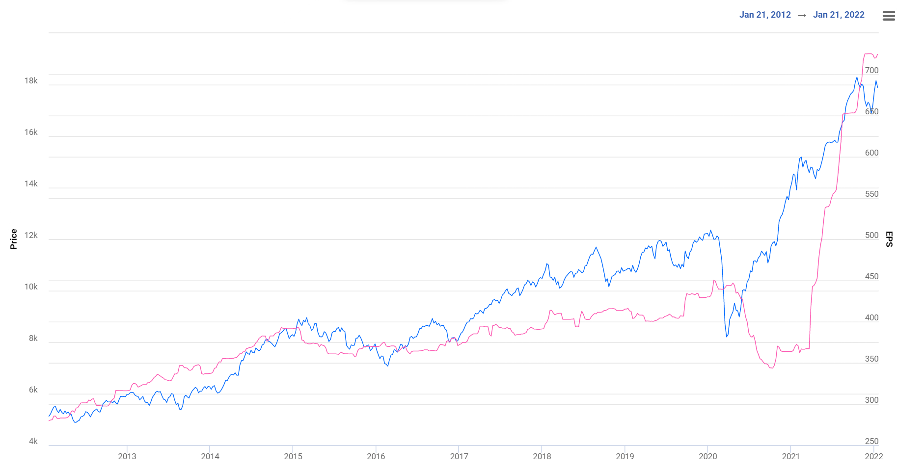
These two charts combined give the PE chart shown below
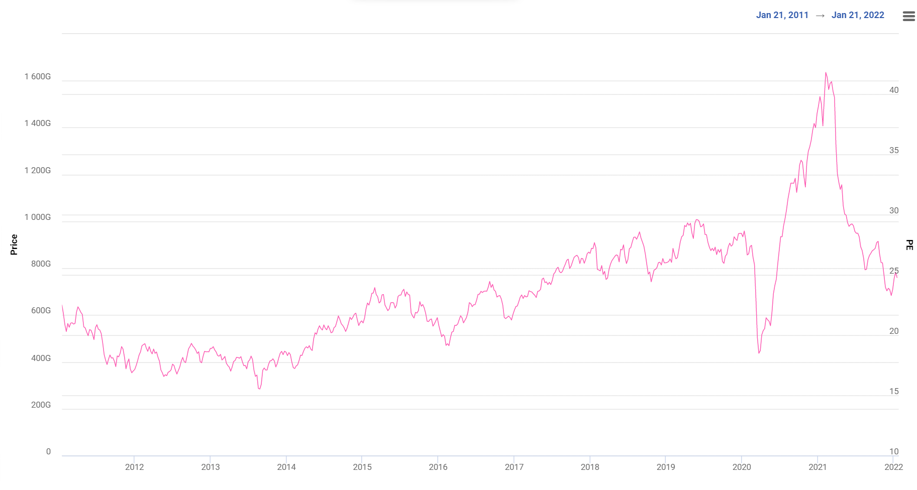
From the above graphs, it is clear that the correction from 40+ to 25 is because of the EPS catching up with Price i.e. The P increased first and the E followed later.
Looking ahead, some estimates are that EPS will touch ~900 by FY23. In such a scenario, I feel it’s unlikely that PE would drop drastically, It may hover around the current levels…
(Caveat: Prediction is a fool’s errand. This is just a gut feel)