MarketSmith India
Website: https://marketsmithindia.com/
Disclaimer: I am active user of this platform and not associated or employed here. Also I made a presentation to help my friends learn more about this platform, which is where I am adding below content from. Hence this content is not exact representation of this platform, there are many more features available here. Also everything covered here is for purpose of education only, not recommendation, or something to blindly follow.
Let’s start
First I will introduce you to this platform and provide a detailed guide about same. Initially I wasn’t able to properly leverage many of these features and wasn’t fully aware about all ins and outs of this platform too.
So perhaps this guide will help others who are active subscribers or looking forward to subscribe in future.
People who follow CANSLIM methodology, would know all about William J. O’Neil and his work. This platform is part of his US based platform ( You can google IBD on youtube about same )
If you like this write-up, you can use me referral link, this gives 10 days added to mine and yours subscription. Thanks
Referral Code: MSI5123A12E-3
Introduction
Let’s start with our home screen.
Home Screen
Helps investors find high-potential stocks using advanced screening tools and in-depth analysis.
Trend
Here you will find information about Trend of Market.
Example
Confirmed Up Trend
A Confirmed Uptrend market status indicates the Nifty is in an uptrend.
The uptrend begins with a follow-through day or when the index reclaims its previous uptrend high.
At this stage, the index is not showing signs of significant distribution or heavy selling by institutional investors. This is the perfect time to be looking out for fundamentally strong stocks at proper buy points.
Up Trend Under Pressure
An Uptrend Under Pressure market status is normally associated with rising number of distribution days on the Nifty.
The index has 3-4 distribution days in the last five weeks and is showing some signs of deterioration. The index may be close to its 50-day and/or 200-day moving average support level, but is typically above at least one of the levels.
Investors need to exercise caution and keep their buying decisions reserved to fundamentally strong stocks showing technical strength.
Rally Attempt
A Rally Attempt begins the third day the index closes higher off the most recent bottom after being in a Correction (also known as Downtrend).
During a Rally Attempt, we are on the lookout for a Follow-Through Day to confirm the trend has reversed and we have entered a Confirmed Uptrend.
A Rally Attempt fails and the index goes back into a Correction if it undercuts the most recent low.
Downtrend
A major index generally goes into Correction when the number of distribution days in the last five weeks rises to 5-6.
The index has typically declined 5-7% or more from its recent high. Also, the index most likely breaches its support levels of 50-day and 200-day moving averages.
Investors should avoid new purchases, get off margin, and raise cash. This is a good time to build your watch list of fundamentally-strong stocks that you would like to own when market condition improves.
Additionally, we have other key information on home screen like:
Stocks On The Move
Upcoming Earnings Report
Then if we go into key Ideas available
India Model Portfolio
Model Portfolio is a list of stocks hand-picked by dedicated team of Research Analysts at MarketSmith India.
Growth 50
Every Friday, MarketSmith India’s Growth 50 is published.
It’s an algorithmic list of leading growth stocks with many, if not all, of the traits of past market winners.
The list is filled with strong price performers so you’ll find stocks that are extended past proper buy points.
These stocks typically have strong fundamentals and sound base patterns.
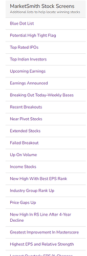
Next we have market smith stock screens
RS Line Blue Dot List
When does the Blue Dot appear?
- When a stock’s Relative Strength line hits 52 weeks high
AND
- When it builds a base pattern that signals a potential price jump
OR
- When the stock is breaking out of the base
Potential High Tight Flag
The “High Tight Flag” is a rare and powerful chart pattern that signals a potential for a strong upward move in a stock’s price
-
Initial Sharp Increase: Imagine a stock’s price shoots up dramatically, doubling or even increasing by 120% within a very short time—say, within four to eight weeks. This is the first part of the High Tight Flag pattern.
-
Sideways Movement: After this big jump, the stock doesn’t crash back down. Instead, it moves sideways, with its price fluctuating within a narrow range, usually only 10% to 25% below its recent high. This sideways movement typically lasts for three to five weeks.
-
Investor Behavior: Most investors might think, “Buy low, sell high,” and would expect the stock to drop after such a big increase. However, in this pattern, a small group of investors might take profits, but the majority are holding on because they believe the stock can go even higher. This creates a “flag” shape on the chart, with the sharp rise being the “flagpole” and the sideways movement being the “flag.”
–
Example:
-
Suppose a tech company’s stock is trading at ₹500. Over six weeks, the stock price jumps to ₹1,100 (a 120% increase). Instead of dropping back down, the price hovers between ₹950 and ₹1,100 for the next month. This sideways movement forms the “flag.”
-
Investors watching this stock might think it’s too expensive, but if the stock breaks above ₹1,100 with strong volume, it could signal the start of another big move upwards, potentially taking the price much higher.
-
This pattern indicates that despite the high price, investors are still eager to buy, expecting the price to go even higher.
Top Indian Investors
Top Indian Investors’ Screens make it easy to look at the shareholdings of large, well-known investors in India.
The screens are designed to include the stocks where the investor is holding 1% or more shares in the company. The data is based on shareholding data filed with the exchanges, as of latest reported quarter.
Earnings
Companies reported earnings in past one month.
Breaking Out Today - Weekly Bases
This screen finds stocks whose price has reached/surpassed the pivot point on a Weekly Base during the prior trading day.
A breakout occurs when a stock’s price rises above its resistance level, i.e., a price ceiling at which the stock has previously encountered selling. This price ceiling is known as pivot.
When a stock charges above the pivot on above-average trading volume, there is a high probability that it will move even higher. We like to see volume at least 40% to 50% above average on the breakout day.
Recent Breakout
This screen finds stocks whose price has reached/surpassed the pivot point on a Weekly Base within the past 16 days and has not declined more than 7% from the pivot price since reaching the pivot.
Near Pivot Stocks
-
This screen finds stocks whose price is within 5% of the pivot point on a Weekly Base.
-
A pivot represents an area of resistance i.e., a price ceiling at which the stock has previously encountered selling.
-
When a stock charges above the pivot on above-average trading volume, there is a high probability that it will move even higher.
Extended Stocks
This screen finds stocks that are more than 25% above the pivot price without ever undercutting the pivot and at least 7 Days but less than 1 year have elapsed since the pivot price.
These stocks are also above their 50-day moving average and near a new 52-week high.
New High With Best EPS Rank
-
Stocks with weekly closing prices with in 5% of their 2-year high and earnings per share rating of atleast of 85.
-
A special screen is used to eliminate most stocks that are extended in price. Stocks reaching new highs have already proven strong price strength, but that does not mean the move is over.
-
In many cases, new highs occur near the beginning of major price appreciation. At other times, they occur when a stock moves out of a second or third stage price consolidation area.
-
Past best performers have all made numerous new highs, which is why this screen should be reviewed.
Industry Group Rank Up
-
List contains stocks with industry group rank in the 25th to 55th percentile that improved at least 15 points over the prior week.
-
Within each group, stocks are ordered by earnings per share rating plus relative strength rating, from high to low.
-
An industry’s price strength may have a direct effect in stocks within the group. Stocks that have confirmation of price movement from others in the group are usually found in groups moving up dramatically in rank.
Middle-Ranked Industries: Industries in the middle range might be on the cusp of significant improvement. If they are showing signs of upward movement, these industries could offer more growth opportunities as they gain momentum.
Investors might be able to get in early before these industries reach their peak, leading to potentially higher returns.
Top-Ranked Industries: Industries at the very top are already well-recognized for their strong performance. While these industries might still provide good returns, the biggest gains might have already been realized by investors who entered earlier.
Price Gaps Up
A gap up occurs when a stock opens at a much higher price than it closed the previous day. This means that there is a gap between the highest price from the previous day and the lowest price of the current day.
-
Demand Indicator: A gap up often happens because of a sudden surge in demand for the stock, possibly due to positive news, earnings, or other factors that make investors eager to buy.
-
Potential for Further Moves: A gap up can sometimes signal the beginning of a substantial price increase as more investors notice the momentum and jump in. However, it can also occur during a “climax move,” where the stock has already risen significantly, and the gap might signal the final stages of the upward trend.
General Criteria for the Gap Up:
-
Daily Low is Higher than the Previous Day’s High
-
Weekly Closing Price Must Be Higher
-
Higher Volume
New High In RS Line After 4-Year Decline
4-Year Price Decline:
The stocks in this list have seen their prices drop significantly over the last four years. These are companies that may have faced difficulties, causing their stock prices to fall.
Relative Strength (RS) Line at a 1-Year High:
The RS line compares the stock’s performance to the overall market (usually a benchmark index like the Nifty 50). A new high in the RS line means that the stock is now performing better than it has compared to the market over the past year. This suggests that the stock might be turning around after a long period of underperformance.
Potential Turnaround:
When a stock that has been declining for years starts to outperform the market, it could be a sign that the company is recovering. This might be due to improved business conditions, new management, or other positive changes. Investors may see this as an opportunity for the stock to increase in value.
Example
Suppose there’s a company, XYZ Ltd., that was trading at ₹1,000 per share four years ago. Over these years, the company faced challenges, such as increased competition or poor management decisions, leading its stock price to fall to ₹200.
However, in the last year, the company started turning things around—perhaps by launching a successful new product, improving its financials, or benefiting from favorable industry trends. As a result, the stock price has started to stabilize and even rise. The RS line for XYZ Ltd. reaches a new one-year high, meaning the stock is now performing better relative to the market than it has in the past year, even though its overall price is still much lower than it was four years ago.
The “New High In RS Line After 4-Year Decline” filter would pick up XYZ Ltd. as a stock that has seen significant price declines but is now showing early signs of a potential recovery. This could make it an interesting candidate for investors looking for turnaround opportunities, as the stock might be poised for future price appreciation if the company’s improvements continue.
Greatest Improvement In Masterscore
What is the Masterscore?
The Masterscore is a composite rating that combines several key factors to assess the potential future performance of a stock. These factors include:
- Earnings: How much profit the company is making.
- Sponsorship: The level of institutional ownership or interest in the stock.
- Relative Strength (RS): How well the stock’s price is performing compared to the overall market.
- Group Rank: How strong the industry group is relative to other industry groups.
- Other Factors: Various additional elements that could influence the stock’s future price.
Why is This Important?
Indicates Momentum: A significant improvement in the Masterscore suggests that the company is gaining strength in multiple areas, which could lead to future stock price appreciation.
Early Signal: This filter helps identify stocks that are beginning to gain momentum, potentially before they make large upward moves.
Highest EPS and Relative Strength
This list features companies with the highest combined relative strength rating and earnings per share rating.
A special screen is used to eliminate most stocks that are extended in price. Strong earnings per share rank and relative strength have been present in most big market performers in the past.
Each week, stocks with this powerful combination that are not extended in price. With new quarterly reports and changing relative strength numbers, this list could contain different securities each week.
The “Highest EPS and Relative Strength” filter helps investors find stocks that are both financially strong and currently performing well in the market. By focusing on these two key factors—earnings growth and price strength—it aims to identify stocks that could be strong performers in the future, while avoiding those that may already be too expensive or overbought.
Largest Quarterly EPS % Changes
EPS% Change: EPS stands for Earnings Per Share, which is a measure of a company’s profitability. The filter looks for companies where the EPS has increased by at least 25% in the most recent quarter compared to the same quarter last year.
Consistent Growth: Not only does the current quarter need to show a strong increase, but the previous quarter must have also shown growth. This indicates that the company is not just having a one-time good quarter, but is consistently improving its profitability.
Avoiding Overextended Stocks: The filter eliminates stocks that have already gone up too much in price, which could make them more risky to buy at that point.
Example:
Imagine a company, ABC Corp., reported an EPS of ₹2.00 in the same quarter last year. This year, in the same quarter, the EPS jumps to ₹2.60, a 30% increase. Last quarter, the EPS was ₹2.50, up 25% from the previous year’s quarter. This consistent growth signals that ABC Corp. is doing something right.
This filter would identify ABC Corp. as a potential stock to watch because its strong and consistent earnings growth might suggest the company is in a good position to continue performing well in the future.
Minervini Trend Template - 1 Month
The Minervini Trend Template is a set of criteria designed to identify stocks that are in a strong uptrend. Mark Minervini uses this template to find stocks that are likely to continue moving upward, making them good candidates for buying.
The 1-month version requires the 200-day moving average to be trending up for 1-Month.
What is Moving Average ?
Moving Averages: A moving average is an average of a stock’s price over a specific period, which smooths out price fluctuations to show the overall trend.
-
200-Day Moving Average: This is the average price of the stock over the last 200 days. In the Minervini Trend Template, this moving average should be trending upward, which indicates that the stock has been generally moving higher over a longer period.
-
50-Day Moving Average: This average is shorter-term, showing the stock’s price trend over the last 50 days.
-
10-Day Moving Average: This is a very short-term average, showing the trend over the last 10 days.
Sustained Uptrend: By focusing on stocks where the 200-day moving average is trending up, the Minervini Trend Template helps identify stocks that are not only strong now but have been consistently strong over a longer period. This can reduce the risk of buying into a stock that is only temporarily rising in price.
1-Month Confirmation: By ensuring that the 200-day moving average has been trending up consistently for at least the last month, we confirm that the stock’s long-term uptrend is still intact and not starting to weaken. This check helps to avoid situations where a stock might have had a strong uptrend but is now starting to plateau or decline.
Minervini Trend Template - 5 Month
The “Minervini Trend Template - 5 Months” filter is a stock screening tool that focuses on identifying stocks with a long-term upward trend.
Specifically, it looks for stocks where the 200-day moving average (a measure of a stock’s price trend over the last 200 days) has been consistently trending upward for the past five months
Markets
Next we have Markets.
Industry Groups
Group Rank: The rank of an industry group is determined by looking at the price movements of stocks within that group. A least-squares curve fit (a mathematical method to find the best-fitting curve to data) is applied to the prices of certain stocks in the industry to create a group trend. This is then used to rank the groups from 1 to 197.
Weightings for Different Time Periods: The ranking considers different time frames, so it’s not just about short-term performance. This helps provide a more balanced view of how well the industry is doing over time.
Half of a Stock’s Movement: Studies show that about half of a stock’s price movement is influenced by the performance of its industry group.
This means that being in a strong or improving industry group can significantly impact a stock’s success.
Identify Top-Performing Industries:
By looking at the industry group rankings, you can easily see which sectors are performing the best. This helps you focus your investments on strong industries that are more likely to yield good returns.
Monitor Changes Over Time:
The rankings also allow you to track how industry groups are improving or declining over the last 3 to 6 months. This can help you spot emerging trends and shift your investments accordingly.
Example
Suppose you find that the Technology industry group is ranked in the top 10. You might then drill down into this group to find individual stocks that are performing well, such as those with strong earnings growth or high relative strength. Conversely, if you notice an industry like Retail has fallen in rank, you might choose to reduce your exposure to that sector.
Using this you can observe “market cycle” too
Market Cycle
Market cycles are periods of rising and falling prices in the stock market. These cycles can be influenced by various factors, including economic conditions, interest rates, and investor sentiment. Typically, market cycles include four phases:
Accumulation Phase: The market is at its lowest, and smart money (institutional investors) begins to buy undervalued stocks
Mark-Up Phase: More investors begin to buy, driving prices higher. This is often when the broader public becomes interested.
Distribution Phase: The market reaches a peak, and smart money starts selling, often leading to a plateau in prices.
Mark-Down Phase: Prices begin to fall as more investors sell, eventually leading back to the Accumulation Phase.
Sectoral Rotation
Sectoral rotation refers to the shifting of investments from one industry sector to another, often in response to changes in economic conditions, market sentiment, or investor expectations.
Different sectors tend to perform better at different stages of the economic cycle.
How to use it ?
Monitor Weekly Changes in Industry Group Rankings:
Identify Rising Sectors: Regularly review the industry group rankings to identify sectors that are moving up in rank. If a sector is improving in rank over several weeks, it suggests that investors are increasingly favoring this sector, which might be entering a period of outperformance.
Spot Declining Sectors: Conversely, if an industry group is falling in rank, it might indicate that investors are rotating out of that sector, possibly due to weaker performance or changing market conditions.
Compare with Broader Market Trends:
Economic Indicators: Align the movement in industry group rankings with broader economic indicators. For example, in an economic recovery, cyclical sectors like industrials or consumer discretionary might start rising in rank. During economic slowdowns, defensive sectors like utilities or healthcare may move up.
Sector-Specific News: Pay attention to news that could impact specific sectors, such as regulatory changes, technological advancements, or commodity price fluctuations. These can trigger sectoral rotations.
Use the Rankings to Narrow Down Stock Selection:
Focus on Top-Performing Sectors: Once you’ve identified which sectors are rising in rank, drill down to the individual stocks within those sectors. The idea is to find strong stocks within strong sectors. These stocks are more likely to benefit from the momentum of the entire sector.
Look for Patterns: Use pattern recognition filters in MarketSmith India to identify stocks within these rising sectors that are forming bullish chart patterns like breakouts or consolidations, indicating potential entry points.
Watch for Confirmation:
Volume and Price Action: As you identify stocks within rotating sectors, ensure that the price action is supported by increased trading volume. This confirms that the sector rotation is driven by substantial investor interest and is likely to be sustained.
Relative Strength: Check the Relative Strength (RS) ratings of stocks within the rising sectors. Stocks with high RS ratings within improving sectors are likely to outperform.
Key Indices
For a Broad View: Start with key indices to get a general sense of which sectors are rotating. This will help you quickly narrow down which sectors are worth focusing on.
For a Detailed View: Dive into industry group rankings to identify specific industries within those sectors that are leading the rotation. This allows you to pinpoint individual stocks that may benefit from the rotation.
How to Use Them Together:
Start with Sector Indices: Monitor key sector indices to identify which sectors are gaining momentum.
Drill Down into Industry Groups: Once a sector shows strength, look at the industry group rankings within that sector to find the most promising industries.
Identify Stocks: Use the insights from both sector indices and industry groups to select stocks that are likely to benefit from the ongoing rotation.
Derivatives
Equity derivative is a class of derivatives whose value is at least partly derived from one or more underlying equity securities.
These are financial instruments whose value is derived from the price of an underlying equity security, such as a stock.
Derivatives are contracts that allow traders to speculate on the future price movements of the underlying equity without actually owning the equity itself.
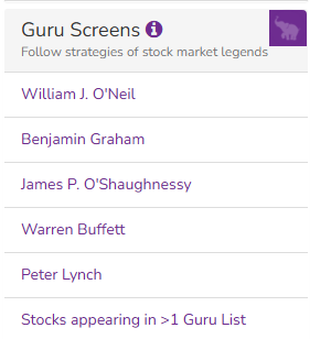
Next we have Guru Screens
Here we can find stocks that are in-line with strategies of famous Legends of Stock Market.
Build Your Screen
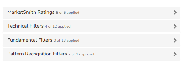
Next we have Build Your Screen
This is one of my favorite part, here you can create your own screener using lot of amazing parameters
If people want to learn more about this platform or about parameters that we can use to build our custom screens, then let me know in comment. If there is enough responses, I will add more content about same.


