
Excerpts from howmuch.net on US Economy. Enjoyed the “Visualisation” that simplifies immensely - by presenting the Big Picture - with embedded details for the data-hungry. I am happy with the Big Picture, itself.
[It’s as if for the first time …I understood what is meant by big picture!! Kind of jaw-dropping for me, to see how much can be conveyed, in such simple, powerful ways]*
The U.S. economy may be in the middle of its largest expansion in history, but record levels of debt could signal trouble on the horizon. In February 2019, the U.S. national debt reached a record $22 trillion, and the annual deficit for this year alone is expected to be almost $1.1 trillion. At the consumer level, household debt (which includes mortgages, auto loans, student loans, and credit card debt) has risen for 19 straight quarters. With these overarching trends in mind, we compiled 10 of our recent visualizations to show a more complete picture of debt in the U.S. Here’s what we learned.
- The national debt has rapidly increased over the past 40 years, doubling in the past decade alone.
- The U.S. has one of the highest debt-to-GDP ratios in the world.
- In general, the governments in larger states incur more debt than the governments in smaller states.
- Millennials have higher debts than other generations like Gen X and Baby Boomers.
- The type of debt that consumers incur has changed over time, with mortgage debt decreasing over the past decade and student loan debt increasing.
1. How Has the U.S. National Debt Changed Over Time?
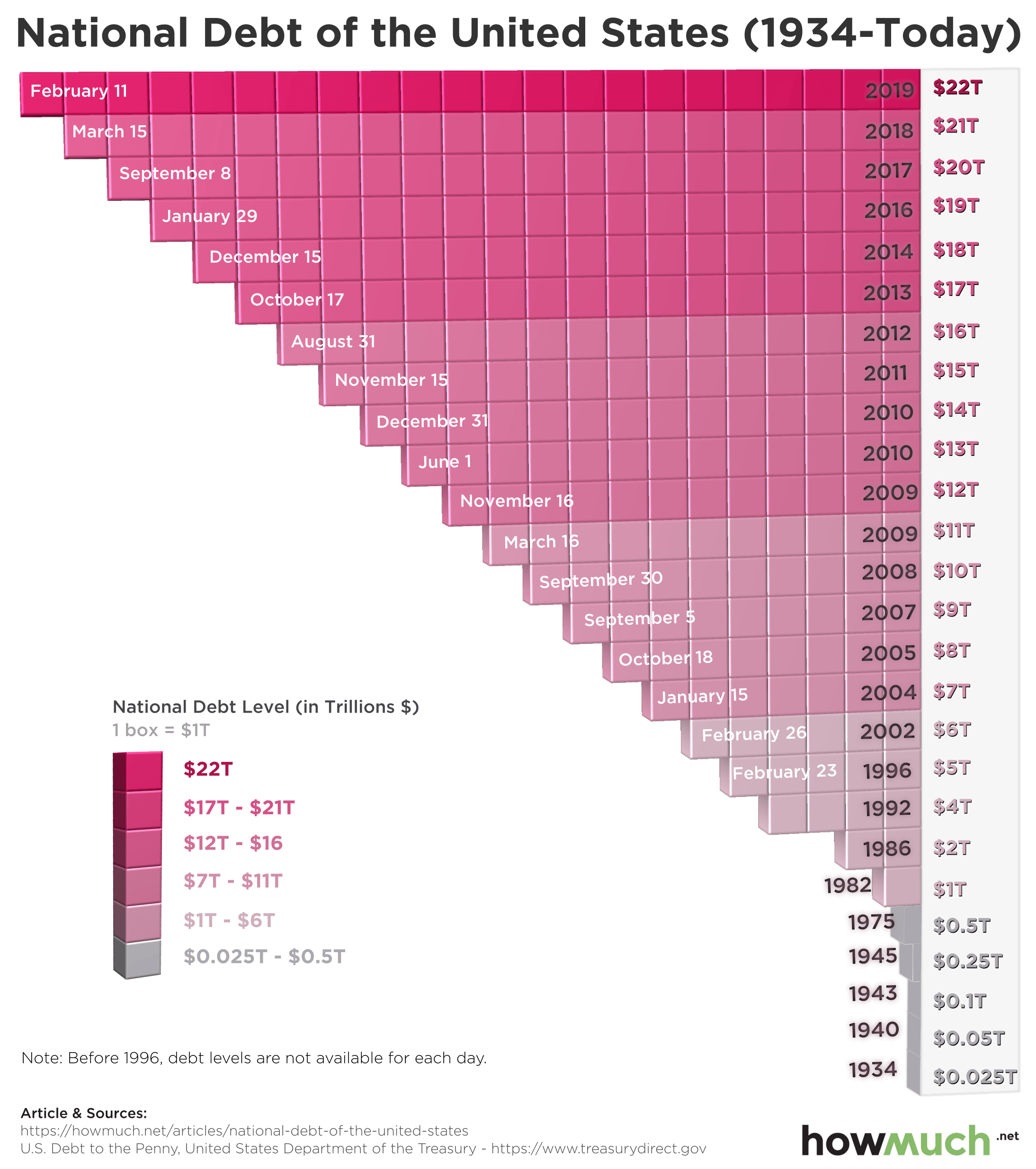
The visualization above references data compiled by The Balance from the Treasury Department’s “U.S. Debt to the Penny” report to map how much the national debt has grown since 1934. The national debt was only $25 billion back then, and it stayed below $1 trillion until 1982. After that, the national debt increased exponentially from the 1980s to the 2010s, eventually leading to the $22 trillion mark where it is today.
2. Who Should Be Blamed the Most for The Increase in National Debt?

Another way to analyze the increase in national debt is to view it in conjunction with the political leaders of the time. According to other research conducted by The Balance, the national debt soared under certain presidents. This visualization shows how much was added to the national debt during each presidency, with each block representing $3 billion in current dollars. As shown in the previous visualization, the majority of the national debt was accrued over the past 40 years. More specifically, Reagan added $1.86 trillion, George H.W. Bush added $1.55 trillion, Clinton added $1.4 trillion, George W. Bush added $5.85 trillion, and Obama added $8.59 trillion. Trump is expected to add $4.78 trillion to the national debt during his first term. The only presidents in the past century who saw a decrease in the national debt are Warren G. Harding and Calvin Coolidge.
3. Which Foreign Countries Hold the Most U.S. Debt?
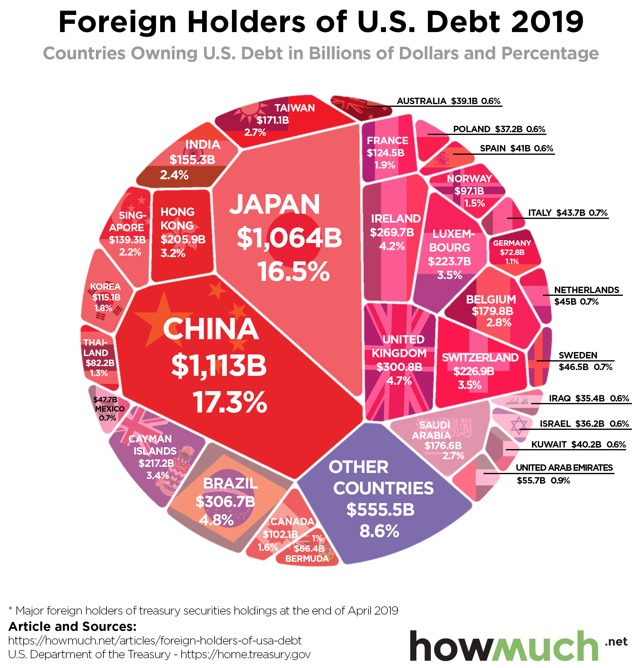
The national debt is financed by the sale of treasury securities, specifically short-term treasury bills and long-term treasury bonds. While many treasury securities are held by the American public and government agencies, foreign countries are some of the bigger holders of U.S. debt. According to the visualization above, both China and Japan each hold over $1 trillion in U.S. debt, accounting for roughly one-third of U.S. treasury securities owned by foreign countries. The data for this visualization comes from the Treasury Department’s database for Major Foreign Holders of Treasury Securities, as of April 2019. Altogether, foreign countries hold more than $6 trillion in U.S. debt.
4. How Deep in Debt is the U.S. Compared to the Rest of the World?
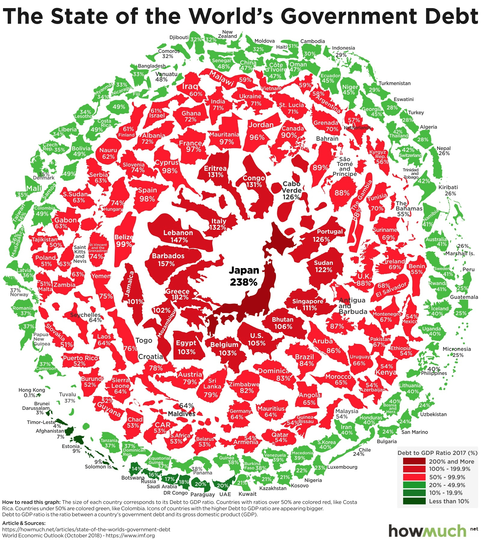
The good news is that the U.S. is not alone in its accrual of debt. While the U.S. national debt of $22 trillion is truly staggering, the country’s economic output is also much higher than other countries’. The best way to compare different countries’ national debts is to use the debt-to-GDP ratio, which compares a country’s output with its debts. The visualization above uses data from the International Monetary Fund to illustrate debt-to-GDP ratios between countries, with the larger, redder countries toward the center representing the highest ratios. The countries with the highest debt-to-GDP ratio are Japan, Greece, and Barbados. By this measure, the U.S. ranks 13th.