
Hi @Dhruv_Meisheri, it would be a great help if you also provide the average buying price of each stock.
Sharing a short note on Indian markets:
Warren Buffett’s observation has aged well: “Only when the tide goes out do you discover who’s been swimming naked”. Well, the tide is out. What follows is an attempt to read what it is showing us.
India: Bear Market Math and What Comes Next
Excluding March 2020, March 2026 was the worst month for the Nifty 50 since October 2008, an 11.5% drawdown in the country’s top fifty companies. Although some of it has been reversed recently, we’re still in a bear market.
Three out of four small and micro cap stocks are currently sitting significantly below their peaks. Large and midcap median drawdowns are running around 30%.
History provides some context. Peak-to-peak cycles in Indian equities have averaged roughly six years. The bear phases within those cycles have lasted 14, 31, and 26 months respectively. The current phase began in September 2024. We are now approximately 19–20 months in. That places us well inside historical bear territory, but not obviously beyond it.
The Job in a Bear Market Is Simple
The bull cycles that bookend bear phases in India have been extraordinary. The post-COVID rally produced nearly 5x returns. The 2013–18 NDA cycle delivered 265%. Post-GST recovery: 226%. The asymmetry is striking, and it is the reason bear market discipline matters so much. Rather than focusing on generating returns, the job is to survive, avoid permanent impairment, and not fall too far behind the index, because the cycle that follows will do the heavy lifting.
At current valuations, the setup for medium-term investors is reasonably compelling. The Nifty 50 is trading around 20.5x earnings. Historical return data by entry PE tells a clear story: at 20x, the one-year median return has been approximately 25%, with an 88% win rate. At a five-year horizon, the win rate goes to 100%, and this holds even if the entry threshold is pushed to 25x.
The Geopolitical Overhang
The specific event that drove much of March’s weakness is now in the open. For the situation to deteriorate meaningfully from here, a second escalation would be required, and on current evidence, that appetite does not appear to exist (thank the bond market!). Containing the damage and managing the optics is the more likely path.
The more important signal came in February, before the event fully materialized. That month saw 18–20% selling in IT stocks, and yet FII flows were net positive, the currency held, and the index stayed positive. The March weakness is therefore largely attributable to the conflict itself, not to a broader deterioration in India’s fundamental picture. Once the dust settles, there will be residual effects in specific sectors (think hotels, airlines, oil refiners that will carry the scars longer than the broader market). Their numbers will disappoint and they will not snap back to pre-event valuations quickly. But for the index overall, a modest allowance on fiscal math does not meaningfully change the return calculus, the markets can absorb that.
Let’s invert this: Can the conflict extend into something structural? India runs $40 billion in annual remittances from the Middle East. Its oil supply is heavily linked to the region. Travel, tourism, and trade flows are meaningful in ways the Russia-Ukraine situation simply was not for India. A prolonged conflict would carry real economic consequence. The base case, however, is resolution. Iran-US back channels were not dramatically far apart before the situation escalated. And the domestic political calendar in the US (midterms approaching, inflation sensitivity) creates natural pressure toward de-escalation.
The FII Problem
Foreign institutional selling in India has attracted significant attention. FIIs have been reducing exposure across emerging markets broadly, and Korea and Taiwan have absorbed more than double India’s selling in absolute terms. The problem is not India-specific, it’s more about return math.
The equation that used to attract foreign capital looked something like this: 15% INR returns, no capital gains tax, minus 3–3.5% currency drag, net roughly 11% in dollar terms. That was a compelling offer. The same equation today looks quite different: 12% nominal INR returns, subtract approximately 2% for taxes, leaving 10% in rupee terms, then subtract 5% on currency, netting roughly 5% in dollars. Against that backdrop, incremental reallocation into India requires a strong conviction call rather than a routine carry trade.
The corrective that would actually move the needle: In 2013, India raised $30 billion through NRI deposits to stabilize the currency under pressure. Today the capacity exists to raise $75 billion. Even at a 2% interest premium on three-year deposits, the carry cost is roughly $1.5 billion annually, a manageable price for currency appreciation of 4–5%, lower import valuations on oil, and restored external confidence.
Where Capital Is Concentrating
One visible exception to the broad FII retreat has been the capital goods sector. The thesis is straightforward enough that multiple allocators arrived at it independently: the world needs power. Data centers, private capex, industrial policy, and electrification are all converging on the same input constraint. Investors who acted on this early discovered, after the fact, that they had company.
So, beneath the surface of macro disruption, the operating economy is not as impaired as the index suggests. Quarterly business updates coming through now are strong across sectors: auto sales, consumer names, gold, retail. The public was spending through March’s turbulence, even as markets fell.
The Framework That Survives Cycles
The clearest way to think about portfolio construction across regimes is through two benchmarks applied in sequence. In bull markets, the goal is to deliver small cap index returns and capturing the outsized gains that accrue to risk during expansion. In bear markets, the goal shifts to beating the Nifty 50, protecting capital, and not falling too far behind. If a portfolio can achieve both with a predominantly small cap orientation, it has produced genuine alpha.
We are still in the phase where the second benchmark applies. That is not a reason for pessimism. The tide being out is how you find out who built something real.
I would like to credit most of this work to my teachers Ishmohit Arora, Siddhant Bhandari, and Samir Arora. I wrote this piece simply as a means of consolidating all their knowledge to paint a digestible picture for you all.
8 Likes
Three things happened recently that I don’t think are unrelated.
- Private credit defaults just crossed 9.2%: That’s above the 2008 GFC peak of 6.5%, per Fitch Ratings data. The $1.8 trillion private credit market carries an 18:1 liquidity mismatch, and major fund managers including Ares, Apollo, Blue Owl and Blackstone have gated redemptions as withdrawal requests surge. Roughly 25% of direct lending portfolios sit in software, the sector now reeling from AI-driven disruption fears, with agentic AI threatening the SaaS model that private credit helped finance.
- Wall Street just launched the first CDS index linked to private credit: This is the first time you can officially short private credit at scale. The CDO short in 2007 = the BDC short in 2026?
- We have roughly 5-6 frontier LLMs in a race where only one probably wins: When that happens, it could make entire categories of software redundant. Why pay for a specialised legal research tool, a coding assistant, a customer support platform, a data analytics SaaS, when the winning model does all of it natively? The businesses private credit financed on the assumption that software moats were durable start looking very different. What happens to private lending and VC portfolios then?
These are a few dots that I feel are connected.
What happens to housing and mortgage markets if private credit stress deepens? What happens to employment and consumer credit?
For the Indian market, FIIs have already pulled significant capital over the last 20 months. In a global risk-off environment, where does India sit in the capital allocation pecking order?
Welcoming any thoughts or pushback.
6 Likes
Sharing a note I wrote recently about the Indian markets:
I: The Price of Uncertainty
Frank Knight, writing in 1920, made an observation that has lost none of its force: all profit resides in uncertainty. The point of maximum profit is at the point of maximum uncertainty. When the future narrows into something knowable, the excess return disappears with it. Look at India in mid-2024, after the election results settled and the narrative became clear. Valuations re-rated, certainty arrived, and within two or three months the market had made its peak, as there was nothing left to price in.
Today the environment is the reverse, as nobody knows when the conflict ends. Supply chains are breaking down in ways that are still working through the system which blurs the macro across multiple fronts simultaneously. The current moment is not maximum uncertainty, but it is high uncertainty. The darkest point was probably late March into early April. Things are slightly less murky now, but the gap between the bull case and the bear case remains wide, and that gap is exactly where returns are manufactured.
What makes this moment unusual is the positioning data. On relative valuation, relative performance over the trailing twelve months, and FII positioning, India is at a lifetime low. In thirty-five years of coverage, Ridham has not seen levels like this. India has not traded this cheaply relative to global markets since it opened to foreign investors in 1993.
The market is not ignoring this. Indian retail investors bought in March while institutional capital was heading for the exit. Most commentary treated this as unsophisticated behavior, but the more accurate reading is the opposite. When you buy risk assets during periods of genuine uncertainty, the prospective result is usually good. Tops and bottoms are for fools, as the saying goes. The retail investor who bought the dip was pricing in the right thing at the right time.
II: What the Strait of Hormuz Is Actually Doing to India
Markets are watching oil, but that’s the wrong variable. Crude accounts for 20-25% of what passes through the Strait of Hormuz. The rest is methanol, sulfur, helium, ammonia, LNG, and urea. None of these attracted headlines but are what holds global food production together.
Half the world’s population depends on nitrogen fertilizers to eat. 30% of all urea moves through the Strait. Virtually none has passed through in the past two months. The price signal arrived with a lag (a tanker that cleared the Strait sixty days ago only reached Europe recently), which is why the disruption felt abstract for so long. It no longer does. India is purchasing fertilizer at prices double what they were before the conflict began, Thailand has been unable to sow its crop this season because the inputs did not arrive, US wheat prices have risen to their highest level since 2024, with projections pointing to the lowest domestic harvest in fifty years.
The oil picture is quieter only because floating inventories have been drawn down aggressively to buffer the shock, which is finite. Exxon’s stock price today sits below where it was when the conflict began, which tells you how thoroughly the market has discounted the physical reality. This is an availability crisis rather than a price shock, which matters because availability crises are not solved by demand destruction alone.
The bear case for India is a sustained escalation that drives oil to $130, which causes real pain. But it doesn’t cause a balance of payments crisis: India’s oil intensity relative to GDP has roughly halved since 2008, when crude touched $140 and the economy absorbed it. The 1991 episode, when oil doubled in a single month and triggered a full BOP collapse, is a different order of magnitude from where India sits today. The current account pressure is manageable under most scenarios.
What changes the risk calculus is the El Niño overlay. Independent research points to an incoming super El Niño potentially stronger than the event of 1876 to 1878, which was the episode that caused the southwest monsoon to fail across multiple consecutive seasons, destroyed harvests across the subcontinent, and produced one of the worst famines in recorded history. That event unfolded in a world without nitrogen fertilizers, yet this one arrives on top of a fertilizer supply shock already in progress.
III: The Nominal GDP Problem
From 2013 to 2023, India’s nominal GDP grew at roughly 12% per year on average, and that rate justified the valuation multiples the market assigned. After 2024, nominal GDP growth collapsed to 8.5-9%. The market cap-GDP ratio did not follow it down, so valuations stayed elevated while the growth engine that supported them slowed materially. You cannot award the same multiples to an economy growing at 9% as you would to one growing at 12%. That mismatch explains more about where foreign capital has gone.
The rebuttal: Nominal GDP recovery back toward 10-10.5% is plausible by next year, and at that level the valuation conversation changes. The government and the RBI both pivoted on policy in 2025, and the effect is already showing in corporate earnings (the reflation trade is on). The question is whether it arrives fast enough, and in large enough magnitude, to shift the attention of capital that is currently positioned elsewhere.
Underneath the nominal GDP debate sit structural facts that do not move with a single election cycle or a commodity shock:
-
India’s median population age is around 27 years. That demographic advantage compounds for the next 70 to 80 years and produces a growing domestic consumption market that no robot-driven economy can replicate (robots do not buy food or drive cars). China’s fertility rate is 0.9. Its domestic market is shrinking.
-
India has a capacity shortage across nearly every sector (infrastructure, energy, defense, fertilizers, basic manufacturing). China has the opposite problem because it overbuilt and must export excess capacity to the rest of the world to sustain its industrial base. India can invest internally for decades without exhausting the need. Investment creates earnings, and earnings drive stock markets over time.
-
Property rights: India’s saving to consumption ratio of roughly 20:80 reflects a population that feels secure in its ownership. People who are afraid their assets will be confiscated save compulsively and consume little. China’s excessive household savings rate is partly a response to exactly that insecurity. The US has gone the other direction, consuming future income it does not yet have. India sits in the correct position.
-
Respect for capital: Indian entrepreneurs do not deploy capital unless they can see a return on it of at least 15 percent. That discipline is what has made India one of the best-performing equity markets in the world in dollar terms over a 30-year horizon, in an economy that is a fraction of China’s size but has produced a far stronger stock market. Growth without capital discipline produces GDP. Growth with capital discipline produces wealth.
Section IV: AI Disruption, Delay, and the Application Layer
The AI trade has cost India more in relative terms than any single macroeconomic event of the past year. The combined profit of SK Hynix and Samsung this year will be approximately 3x the total earnings of all Nifty 50 companies. That ratio captures the problem precisely: India has no memory chip industry and has no position in the hardware layer that is absorbing the bulk of AI capital expenditure right now. While Korea re-rated 50% in six weeks on the back of that trade, India moved 7-8%.
The near-term pain runs deeper than relative underperformance: The world’s blunt measure of AI adoption is headcount reduction. If a company fires people, the market concludes it is embedding AI into its processes. A significant share of the work being automated sits in India (lower-end coding, data processing, back-office functions that American firms had offshored). The instinct is to let those people go, which is already translating into hiring freezes and headcount declines across the IT services sector. Ridham Desai calls it a 4-6 quarter transition, and the market, having priced it in aggressively, has likely turned too pessimistic on the other side.
Ritesh Jain adds a data point that reframes the AI story: For the first time in 65 years, the cost of compute exceeds the cost of hiring a human being. Technology has historically been the cheaper input, which has inverted. The implications run in both directions, as it makes AI adoption more expensive than projected and creates a floor under human labor demand that most models have not accounted for. By 2027 and 2028, the application layer opportunity begins reflecting in earnings.
V: FIIs, Dollar Returns, and the Momentum Trap
FII selling in India over the past year has three distinct causes. The first cause was valuation, India was simply too expensive going into September 2024, and this has since has unwound. The second was a growth slowdown that made the valuation even harder to defend, which has also largely unwound with most companies now reporting numbers that reflect the policy pivot by both the government and the RBI. The third cause is the absence of an AI trade which has not gone away.
Let’s look at the mechanical dimension of FII selling. Domestic investors are putting roughly 40,000 crore rs into the market every month, and that capital has to find a seller on the other side. With corporate issuances not absorbing the demand, foreign institutions are functionally providing liquidity to domestic flows. It is partly a structural consequence of the volume of domestic buying.
The deeper issue is the composition of global institutional capital. Around 80% of it is momentum-driven. When momentum shifted away from India in September 2024 (tighter fiscal conditions, tighter monetary policy, China beginning to ease, the global AI trade gathering speed) that capital moved. It will return when the price action changes, or when something goes wrong in the markets currently absorbing that flow.
Kenneth Andrade says we are stuck in the middle. India has lost its momentum entirely. Its valuations, while meaningfully cheaper than a year ago, are not yet cheap enough to force the hand of deep-value capital. It is attractive without being compelling, which is the least useful combination for attracting flows.
The metric that argues most clearly for a floor is dollar returns. Indian equities have compounded at roughly 15% in dollar terms over the past five years and we are near the rolling low for that measure. Historically, that level marks the point from which markets recover from a dollar-return perspective, absent a further deterioration in the underlying. Kenneth’s positioning is to deploy half now and stagger the remainder through the first half of 2027. The worst is mostly in the price, and the upside requires patience and a catalyst that shifts relative momentum.
VI: The Rupee
Every major conflict since 1990 has produced the same market response: capital flows into the dollar, US bond yields fall, and the rest of the world absorbs the volatility. The Iran war has produced the opposite. The dollar is receiving no meaningful bid, US thirty-year borrowing costs crossed 5% for the first time since 2007, UK yields are at five-year highs, German and Canadian yields are rising. The bond market is where this crisis is expressing itself in the West, and it’s the currency markets in emerging economies.
The rupee operates inside this new configuration under pressure. Ritesh Jain’s pre-war target was 92 against the dollar. The current range of 95 to 100 reflects the fertilizer import bill, sustained domestic gold buying, and the reality that oil prices have not been fully passed through to consumers. The question of how far the rupee falls is partly a question of how much gold Indians keep buying. If that continues, the depreciation pressure persists. If it slows, the exchange rate stabilizes around 95 to 96, which is also where Bernstein’s current target sits.
VII: Where to Invest
The Nifty 50 benchmark is 50-55% services. When the Indian Prime Minister and the US President both say they want manufacturing, reshoring, and energy sovereignty, they are describing a world in which the benchmark is the wrong place to look. The investment thesis for India is not the index, but what the index does not yet contain.
Four themes have anchored Ritesh Jain’s India positioning for two years: electrification, defense and engineering services, tourism, and wealth management. Three of the four have delivered. Tourism was supply-constrained and did not deliver on its potential. The three that worked sit in sectors where the Indian government is actively deploying capital and where global supply chains are beginning to redirect work toward India.
The manufacturing angle is the medium-term frame. India’s manufacturing sector is currently 14% of GDP. Moving it to 16-17% over 5-7 years is achievable and would produce a set of winners that are not yet in any benchmark. Kenneth Andrade’s version of this is that the companies that win are not those in a particular sector but those that have built dominant domestic cash flow positions and are using that base to step out into global markets. A competitive cost structure and supply chain discipline matter more than sector designation. India’s depreciated currency makes the country one of the few large economies capable of exporting deflation to a world that is otherwise importing inflation.
Within that framework, the sector-level picture is differentiated. Automotive, defense, industrial engineering, pharmaceuticals, and solar all have structural tailwinds. India is already the second largest solar module producer globally, with significant capex committed for both domestic and export markets. Ceramics, commoditized steel, and agriculture sit further back in the formation but follow the same logic that India has capacity, the world needs an alternative source, and India’s share of global trade is still small enough that gaining share moves the needle domestically without displacing incumbents globally.
IT services remains the unsolved question. Kenneth Andrade has exited the sector pending clarity on how the AI transition redistributes work across the value chain. Valuations are cheaper than they have been in years, but cheaper is not the same as investable. The shape of the industry in five years looks genuinely different from what it was, and that uncertainty argues for patience over conviction. The revisit happens in six to twelve months when the transition pattern becomes clearer.
Two sectors warrant explicit caution. Consumer staples and discretionary are entering the same consolidation phase that capital goods endured between 2008 and 2020. Those companies will rework their models, invest their balance sheets, and eventually return. But the cycle suggests 5-8 years of grinding before the re-rating arrives. Financials face a different problem: in an inflationary environment, pricing power belongs to the companies manufacturing products, not the institutions financing them.
Something worth tracking is labor export. High-income countries and post-conflict reconstruction zones are running out of blue-collar workers, and India obviously has a surplus. The next five years will see a material increase in Indian tradespeople (plumbers, electricians, carpenters, drivers) moving to Japan, Germany, Canada, and eventually the economies that will need rebuilding when the current conflict ends. White-collar workers remain in India and blue-collar workers leave. The domestic scarcity that follows creates its own set of investment implications in wages, productivity, and the sectors that depend on that labor.
I would like to credit most of this work to my teachers Ritesh Jain, Ridham Desai, and Kenneth Andrade. I wrote this piece simply as a means of consolidating all their knowledge to paint a digestible picture for you all.
15 Likes
I think one of my biggest learnings from the last year was that, especially in a sideways market, you can’t model a company’s perception multiple (PE, EV/EBITDA, etc.) and certainly shouldn’t make decisions based off it.
The way I used to sell was if, according to my models, there wasn’t much upside left for the next 1-2 years which typically happened due to a rapid surge in market cap over a short period of time. Although it worked for a few exits (AB Capital, Narayana), I also left a lot of money on the table with wrong sells (TD Power, Thangamayil). And who knows, the companies I exited may go on to have the same growth I didn’t foresee!
My focus will shift more towards earnings growth, earnings quality, and operating leverage. As long as I have conviction that the business will grow PAT at 20+% and it’s of relatively high quality, hold it and the market will reward the stock at some point. PEG is important to consider too, as well as the forward-looking thesis. There have been many instances of companies with phenomenal returns (KEI industries) where there were long periods, sometimes even years, of stagnant prices.
6 Likes
Hey everyone, I’m sharing a piece I wrote recently about Gold. Hope this explains what’s going on and why the thesis is intact.
Section I: Why Gold Fell
The first reason is Chinese liquidity. China is the largest marginal buyer of gold in the world. American investors have a deep menu of alternatives (equities, credit, real estate, money markets) and gold is a small allocation within a diversified portfolio for most. Chinese savers operate in a different environment. Domestic real estate, which absorbed the bulk of Chinese household wealth for decades, effectively ceased to function as a reliable store of value after 2016–17. Equity markets have not filled that gap. What replaced real estate, over time, was gold. When China injects liquidity into its system, that marginal purchasing power finds its way disproportionately into gold. When China withdraws it, the opposite occurs. Starting in early March, China stopped injecting and began removing. The renminbi appreciated, which confirmed the tightening. The effect on gold was immediate and significant. That dynamic has only recently begun to reverse (China restarted liquidity injections in late June) which is the first signal worth monitoring for a potential floor.
The second force operated through the yield curve. The spread between the two-year and thirty-year US Treasury yield, which had been running at approximately 140 basis points at the start of the year, compressed to around 71 basis points by late June (see table below). That spread is a useful shorthand for dollar liquidity conditions: when it widens, banks are incentivized to lend long, credit expands, and the dollar tends to soften. When it narrows, the opposite holds. A spread at 71 basis points means the system is tightening, the dollar index trends higher, and assets priced in dollars face mechanical pressure regardless of their underlying fundamentals. The dollar hitting a 52-week high as gold fell from $5500 to $4000 is not a coincidence. The question is whether the spread has found its floor, and whether the next move is a widening that reverses the dynamic. If the two-year yield begins declining from here, which slowing growth data and oil coming off its highs would both support, the spread widens without any explicit Fed action, the dollar softens, and gold recovers accordingly.
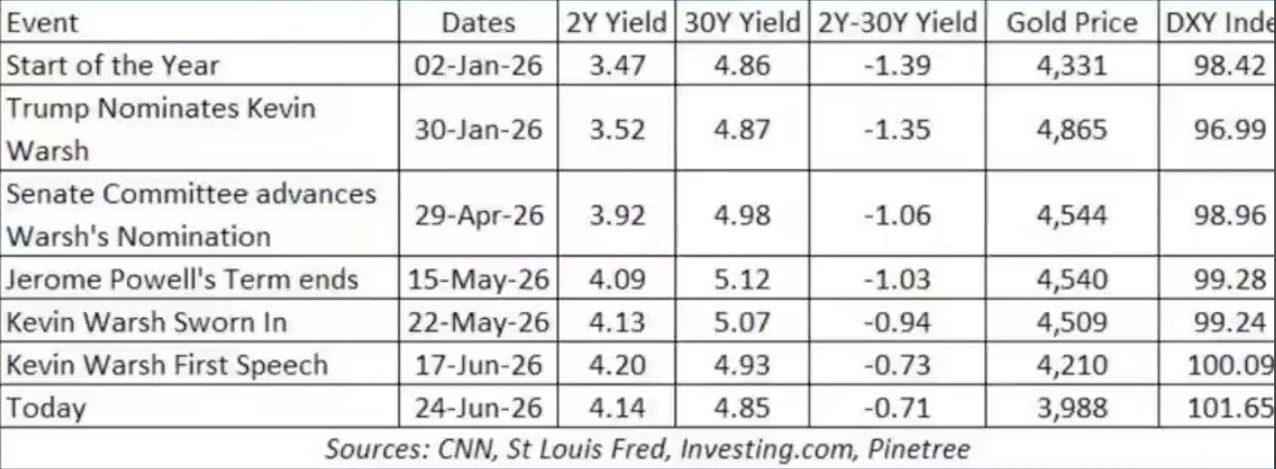
Into this backdrop arrived Kevin Warsh, and with him a shift in how the market reads monetary policy. Warsh has positioned himself as a chair who will not telegraph his intentions. Where previous chairs managed expectations incrementally, Warsh has essentially told the market to read the incoming data itself. The immediate effect was that the market did exactly that, and what it concluded was hawkish: roughly two rate hikes are now priced in. Gold’s decline can be read as precisely that discount working through the system. If those hikes are not delivered, that discount unwinds.
Section II: This Has Happened Before
A 25%+ drawdown in gold feels significant in the moment. But measured against history, this tends to happen in the middle of a multi-year move.
In 2008, gold fell 33% within a larger bull market before going on to new all-time highs. In 1974, it fell 25% before recovering and extending. In 1973, it fell 28%, found a low in November, and was printing new all-time highs by January. In 2006, a 25% correction interrupted a bull run that still had years left to run. The current correction at sits in the middle of that distribution. Bull markets in gold have always included corrections of this magnitude, and those corrections have never, in the historical sample, coincided with a durable top. The top, when it came in prior cycles, arrived after a speculative blow-off that dwarfed the moves that preceded it.
Let’s take a look at midterm year seasonality. Gold has tended to bottom in June or July in midterm years on average, around day 187 of the calendar year. As of writing, we’re only slightly behind. Looking across the full set of prior midterm years, the pattern holds with enough consistency to be useful as a probability weight, even if it fails roughly a third of the time. When stocks have also corrected going into late summer and early autumn of a midterm year, as they have historically and as they appear to be doing in 2026, gold has sometimes found its low ahead of equities and began recovering while stocks were still weakening, improving the ratio of gold to equities in the process.
The broader structural frame is a three-leg bull market. The first leg ran from gold’s prior lows to its initial breakout. The midterm year brought consolidation and correction. The second leg extends the trend, often more forcefully than the first, before another midterm year interruption. The third leg is the speculative conclusion, typically the most volatile and the most extreme, before the cycle ends. If the current correction is the midterm consolidation of the second leg then the third leg has not yet begun.
Section III: The Dollar’s Strange Behavior
There is a signal embedded in the current sell-off that is easy to misread as bearish for gold when it is, in fact, one of the more consequential structural developments of the current cycle. Gold falling is the near-term fact. But let’s look at the dollar.
The historical pattern in major geopolitical shocks is consistent to the point of being reflexive. War breaks out —> energy prices spike —> capital moves into dollars and into US Treasuries —> yields fall as demand for the safe-haven asset rises —> dollar strengthens. The combination of a stronger dollar and lower yields is the fingerprint of a system that, under stress, still treats the United States as the lender of last resort and the dollar as the terminal destination for frightened capital. That pattern held through the Gulf War, through 9/11, through the financial crisis, and through virtually every significant conflict of the past four decades.
It is not holding now. Since the Iran war began and the Strait of Hormuz was effectively closed, bond yields have risen. The dollar on several occasions has actually weakened despite circumstances that, by the historical template, should have driven it sharply higher. Luke Gromen’s characterization of that combination is precise: it is capital flight. It’s money leaving the dollar system rather than retreating within it.
The most likely candidates are physical assets and commodities — oil, gold, hard goods that sit outside the counterparty web of dollar-denominated financial claims. This is a signal that the dollar’s safe-haven premium is eroding precisely at the moment when it should be most visible, most sought-after, and most self-evidently valuable. If the dollar cannot rally during an energy shock of this scale (one that is materially worse for Europe, Japan, and most emerging markets than for the United States) then the question of when it will rally, and under what conditions, becomes much harder to answer.
This does not make gold’s near-term path straightforward. Tighter financial conditions, a rising dollar index, and compressing liquidity weigh on gold and on everything else priced in dollars. The absence of a dollar safe-haven surge has not been replaced by a gold safe-haven surge; both are being sold in an environment where dollar liquidity is contracting and the market is pricing in tighter policy. The short-term dynamic is one of general risk-off, and gold has not been exempt from that. What the dollar’s anomalous behavior represents is evidence that the global monetary system is shifting underneath the surface of a correction that most observers are reading as simply a commodity trade going wrong.
Section IV: The Thesis Is Intact
The causes of gold’s correction are real and they explain the timing and the magnitude of the move. What they do not explain is why the underlying thesis for owning gold was valid in the first place.
Start with the debt arithmetic, because it is where the argument begins and where it ultimately ends. US debt is approaching $40 trillion. Debt-to-GDP is running at 122%. The fiscal deficit is approximately 6% of GDP in what is, by historical standards, an expansion. The three components of that deficit are politically untouchable in combination: interest expense, which rises mechanically as rates move higher; entitlements, which a retirement-age demographic cohort has rendered immune to meaningful reform; and defense spending, which the current administration is actively expanding. None of the three is being cut. All three are growing. When a recession arrives (and the current tightening cycle, overlaid on an economy carrying 122% debt-to-GDP, makes one more likely than the consensus currently prices) the historical pattern is that the deficit expands by roughly five percentage points from its starting base. A 6% deficit in good times becomes something closer to 11% or 12% when conditions deteriorate. US tax collections, which were growing at 8% to 10% year-on-year in January and February, had already slowed to approximately 2% growth by May.
This is the context in which Kevin Warsh’s policy position becomes significant rather than merely tactically interesting. Warsh has presented himself as a price stability hawk, committed to restoring credibility to a Fed that, in his view, allowed itself to be subordinated to fiscal imperatives under his predecessor. The problem is the math that sits underneath it. The Fed can sacrifice the dollar or it can sacrifice the bond market, but it cannot protect both simultaneously. US debt is too large and the deficit too wide to be financed without ongoing central bank involvement, regardless of how that involvement is structured or described. And it was always going to be inflationary. The war in Iran has simply accelerated the timeline on which the contradiction becomes visible. If Warsh holds the line and refuses to accommodate (if he allows financial conditions to tighten until something breaks) the bond market dysfunction that follows will force his hand in exactly the way it forced every predecessor’s hand. This resolves the same way it always has: by printing.
Meanwhile, the entity whose behavior was supposed to confirm the gold bear case has done the opposite. Three months ago, the overwhelming consensus was that China would be forced to liquidate gold reserves under the pressure of US sanctions, financial isolation, and the economic consequences of Hormuz remaining closed. China is instead buying more gold as the price falls. China’s accumulation of gold over the past several years has been a deliberate strategic choice to defend the renminbi’s store-of-value credentials outside the dollar system. Buying into a correction is consistent with that strategy and inconsistent with the narrative that China’s position in the current conflict leaves it exposed and defensive. The yuan swap line network (185 countries, with settlement infrastructure anchored at every major gold trading hub in the world) did not get built accidentally, and it did not get built to be abandoned at the first sign of geopolitical pressure.
The UAE’s decision to leave OPEC and the subsequent swap line negotiation with the United States is a microcosm of the broader realignment underway. This reflects a world in which the United States is no longer the only counterparty available to energy producers. For thirty years, dollar exclusivity in oil pricing meant that producers needed the dollar system to maximize the value of their reserves. A cartel made sense in that world: restrict supply, maintain price, protect the dollar value of what remains in the ground. If oil begins to be priced and settled in a gold-backed alternative, the incentive structure inverts entirely. The producer who maximizes output and accumulates gold at current prices is better positioned than the one who manages a cartel for dollar optimization. That transition is not complete, and it may not complete on any near-term horizon. But the direction is visible, and the UAE’s positioning is a data point in that direction rather than against it.
The deepest version of the structural gold argument sits underneath all of this: no country wants the reserve currency mantle right now. The United States, pursuing re-industrialization, needs a weaker dollar. A strong reserve currency and a competitive manufacturing base are incompatible. China has been explicit that it does not want the liabilities that come with running the global reserve currency. No other candidate has the depth, infrastructure, or the political will to absorb that role. What fills the vacuum when every major currency is being managed lower, when no sovereign wants the reserve burden, and when the system’s stress tests are producing anomalous signals is not a new fiat claimant. Gold is the asset that has no counterparty, no maturity, no dependency on any government’s policy credibility, and no one to disappoint.
Section V: What Resolves This Correction
Knowing that the structural case is intact is not the same as knowing when the correction ends. The endgame for gold is not in doubt. The path to get there involves a sequence of conditions that have not yet fully resolved.
The most direct indicator to watch is the yield curve spread (the gap between the two-year and thirty-year Treasury yield). At approximately 71 basis points as of writing, it is less than half what it was at the start of the year. When the spread widens back above 1%, dollar liquidity eases, the dollar index softens, and gold’s primary headwind reverses without requiring any explicit policy decision. The path to that widening runs through one of two directions: either the two-year yield falls because incoming economic data deteriorates faster than the rate-hiking narrative can sustain, or the thirty-year yield rises because fiscal pressure reasserts itself at the long end. Both are plausible. Oil coming off its highs reduces the inflation impulse that has been driving the front end higher. If the two-year moves from its current level back toward 4%, the spread widens to something closer to 90 basis points, the dollar index begins to decline, and gold recovers the mechanical portion of its losses without any change in sentiment required. The Fed does not need to cut, announce anything, or reverse course. Market’s do the work.
China restarting liquidity injections in late June is the second signal, and it matters because it represents the return of the largest marginal buyer to an asset it has been systematically accumulating for years. The renminbi has begun to soften slightly from its March–June appreciation, which is consistent with the liquidity cycle turning. If Chinese domestic liquidity conditions ease through the summer, the historical correlation between that easing and gold demand reasserts.
The more consequential resolution, however, comes through the point at which financial conditions tighten far enough that something in the system breaks visibly, forcing the policy response that the structural gold thesis has always anticipated. The adjusted Warren Buffett metric (total equity market cap - federal debt / GDP) is at its highest level in 65 years, above the readings of both the first quarter of 2000 and the fourth quarter of 2021, which were the two worst entry points for equities in a generation. Global bond yields are breaking out simultaneously across major markets. The Hormuz closure, if it persists, will begin registering in hard economic data that current valuations have not priced. An economy carrying 122% debt-to-GDP is not structured to absorb a sustained energy shock and a tightening monetary policy simultaneously. Something gives.
When it does, the sequence is legible from history even if the precise timing is not. Deflation arrives first. That deflation puts upward pressure on the real burden of existing debt, shrinks the cash flows used to service it, and generates defaults that migrate from the periphery toward the core. At some point the dysfunction becomes systemic, the political pressure to intervene becomes overwhelming, and liquidity is injected at whatever scale is required to arrest the collapse. What follows is an overshoot in the opposite direction: the inflationary or in extreme cases hyperinflationary consequence of the intervention required to prevent a deflationary spiral from becoming uncontrollable. Gold is the asset that survives the deflationary shock without counterparty exposure and captures the inflationary overshoot without yield dilution.
The near-term risk to hold clearly is that gold and Bitcoin, in falling together as risk assets have weakened, are issuing a warning about where equities are going. Both assets tend to lead equity weakness by weeks. If equities take a more significant leg lower in the back half of the year, gold will likely experience further short-term pressure before the policy response triggers the next move higher. Seasonal patterns in midterm years suggest a low forms somewhere between June and October, with the subsequent recovery carrying into 2027. That window is consistent with the macro: enough deterioration to force intervention, enough intervention to restart the cycle.
3 Likes
I just graduated from my B.Tech and changing fields. Got any advice for where I can start?
Hey, thanks for reaching out!
I think the best way to start learning to invest is to understand the basics (3 statements, basic ratios used in financial analysis, understanding what a moat is, etc). I spent my first 6 months learning these concepts before I bought my first stock.
There are loads of wonderful, and free resources on YouTube. I heavily vouch for SOIC’s YouTube channel (I credit most of my learnings to them). They have a paid course too, which is not necessary, but is a structured way to learn investing as a complete beginner (I am not affiliated with /sponsored by SOIC).
After you learn the basics, I don’t think there’s any better way to understand the markets than to actively participate in it. Start your own portfolio, with an amount you are comfortable risking. At the end of the day, there’s nothing that’ll help you more than learning from your own mistakes :)
Try to look for top-quality businesses that are well placed in structurally growing industries and that are run by a trustworthy management. There’s a lot of blogs and videos online with exceptional analysis to help you find these companies. Over time you’ll develop your own style and gradually start noticing patterns and finding ideas yourself.
I too am on my learning journey, so I hope this helped. Don’t hesitate to reach out via dms if you have more questions!
4 Likes
Portfolio as of 4th August 2026
| Stock/Commodity | Value | |
|---|---|---|
| Gold | 18.08% | |
| Silver | 10.96% | |
| Bondada Engineering | 3.69% | |
| Samhi Hotels | 8.28% | |
| Senores Pharma | 8.67% | |
| JM Financial | 3.84% | |
| Sakar Healthcare | 7.27% | |
| Time Technoplast | 3.47% | |
| Aarti Pharmalabs | 3.20% | |
| Goodluck India | 4.39% | |
| Oswal Pumps | 1.40% | |
| Gravita India | 6.12% | |
| JNK India | 7.16% | |
| Alpex Solar | 2.04% | |
| Kilburn Engineering | 6.80% | |
| Kross Limited | 3.68% | |
| Cash | 0.97% |
1 Like
Hey everyone, I’m sharing a piece I wrote recently about global markets and the overall macroeconomic picture. Hope you find this insightful.
The Auction Signal
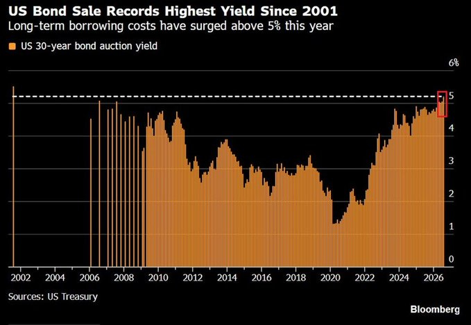
The US government recently sold $25 billion of 30-year Treasury bonds at a yield of 5.216%, the highest auction yield on that maturity since 2001. It came a day after a sale of 10-year notes cleared at 4.683%, the highest since 2007. Back on July 9th, a 30-year auction had already gone off at 5.058%, itself the highest since 2007.
For context, the same maturities were auctioning below 2.00% during the 2020 pandemic. The government is now paying more than two and a half times as much to borrow as it did 5 years ago, and it is doing so while borrowing far more.
The mechanism here is straightforward: investors are demanding more compensation to finance a deficit that keeps expanding. In July alone, the Treasury’s budget deficit widened by $141 billion year-over-year to $432 billion, the largest July total on record.
National debt recently crossed $40 trillion. And interest expense on that debt hit a record $1.4 trillion over the trailing twelve months, a figure that has nearly tripled since 2020. Even if the deficit stopped growing tomorrow, the average coupon on the existing stock would keep climbing for years as low-rate paper rolls off and gets refinanced at today’s levels. Interest expense is now effectively on autopilot, and the auctions above are the market setting the speed.
The Obligations Exceed the Revenue
(Luke Gromen)
Take the obligations the government cannot politically or legally avoid (Social Security, Medicare, and Medicaid, plus interest payments, and veterans’ benefits) and add them together. Through fiscal Q3, that sum equals 105% of federal receipts.
What makes this worse is the context in which it is happening. Receipts are near all-time highs. The economy, on the official numbers, is doing well. Employment has somewhat held , asset prices are elevated, and tax collection reflects that. And it still is not enough. This is a number produced during good conditions, which tells you what the downside looks like when conditions turn.
The gap also compounds. Gromen’s grouping of interest-like obligations is expanding at roughly 7.5% year-to-date, while receipts are growing at only 4%. Revenue would have to accelerate sharply, or these obligations would have to decelerate sharply, for the lines to converge, and neither is happening.
This is why the auctions in the previous section matter beyond their headline yields. Every basis point added to the cost of debt feeds directly into the fastest-growing line in the fiscal picture, and that line is already growing faster than the revenue meant to cover it.
Why the Market Has to Stay Up
If the fiscal position is this fragile, the equity market becomes a variable the government has a direct interest in managing. It is in the government’s interest to keep the market inflated. Every prior market crash of consequence occurred when US debt-to-GDP was well below where it sits today. A major correction now, with debt above 100% of GDP and interest expense already at record levels, would be devastating in a way earlier drawdowns were not, because the government no longer has the fiscal room to absorb the fallout. A falling market drags down capital gains receipts, weakens confidence, and tightens financial conditions precisely when the Treasury needs to issue $1.4 trillion of new paper.
Gareth Soloway pairs this with a technical target. The first is a straightforward channel argument. The S&P has traded within a parallel channel since the COVID low, and after breaking out above it, the old resistance line flipped to support and held (see white lines on chart below). Projecting the parallel upper boundary forward puts the next logical target at roughly 8,100 to 8,200 by year-end (yellow lines).
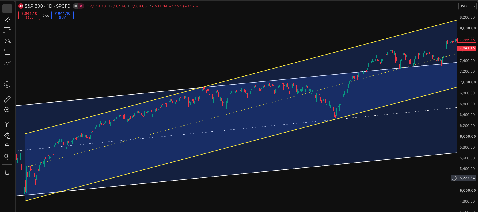
S&P500 chart recreated from Gareth Soloway from Verified Investing
What makes this interesting is the second chart.
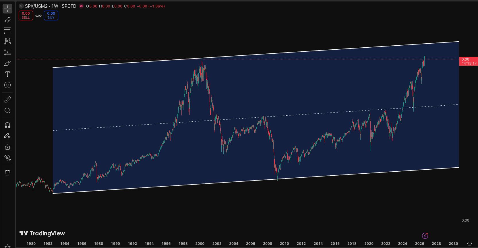
SPX/USM2 chart recreated from Gareth Soloway from Verified Investing
Divide the S&P by US M2 money supply, and you strip out the effect of monetary expansion (you are measuring the market against how much money actually exists in the system, rather than in nominal points). On that ratio, connecting the dot-com bubble high to the 2009 financial-crisis low and projecting forward, an S&P at 8,200 would top out exactly at that resistance line. Read plainly, this means that at 8,200 the market would be more expensive relative to the money supply than it was at the dot-com peak. Two different methods (a nominal channel and a liquidity-adjusted ratio) point at the same level.
Soloway’s view is that the path to 8,200 runs through the midterms, likely with only ordinary drawdowns along the way, and that the serious risk arrives afterward, in early 2027. The market is being held up because it has to be held up, the liquidity backdrop can carry it to a definable ceiling, and the danger is not immediate but deferred to the far side of the election.
The Midterm Trade
The same election logic that keeps the market elevated also governs the war, and by extension gold. You cannot run a conflict with ongoing casualties into a midterm election. The political cost is too high, and a president who treats the market and the mood of the country as a gauge of his own standing has every reason to cool things down before November. My read is that the war is likely to quiet down for reasons to do with the electoral calendar.
For gold, this cuts in a specific way. When the conflict escalated, gold sold off (I covered the reason in an earlier memo, but the short version is that a long-standing profitable position got liquidated into the shock rather than gold behaving as a straightforward haven). If the war now cools into the midterms, that pressure lifts, and the beatdown gold took when the fighting started is the thing most likely to reverse. A de-escalation driven by political necessity would remove the specific overhang that pushed gold down.
But what if the war doesn’t cool down, and the president heads into the midterms with an active conflict? If that conflict is still live after the election, the political calculus inverts. A second-term president facing his final midterms has no re-election to protect, which removes the incentive to show restraint. Escalation after the votes are counted becomes cost-free. That scenario would be bad for gold in the near term, reintroducing the same shock dynamics that produced the original selloff.
To Hike or Not to Hike
Start with the case against hiking. The inflation prints have come in consistently cooler than expected, with core CPI, PPI, and import prices all missing to the downside. Truflation, which tracks around 15 million prices daily, sits near 1.62%. The retailer commentary reinforces it: Target, Home Depot, and Lowe’s all report consumers who can afford essentials and little else, while apartment operators offer record rent concessions and homebuilders offer their largest-ever discounts. Housing, the stickiest component, is disinflating rather than inflating. That is what removes the justification for a hike.
Weak consumers strip businesses of pricing power, and businesses without pricing power cannot pass costs through, which is itself disinflationary.
There is a second channel layered on top: consumer inflation expectations. The University of Michigan survey showed the share of Americans expecting higher borrowing costs rising from roughly 44% to 53%, and expectations of that kind constrain spending preemptively (households anticipating pricier mortgages and loans pull back before the costs even arrive). Rates therefore bite through two doors at once, actual borrowing costs and expected ones, and with the labor market already softening, a hike into that would compound damage the economy is starting to show on its own. Danielle DiMartino Booth from QI Research cites 1.6 million full-time jobs lost since year-end and declining participation as the evidence the other side of the mandate is deteriorating.
Also, the dual mandate (price stability and maximum employment) can pull policy in opposite directions, and the hard scenario is high inflation and weak employment at the same time. Jobs matter more, because who cares about inflation if you don’t have a job? Under stagflationary conditions the mandate becomes incoherent, and a governor would now struggle to justify a hike against clearly disinflationary winds.
There is one live threat to this benign near-term picture. If the Fed does not raise rates, the bond market may do it for them. When asked why the Fed did not hike despite three dissents, Warsh pointed out that rates had effectively been rising anyway, so the bond market had done the job for him. That is a comfortable thing to say when yields drift up modestly. It becomes dangerous if the bond vigilantes decide to press it, selling Treasuries and pushing yields higher on their own, independent of what the Fed wants. The threshold for real concern is a 10-year above 5%, at which point the strain moves beyond mortgages into the fiscal core, because with $40 trillion in debt and interest already north of a trillion, there is a level at which rising yields simply break the arithmetic.
The Cracks in AI Credit
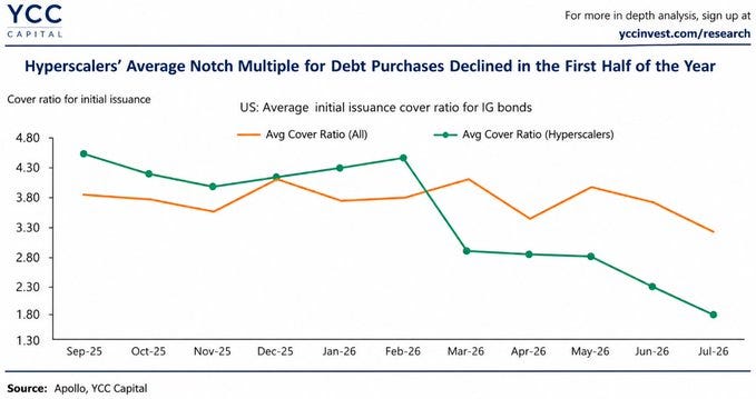
The clearest early warning is inside hyperscaler financing. According to YCC Capital and Apollo, the average initial issuance cover ratio for hyperscaler investment-grade bonds (a measure of how many buyers show up relative to the debt on offer) collapsed from roughly 4.5x in September 2025 to about 1.8x by July 2026, a decline of ~60%. The broader investment-grade market held up far better over the same period, with overall cover ratios around 3.2x in July. Investors are becoming markedly more selective about financing the AI capital-expenditure boom specifically, even as they remain willing to fund corporate credit generally. Hyperscalers can still raise debt, but marginal demand is thinning at precisely the moment AI-related issuance is accelerating, and it is doing so alongside widening long-maturity spreads. The market is beginning to demand a higher price for absorbing America’s increasingly debt-funded AI infrastructure.
Circular Financing
Nvidia is reportedly helping arrange up to $500 billion of capital from Apollo, BlackRock, Blackstone, Brookfield, Goldman Sachs and KKR to fund the AI buildout, while offering support covering as much as 25% of certain projects. The ecosystem has become densely interconnected: Nvidia, OpenAI, Microsoft, Google, Amazon, Broadcom and others linked simultaneously through investments, hardware purchases, and AI services, money moving in loops among the same cluster of companies. Nvidia was separately reported to be discussing up to $250 billion in support for OpenAI’s computing leases and up to $350 billion in chip purchases tied to the same project. The concern is that the structure may be recycling capital through a closed circle rather than generating actual external demand, artificially supporting the revenues and valuations that justify the next round of spending. The question worth holding onto is the simple one: if AI demand were as strong as the valuations imply, why does the ecosystem increasingly need to raise money from within itself to keep expanding?
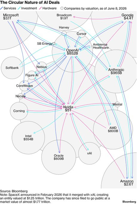
This is the same dynamic Soloway flagged, that much of recent corporate revenue is Mag 7 companies selling to each other, B2B spending that props up earnings as long as they keep lending to one another. This holds until it doesn’t, and that markets tend to price the top six to twelve months in advance. The credit market may be starting to do exactly that.
Investors are worried about Oracle
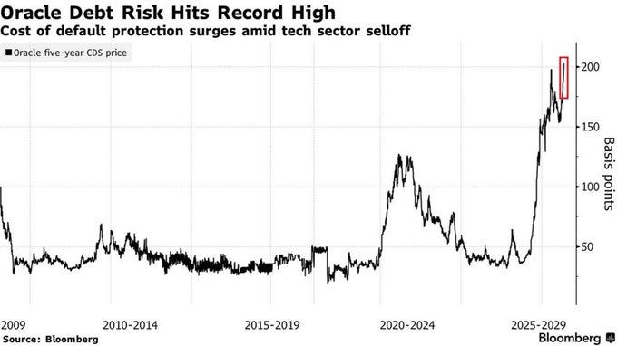
Oracle’s 5-year credit default swaps (the cost of insuring against default) rose to a record in July, meaning protection now costs higher. Oracle’s CDS have more than quadrupled since mid-2025. The company’s borrowing costs are climbing in step. S&P Global Ratings downgraded Oracle to BBB- on July 9th, one notch above junk, citing its rapidly growing AI-related spending. A single company’s default insurance quadrupling, its debt repricing wider, and its rating pushed to the edge of investment grade (all driven by AI capex) is the clearest sign that the credit market has started to distinguish between the AI story and the AI balance sheet.
The Dollar Has to Fall
Step back and review: The debt is too large to grow out of, the obligations already exceed receipts and are widening the gap, the cost of financing keeps rising, the equity market has to be held up, the Fed cannot fully control the long end, and the credit market is beginning to reprice the largest source of new issuance.
There is no combination of spending cuts and tax increases politically capable of closing a gap this size, and there is no growth rate realistically available that outruns it. When an obligation cannot be met in real terms and cannot be defaulted on outright, it gets met in nominal terms through a cheaper currency. A weaker dollar is the escape.
Depreciating the dollar inflates away the real burden of a debt stack that is fixed in nominal terms (the $40 trillion does not shrink, but the dollars used to service it become worth less). It lifts nominal revenues helping the fiscal ratios cosmetically even as nothing improves underneath. And a weaker dollar helps the equity market directly.
But depreciation is not a clean solution. A falling dollar is inflationary by construction, because imports cost more and that feeds through to domestic prices. It erodes the purchasing power of every saver and every holder of dollar-denominated fixed income. The nations that have recycled surpluses into US assets for decades (a compact that has underpinned the dollar’s reserve status) do not sit still while the value of those holdings is deliberately reduced. Questions are already being asked across the Gulf and elsewhere about the durability of arrangements that have anchored the system for a generation, and a sustained depreciation accelerates everything.
The Endgame: Printing and YCC
When the debt cannot be grown out of, taxed away, or defaulted on, and when a weaker dollar is required, the mechanism that remains is the printing press. At some point the Treasury’s buyback operations stop being enough, because they redistribute duration without creating money and the bond market can test them until they break.
What follows is the real thing: outright monetization, and eventually yield curve control, in which the central bank commits to capping yields at a chosen level and prints whatever quantity of money is required to defend it. The government cannot allow yields to rise to the point where interest expense explodes, and it cannot allow the equity market to fall to the point where the fiscal position unravels. Once both of those constraints bind at once, capping the cost of debt and funding the gap with created money is the only move left.
The timing is uncertain, but YCC is the destination the structure points toward.
Printing is inflationary. Stocks rise, gold rises, Bitcoin may participate.
I would like to credit most of this work to my teachers Ritesh Jain, Luke Gromen, Danielle DiMartino Booth, Gareth Soloway, David Lin and YCC Capital. I wrote this piece simply as a means of consolidating all their knowledge to paint a digestible picture for you all.
6 Likes