Analysis on Index Investing in India

INTRODUCTION
We all know that a buy and hold (aka: shut up & wait/buy & forget) strategy has worked for investors investing in INDEX FUNDS in the US equity markets. But how has this approach fared for domestic Indian investors in an Indian INDEX? To answer this question I have analysed returns of an Indian index investor over the past 20 years ACROSS VARIOUS ROLLING TIME PERIODS.
In addition to analysing whether index fund investing has worked, I have also tried to analyse whether index funds have beaten Fixed Deposits, what is the ideal holding period for an index fund, how are the returns been for SIP investors, etc

METHODOLOGY
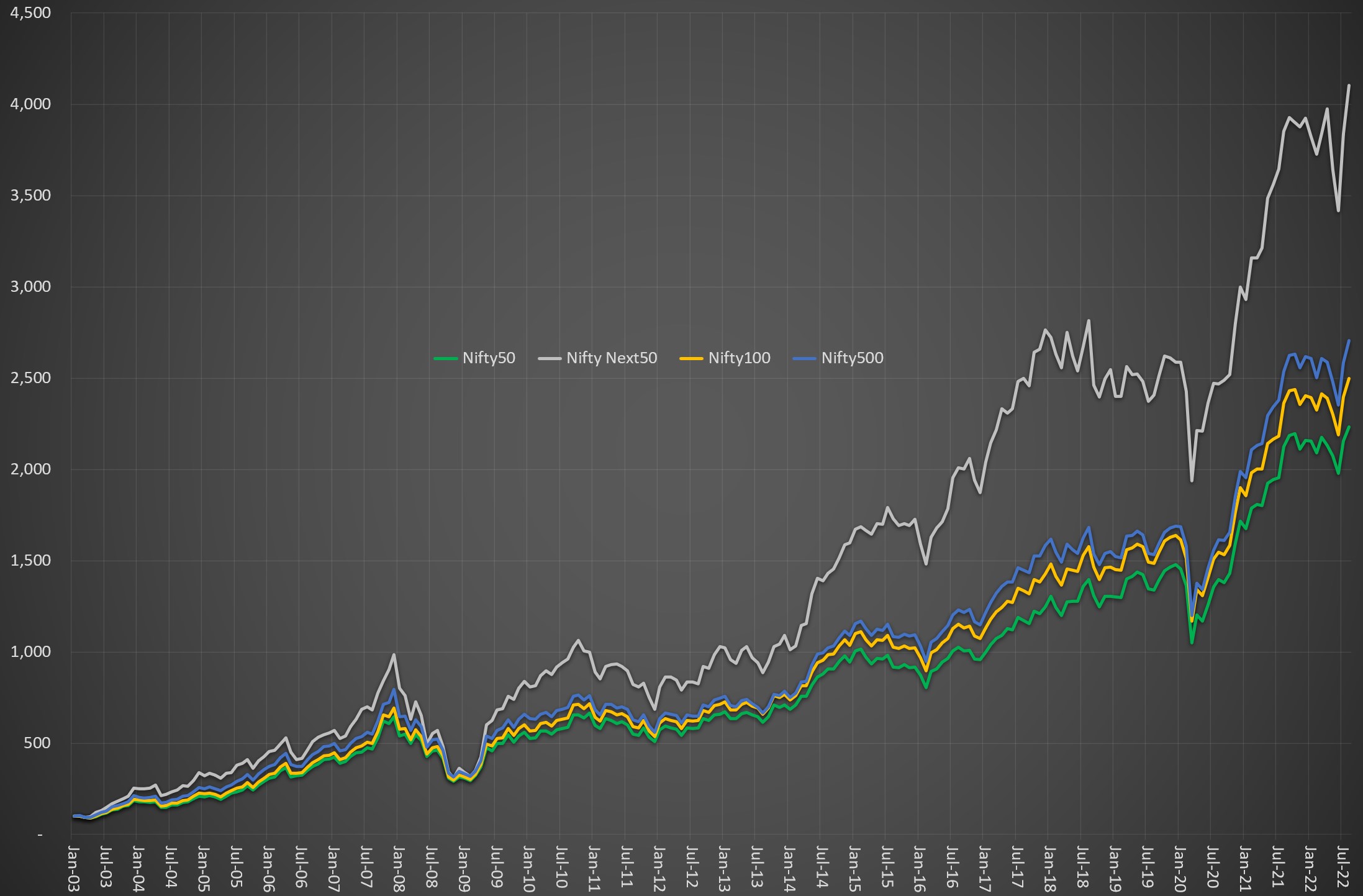
To analyse the returns for Indian Index investors, the first thing to decide is which index to use. I chose the most popular index – the NIFTY 50. However, if we just the Nifty it would understate the actual returns as it does not consider the returns arising from dividends. To get a true & complete picture of returns, the dividends received also need to be factored in. This is where the Nifty TRI (Total Return Index) comes to our aid as it provides the return including the dividends. NSE provides historical data for the Nifty TRI from June 1999 onwards on its website.

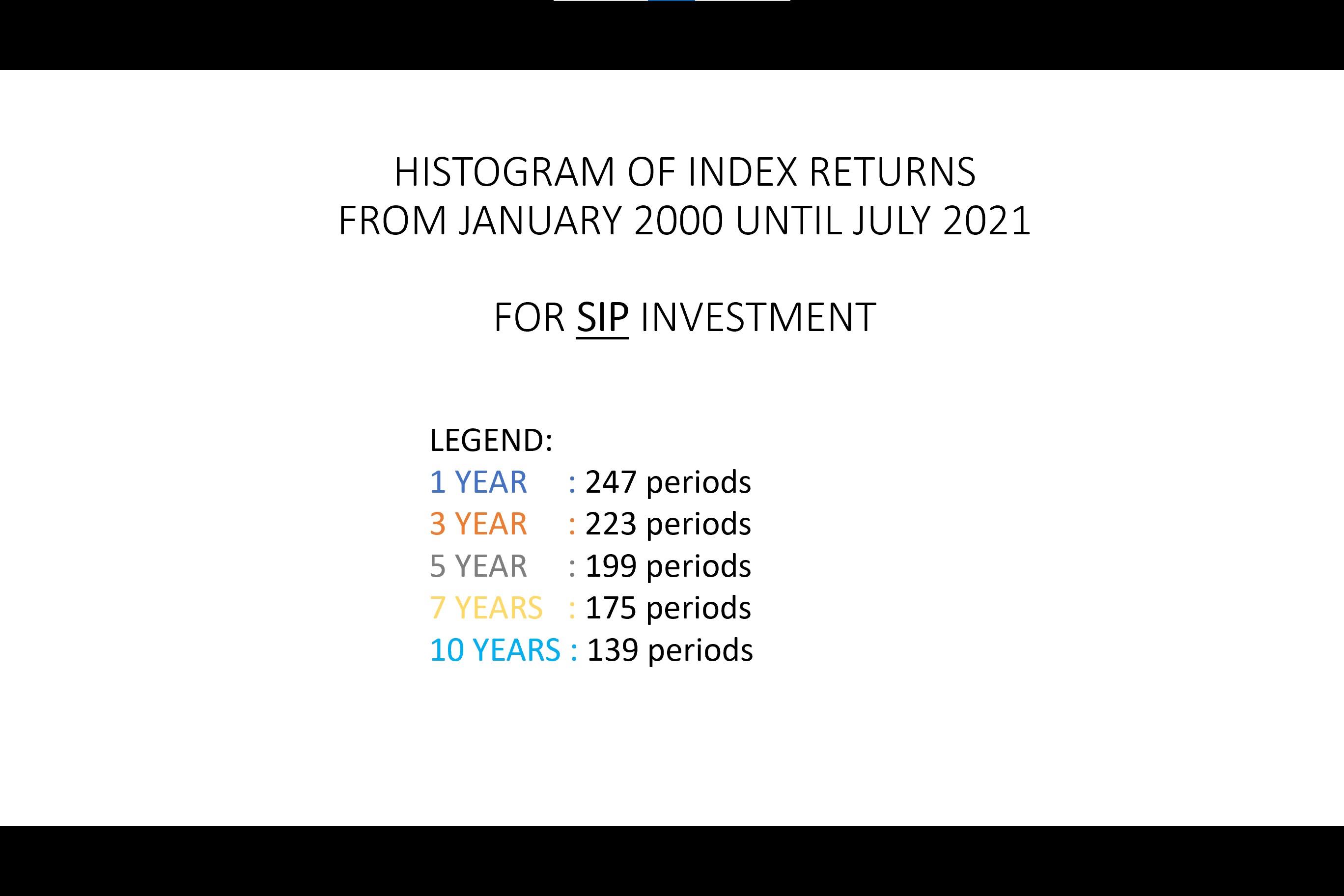
The second question to decide is the timeframe. I have come across several misleading posts/write-ups/brochures, etc where people cherry pick the starting and ending date of their analysis to make their point. In order to address this issue I have taken every month from January 2000 until July 2021 and provided returns for every possible rolling One year period, Three year period, Five year period, Seven year period, and Ten year period.
For e.g. January 2000 to January 2001 is the first one year period, February 2000 to February 2001 is the next one year period…………July 2020 to July 2021 is the last one year period. The same thing has been done for the other time periods as well. Consequently, we get 247 One year periods, 223 Three year periods, 199 Five year periods 175 Seven year periods, 139 Ten year periods.

The next question to decide is the method of investment: whether a lump sum investment or whether a Systematic Investment Plan (SIP). To get a comprehensive view, I have calculated the returns for all periods for both methods of investments. For the SIP calculation, I have assumed that a SIP investor will make a fixed investment ONCE every month (on the last trading day of the month) and shall continue to do it for the entire time period without fail. It is important to note that even a monthly SIP can be broken into many smaller investments over the course of month (instead of one large investment at the end of month) but I have not considered the effect of this complication (yet).

Now that we have the returns for the 1/3/5/7/10 year periods, we can run the usual descriptive statistics on them. However to make it more intuitive & visual I have also plotted the returns for each period on a histogram that has the same scale and same bucket size so as to make comparison easy.

Thereafter, I compared the Nifty TRI returns with the Fixed Deposit (FD) rates prevailing exactly at that time period and calculated the excess return over the FD for all the aforesaid time periods. The data regarding the FD rates is taken from the RBI website

NOTE: You may ask why January 2000 and why not earlier. The reason for this is that NSE website provides data for the Nifty TRI only from June 1999 onwards and consequently only from January 2000 onwards we get data for the entire calendar year. If someone knows of any reputed data source providing NIFTY TRI data earlier than June 1999, then please do let me know and also provide me with the data :slightly_smiling_face:

AN IMPORTANT FACTOR TO KEEP IN MIND
Before talking about the results, one must keep in mind that the Nifty has shown a secular growth trend in the past 20 years (you can see it here). While there have been some years of flat/negative returns, our market is yet to see a LARGE time period (say a decade or more) of flat/negative returns. Hence, in the past 20 years, if you remained invested in the Index for longer time periods of 7 years & more you have ALWAYS got positive returns and that too greater than 5% even if you invested in the worst periods. No wonder that the mutual fund industry always tells that investing for longer periods yields good returns and treats the same as gospel truth.
However, this has not been necessary true for all indices even in the case of growing countries. For e.g. If you see the Shanghai Composite Index, it is around the same level today as it was in July 2009 and AT THE INDEX LEVEL there have been no returns. Now of course if we include dividends & buyback then the returns will be better but then if we invested in such a period then, intuitively, our returns are almost bond like as they are restricted merely to dividends/buybacks. If I manage to find the time, I shall try to do a more detailed study of returns for such markets in a follow up post.

Hence, in case we extrapolate the results given below into the future we must remember that we are implicitly also stating that the future will continue to remain like the past. While that may be the case it may not necessarily be true. Also the returns must be viewed in the context of prevailing inflation. With this in mind let us see the results below

ANALYSIS OF RETURNS OF INVESTMENT DONE THROUGH SIP


  • One Year Period: As expected, the returns from one year periods were very volatile as seen from the wide range (max-min) and high standard deviation. Importantly, in 25% of the time we lost money and 1/3 of the time our returns were below 5%. The data seems to be normally distributed (though this is not evident in the above histogram due to the way I have made my buckets)

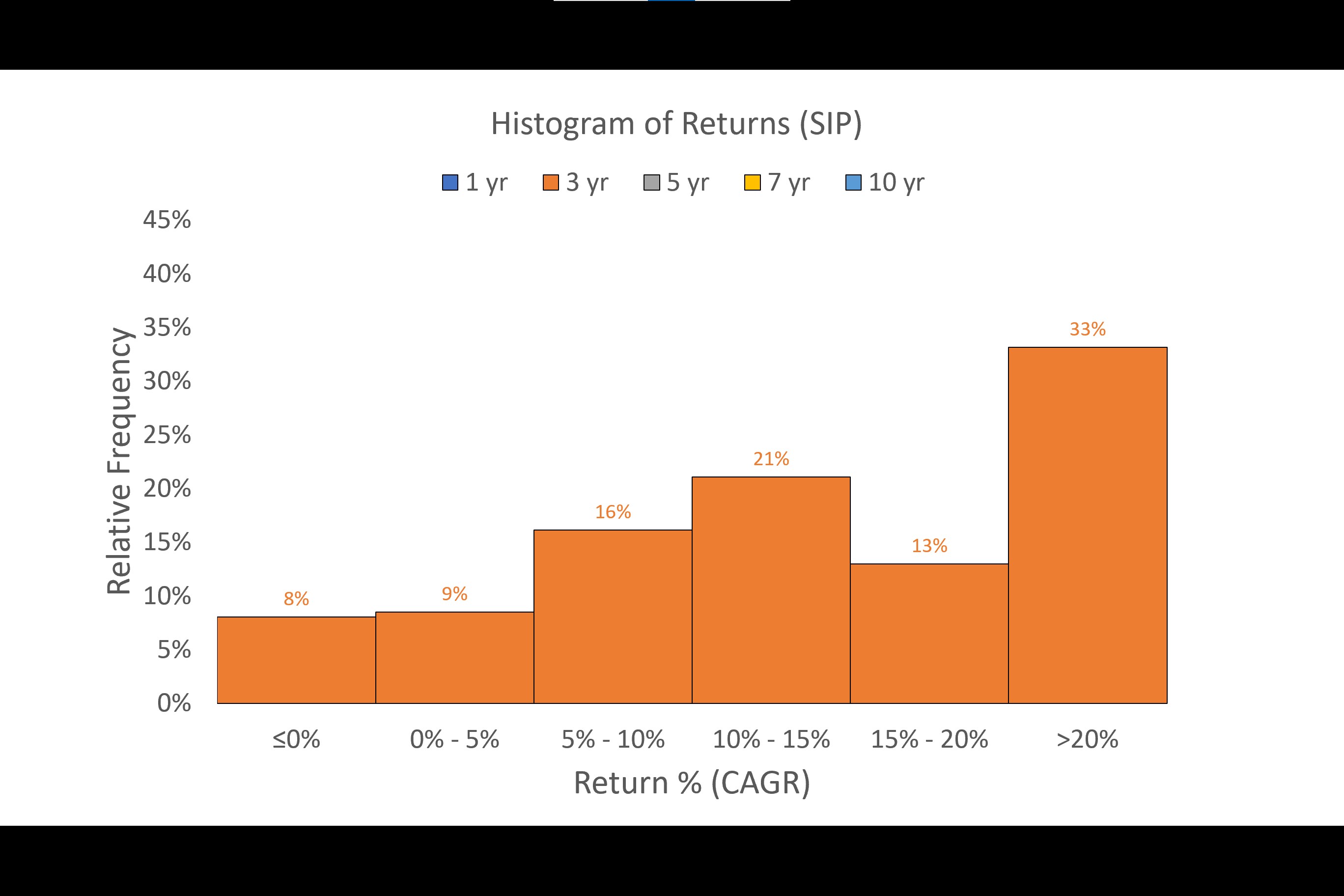
  • Three Year Period: The 3 year returns were much less volatile and range & standard deviation drop significantly. We lost money only in 8% of the time (as compared to 25% in the one year period). The data is moderately skewed to the right

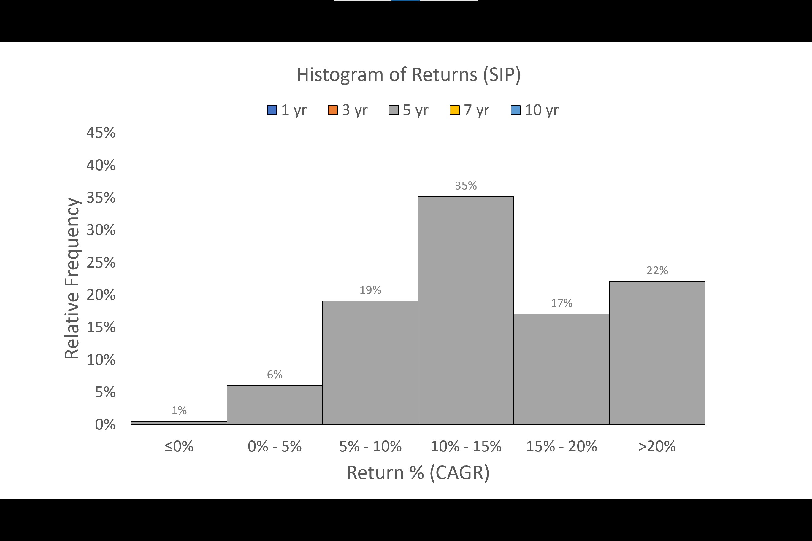
  • Five Year Period: The volatility further reduces in the 5 year period. Also we did not lose money in any of the periods. Furthermore in 54% of the time our returns were in 5%-15% range. The data is heavily positively skewed

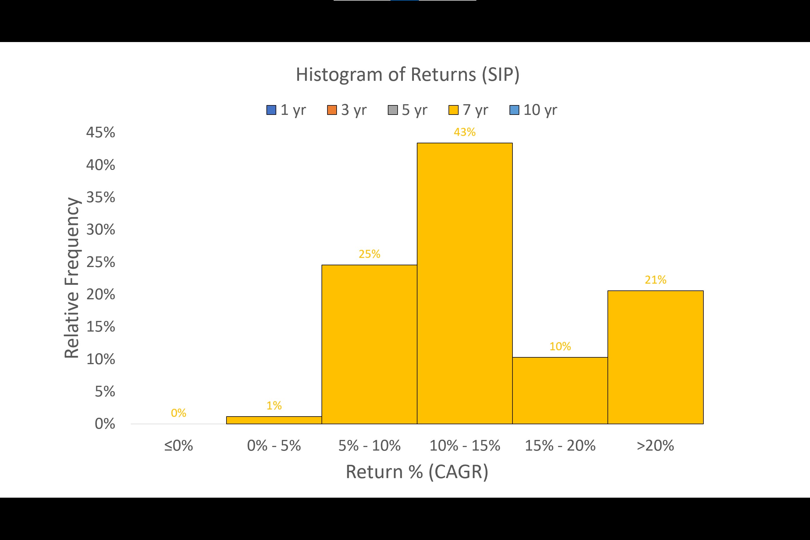
  • Seven Year Period: From this period onwards the results start getting interesting. The volatility continues to narrow and the dispersion of the returns is closer to the average. Not only there is no loss of money, but also the returns in virtually all periods were above 5%. Furthermore 74% of the time our returns were above 10%. The data is heavily positively skewed and with high peaks

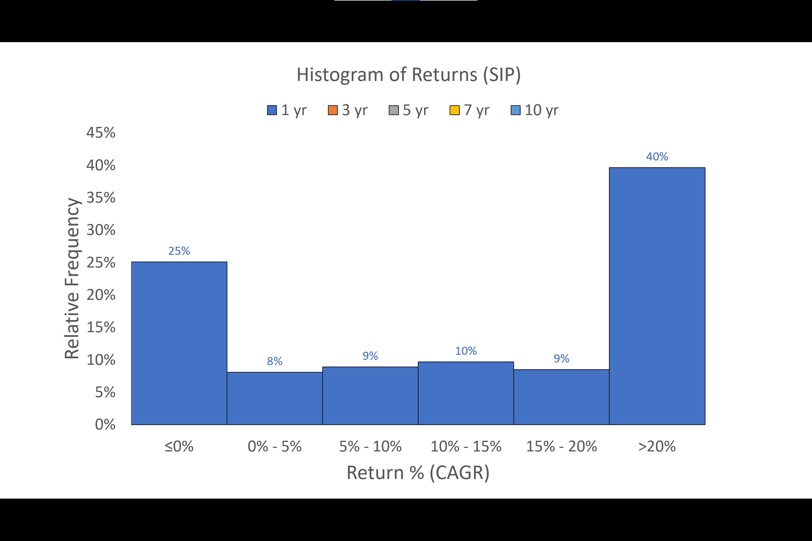
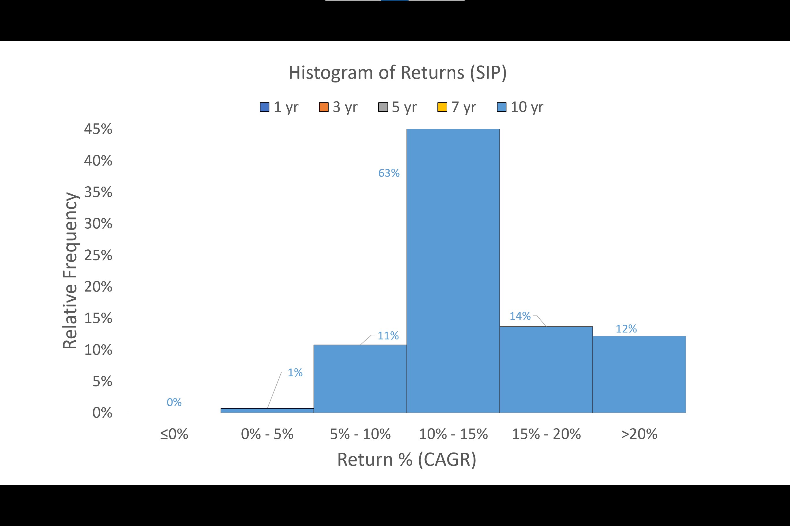
  • Ten Year Period: The results continue to get better and a staggering 89% of the times, the returns were above 10%. However the returns>20% were only 12% of the time compared to 21% of the time in the 7 year period. NOTE: y-axis has been topped at 45% despite the fact that there is a data point above that number because I wanted to maintain comparison with charts of other time periods

ANALYSIS OF RETURNS OF INVESTMENT DONE THROUGH LUMPSUM
I have done an analysis of even the lumpsum investment and the detailed images for the same are on my blog post. Not posting it here as this write up already has too many images :slight_smile:
However, the key takeways are:
*The results of even a lumpsum investment across the 1/3/5 year time periods mirrors the basic pattern seen in the SIP histograms. However the 7 and 10 year periods are different.

  • The 7 year lumpsum return has a lesser range of 24% vis-a-vis 38% in the SIP return and thus the dispersion of returns is much lesser. This can also evident from the negative kurtosis of the lumpsum return vis-a-vis the positive kurtosis of the SIP return. A negative kurtosis typically means lesser data at the tails as compared to a normal distribution
  • While the 10 year lumpsum return shows the same average, standard deviation and range as that of the SIP return, it has a significantly different distribution. As evident from the high negative kurtosis, the data shows a kind of uniform distribution which is very different then that of the SIP. It shows that 40% of the time the returns were in the 15-20% bucket as opposed to only 14% in the SIP. But 22% of the times, your returns could also be in the 5%-10% bucket as compared to only 11% in the SIP.

OUTPERFORMANCE OF LUMPSUM INVESTMENT OVER A FIXED DEPOSIT

As seen above, the times when the Index outperformed the Fixed Deposit improved significantly from the Year 7 onwards

CONCLUSION

If you want only one single takeaway from all of the above (with the caveat that the future would be similar to the past as stated earlier) then it is this: The ideal time frame for investment in an index is 7 years and above as not only did you not lose any money but also managed to get a return>5% in ALL of the periods. Furthermore, also remember how a return is calculated: it assumes that you WILL exit after your timeframe is over even if the market is pessimistic at that point of time. However, if you are not in need of any funds but are willing to wait till the tide turns (and even assuming that you don’t invest further money) then your returns could improve and more so in the case of an SIP where your exit matters more than the entry

If you want to print the results and wish to share them I have made a handy PDF for you to download from my blog. I would love to hear your critique on my process as well as your take on the results through comments / twitter.

There are many follow through analysis that can be done and if I get the time to do it I will post it here.

45 Likes

Thanks for doing this wonderful analysis.Do you have any data on index investing vs active mutual fund investing.

Really amazing analysis, Thanks for doing this.

Brilliant. Extremely useful for people who are scared about loosing capital in Stock market.

Superb! Probably for the first time I have come across such kind of exhaustive analysis on Index investing. Conclusion isvery clearly brought out by you. Thanks for doing such a wonderful job.

Brilliant stuff.

One minor feedback, you probably should mention what kurtosis indicates for a layman who might stop mostly with standard deviation. SD/variance too, in this context would be much too even couching it as “…how much variation you’re going to see in every year if you do yearly exits, greater this number, higher the likelihood of it swinging both ways from the mean” or such sort. The wording would be of great importance just so that people don’t rush to judgement on this alone

Thank you for the kind words and feedback. Will try to be more descriptive on the statistics next time

Very good points you have made in this article. Good research with backed up data…Kudos .

Thanks for all the efforts.
Nice inputs sir

Exceptionally good study on Index Investing. There are people out there who make such studies, but they choose the periods such that the returns will look extremely high. I like the idea of not taking such things during your study. This is really helpful and eyeopener.

@Amol2021 and other friends,

What’s your view on the comparison of SIP investing in top 8-10 blue-chip like HUL, Nestle, Asian Paints, Pidilite, TCS, RIL, Infosys, HDFC Bank etc. vs index fund (Nifty 50 and Nifty Next)?
In long run, as per your opinion which strategy will give a better return?
Any study or data for Indian or USA market - @barathmukhi. Thanks.

Even I have this plan, but as of now what I think is, each stock has to be looked at from valuation and return perspectives, and the time frame we have.

Unlike index, which has at least 50 stocks, we will have only 10 stocks in the PF. There is a chance of the PF underperforming the index too, because with index, you always have some stocks posting good returns and some dragging the index, but at an index level, it performs over a long period, more so with market cap weighted indices, and there are exclusions and new inclusions. We will have to stick with our PF, if we choose so, or we have to churn too.

In these ever changing times, we cannot simply SIP and assume that it will beat Nifty. Because, the past performance of our selected companies may not be repeated again, unless the companies are monopolistic in nature, or offer different products, or cater to different groups.

I say this because, for HDFC Bank, the fintech companies may have already started making a dent to the oligopoly of HDFC Bank’s great success till now. Not that it cannot bounce bank, it very well may, they are planning for that, and the big may get bigger. Asian Paints may have a tough time if new companies start to take away market share, the competition intensifies. The IT dream run may end after 2-3 years and consolidation may happen. For FMCG stocks, the valuations are high, so there could be a time correction.

So I think that time of, selecting a few good names and investing periodically and not looking at them, and getting good returns after a few years, in this age of disruption, is gone. Just like the time of getting 20% return from mutual funds is gone, if one was an early entrant in mid or late 90s.

So I have this thought. I am more focused on what does not change after 5 years, after 10 years. And while I think the idea of selecting a few good stocks, provided they are different businesses with no overlap, which have a long run way for growth, still works, this cannot be a plain vanilla investing. There has to be a strategy for this. I am trying to work on it with Nifty stocks.

There are some such strategies posted in VP.

And to start this in the middle of a bull run sounds counterintuitive. We may very well wait for the index that we choose to cool down, or at the least wait for our selected stocks’ valuations to come down. But it may not happen for another 2 years. I don’t know.

Also, this cannot be called as passive investing, only the scale at which we are active is low, we are very much active, executing the strategy. So the return that we expect should be considered first I guess. If the return difference after 10 years does not look meaningful, then index may be the answer, provided if we have long time horizon.

Beating Nifty Next 50 is a different story, it is more volatile to and equally rewarding as Nifty Midcap 150 index. The way one should go about it is different.

2 Likes

Hi everyone.

Has anyone analysed comparison of Nifty 100 Index Fund (Market cap weighted) vs Nifty 100 Equal Weight Index Fund. If anyone has done backtesting, please share and also would love to know views on which fund would make sense moving ahead.

1 Like

In the previous article on Index Investing we had seen the returns of the Nifty50 TRI over ROLLING 5 year, 7 year and 10 year periods for both SIP and Lumpsum investments starting from January 2000 until July 2021. Amongst other things, this analysis showed that if anyone investing for 7 years or more in the Nifty50, one managed to get a return>5% CAGR in almost ALL periods.

However, the analysis done above was ONLY for the Nifty50. A quick look at the NSE’s website shows that there are several more Broad Based Indices. Hence, in this post I will cover how the Nifty100, Nifty500 and the Nifty Nxt50 have performed as well as compare their performance with the Nifty50. I will be also covering the Midcap and Smallcap Indices in ANOTHER post.

METHODOLOGY
Even in this case, I have used the Total Return Index (TRI) for all the Indices above since it provides returns from dividends as well. In order to prevent cherry picking of starting and ending date, I have taken EVERY month from January 2003 until August 2022 and provided returns for every possible rolling Five year period, Seven year period, and Ten year period (just like the previous analysis). For e.g. January 2003 until January 2008 is the first five period, February 2003 to February 2008 is the next five year period…………August 2017 to August 2022 is the last five year period. Similar thing is done for 7 year and 10 year periods. Thus we get 176 Five Year Periods, 152 Seven Year Periods and 116 Ten year periods. Now, you can ask here why January 2003 and not January 2000 (as done in the previous analysis). This is because the NSE website provides data for Nifty100 TRI only from January 2003 onwards. Hence in order to make perfect comparisons, I have taken the starting point for ALL the indices from January 2003. You can also ask why I did not include the Nifty200 in this analysis. This is because the difference between the returns of Nifty200 and Nifty500 was very small and not worth the extra effort. More importantly, the NSE website provides data for the Nifty200 from January 2004 onwards (as opposed to January 2003 onwards for the Nifty100). I was already distraught at losing 3 years of data because of including the Nifty100 and if I included the Nifty200, I would have to lose one more year of data.

Also important to note that this analysis is done assuming that an investor has invested through the SIP route. I have assumed that the SIP investor will make the same fixed investment ONCE every month (on the last trading day of the month) and shall continue to do it for the entire time period without fail and shall liquidate his total investment at the end of the SIP. For e.g. Assume an investor who invests Rs 10,000/- every month in a SIP for 5 years (i.e. 60 months). In this case, the 1st investment would be in August 2017, 2nd investment would be in September 2017… and the 60th investment would be in July 2022. Thereafter, in August 2022, the investor would liquidate his entire position and the IRR is calculated and annualized.
With this nifty nitty-gritty out of the way, let see the results below. The results are presented through charts and while I have provided some basic commentary on them, the charts themselves are very visual and hence you can easily draw conclusions upon seeing them carefully.

RESULTS

GENERAL CHART

The above chart shows the performance of all the indexes starting from 31st January 2003 until 30th August 2022. As you can see both the Nifty100 and Nifty500 have outperformed the Nifty50. However, the Nifty Nxt50 has spectacularly outperformed ALL of the above Indices. If someone invested Rs 100 in January 2003 in these indices and withdrew the money in August 2022 then:
Rs 100 in Nifty Nxt50 became Rs 4102 (CAGR 20.9%)
Rs 100 in Nifty 500 became Rs 2704 (CAGR 18.3%)
Rs 100 in Nifty 100 became Rs 2499 (CAGR 17.9%)
Rs 100 in Nifty 50 became Rs 2233 (CAGR 17.2%)

While the above charts are useful to see the performance of the Indices, does it mean that Nifty Nxt50>Nifty 500>Nifty 100> Nifty 50 in ALL instances. The answer clearly is no. This is because the above chart shows the return profile of someone who invested in Jan 2003 and exited in August 2022. It does not give a CLEAR picture of returns for someone invested between these periods and/or for varying periods of time. It is for this reason we need to see the returns for rolling 5 year/7 year/10 year periods starting from Jan 2003
As a side note: If one is a long term investor and IF a mutual fund is in existence since several years, this method of seeing returns over rolling 5 year, 7 year (and if possible 10 year) periods is a better way of analysing performance of a mutual fund rather than cherry picked timeframes given by the funds. If such data is not available, then one can try to do the same for the fund manager.

EXCESS RETURNS OVER NIFTY50

5 YEAR PERIODS

As stated earlier, we get 176 Five Year Periods starting from January 2008 until August 2022. The above image shows the EXCESS Returns of the Nifty100, Nifty500 and Nifty Nxt50 over the Nifty50. Some basic commentary on the above charts:
Nifty500: While the average excess return is 0.1%, it is not a meaningful number because there is a wide variation in excess returns (Std Dev: 1.6%) and also a wide range (7.7%). This index outperformed the Nifty50 in 47% of the periods. The key period of outperformance (wherein this index outperformed even the Nifty100) was December-2015 until August-2018

Nifty 100: The average excess return is 0.4%. The variation (Std Dev 0.8%) and range (3.4%) is both lower than the Nifty500. This index outperformed the Nifty50 in 69% of the periods.

Nifty Nxt50: The average excess return is 2.2% but as you can see there is a huge variation in returns (Std Dev 5.1%) and a high range (11.4%). However, the variation is more on the positive side. The index outperformed the Nifty50 in 65% of the periods. Interestingly, since March-2019, this index is underperforming the Nifty50. The key period of great outperformance was from October-2009 till October-2011 and also from May-2014 until December-2018

7 YEAR PERIODS

We get 152 Seven Year Periods starting from January 2010 until August 2022. Some basic commentary on the above charts:
Nifty500: The average excess return is 0.3%. However, the variation (Std Dev 1.1%) is higher than Nifty100 and the range (4.7%) is higher too. Crucially, the index underperformed the Nifty50 in 41% of the time periods

Nifty100: At the outset you can see that the index outperformed the Nifty50 in most of the time periods - 85% to be precise. The average excess return was 0.5% and the variation of returns (Std Dev 0.5%) is lower and with a lower range (1.8%) as well.

Nifty Nxt50: Even this index outperformed the Nifty50 in 86% of the time periods. The average excess return is 3.1% While the standard deviation (3%) and range (11.8%), I will gladly accept such variation/range as it so positively skewed. The key period of great outperformance was from March-2014 until April-2019

10 YEAR PERIODS

We get 116 Ten Year Periods starting from January 2013 until August 2022. Some basic commentary on the above charts:
Nifty500: The average excess return is 0.4%. However, the variation (Std Dev 0.8%) is higher than Nifty100 and the range (3.4%) is higher too. Crucially, the index underperformed the Nifty50 in 32% of the time periods

Nifty100: At the outset you can see that the index outperformed the Nifty50 in ALL time periods. The average excess return was 0.6% and the variation of returns (Std Dev 0.3%) is lower and with a lower range (1.1%) as well.

Nifty Nxt50: Even this index outperformed the Nifty50 in ALL time periods. The average excess return is 3.3%. While the standard deviation (2.2%) and range (7.7%), I will gladly accept such variation/range as it on the positive side. The key period of great outperformance was from May-2014 until April-2019 (almost the same period as that in the 7 year timeframe)

ABSOLUTE RETURNS
The chart shown earlier give relative returns i.e. Returns in EXCESS of the Nifty50. You can ask what the absolute returns for these 5 year/7 year/10 year periods. For that instead of throwing the basic statistics (average, min, max, std dev, skew, kurtosis, etc) at you I am presenting the same in the form of Cumulative Relative Frequency charts. The advantage of this chart over histograms (that I did in the previous analysis) is that histogram suffer from biases of the presenter (ME in this case!) as the range of the “bins” chosen by presenter decides the “look” of the histogram.
I have made a PowerPoint presentation for these charts. You can see the link on my BLOG

CONCLUSION
Upon doing the above study, we can say that Nifty Nxt50 > Nifty 100 > Nifty50 and more so from 7 year and 10 year periods. The Nifty500 is a mixed bag as it does outperform the Nifty50 in mostly majority of the times in these time periods but not to the same extent as the Nifty100 and Nifty Nxt50. One also wonders as to how the Nxt50 outperformed to the extent that it has but I do not have any answers as of now. The idea in this post was just to present the data. If I manage to get some reasonable theories, I shall update the post.

Since the above data is a presentation about the past, we can neither extrapolate the outperformance findings nor can extrapolate the generalized findings (that Nifty100 and Nifty Nxt50 are better than Nifty50) into the future and I humbly request you to be MINDFUL OF THE SAME.

7 Likes

In the previous two article on Index Investing we had seen the returns of the Nifty50 TRI, Nifty Nxt50 TRI, Nixty100 TRI and the Nifty500 TRI over ROLLING 5 year, 7 year and 10 year periods

Hence, in this post I will cover how the Midcap Indices (TRI) namely the Midcap50, Midcap100 & Midcap150 have performed as well as compare their performance with the Nifty50. I will cover the Smallcap indices in another post
The key takeaways from the analysis below are that: The Midcap 150 is the best performing amongst all the indices. The larger the number of stocks in these indices, the better they perform and thus the Midcap 150 > Midcap 100 > Midcap 50. The Midcap 150 has also outperformed the Nxt50 (the star of the previous analysis) but there were periods of underperformance too

METHODOLOGY
The same methodology used in the previous sections applies here. However, the data starts from April 2005 (instead of January 2003 for the Nifty TRI Indices). This is because the common earliest starting point for all the Midcap and Smallcap TRI Indices is April 2005 as per the NSE website.

RESULTS

GENERAL CHART

The above chart shows the performance of all the TRI indexes starting from 29th April 2005 until 30th August 2022. As you can see the Midcap100 and Midcap150 have outperformed the Nifty50 while the Midcap 50 has underperformed. However, the Midcap150 has performed the best. If someone invested Rs 100 in April 2005 in these indices and withdrew the money in August 2022 then:

  1. Rs 100 in Midcap150 became Rs 1509.2 (CAGR 16.9%)
  2. Rs 100 in Midcap100 became Rs 1374.5 (CAGR 16.3%)
  3. Rs 100 in Nifty Nxt50 became Rs 1335.4 (CAGR 16.1%)
  4. Rs 100 in Nifty 50 became Rs 1164.2 (CAGR 15.2%)
  5. Rs 100 in Midcap50 became Rs 846.5 (CAGR 13.1%)

Interestingly, the Midcap150 also outperformed the star of the previous section - the Nifty Nxt50. The above chart shows the return profile of only someone who invested in April 2005 and exited in August 2022. It does not give a CLEAR picture of returns for someone invested between these periods and/or for varying periods of time. It is for this reason we need to see the returns for rolling 5 year/7 year/10 year periods starting from April 2005

EXCESS RETURNS OVER NIFTY50

5 YEAR PERIODS

As stated earlier, we get 149 Five Year Periods starting from April 2010 until August 2022. Some basic commentary on the above charts:

Midcap 50: While the average excess return is -0.5%, it is not a meaningful number because there is a wide variation in excess returns (Std Dev: 5.3%) and also a very wide range (23.7%). This index had excess returns (over Nifty50) in 44% of the periods.

Midcap 100 The average excess return is 2.3%. The variation (Std Dev 5.0%) and range (20.6%) is lower than the Midcap50 but it is still quite high. This index had excess returns in 70% of the periods.

Midcap 150: The average excess return is 3.7% but as you can see there is a still high variation in returns (Std Dev 4.8%) and a high range (18.9%). However, the variation is more on the positive side. The index had excess returns in 76% of the periods.

7 YEAR PERIODS

We get 125 Seven Year Periods starting from April 2010 until August 2022. Some basic commentary on the above charts:

Midcap 50: The average excess return is -0.4%. Just like the 5 year periods, the variation (Std Dev 4.1%) and range (17.8%) is the highest amongst the three indices and it is the worst performing. It had excess returns in only 51% of the periods.

Midcap 100: At the outset you can see that this index closely mirrors the Midcap 150. However, the average return (2.1%) is lesser and it had excess returns in only 70% of the periods. The variation (Std Dev: 3.2%) and range (12.4%) is lesser than the Midcap 50

Midcap 150: This index had average return of 3.9% and while the variation (Std Dev: 3.4%) and range (14.3%) is more than the Midcap100, it is more on the positive side. It had excess returns in 84% of the periods

10 YEAR PERIODS

We get 89 Ten Year Periods starting from April 2015 until August 2022. Some basic commentary on the above charts:

Midcap 50: The average excess return is 0.6% and it is the worst performing index, just like the 5 and 7 year periods. The Std Dev is 2% and range is 7.7%. It had excess returns in only 61% of the periods.

Midcap 100: You can see that this index closely mirrors the Midcap 150 but with lesser returns and also had periods of negative (excess) returns. The average return (2.7%) is lesser than the Midcap 150 and it had excess returns in 85% of the periods. The variation (Std Dev: 2.2%) and range (8.6%) is lesser than the Midcap 50

Midcap 150: This index had excess returns in ALL the periods. The average return of 4.6% and while the variation (Std Dev: 1.7%) and range (7.1%) is the least amongst all the indices

ABSOLUTE RETURNS
The chart shown earlier give relative returns i.e. Returns in EXCESS of the Nifty50. As done in the previous analysis, a Cumulative Relative Frequency charts shows the ABSOLUTE RETURN. You can see the same on my BLOG.

For those interested, I have also compared the Midcap 150 vs the star of the previous section-Nifty Nxt50 for 5/7/10 yr periods and have posted the same.

CONCLUSION
The Midcap 150 undoubtedly performs the best of all the three indices. Also the larger number of stocks in the index, the better it has performed. Thus, the Midcap 150 > Midcap 100 > Midcap 50.

In regards to performance of the Midcap 150 v/s the Nxt50, the Midcap had better performance than even the Nxt50. However until 2014-2015 it was underperforming the Nxt50. Also there is a kind of a breakout outperformance since August 2020

The same caveat mentioned in the previous analysis applies here too: Since the above data is a presentation about the past, we can neither extrapolate the outperformance findings nor can extrapolate the generalized findings into the future and I humbly request you to be MINDFUL OF THE SAME.

4 Likes

Hi Amol, thanks for the analysis. Can you please try to compare the difference in performance between market cap weighted and equal weighted indices?

I had thought of doing a comparison with the Equal Weight Indices as well. But the historical data provided by the NSE for the Equal Weight Indices is fairly recent.
For e.g. For the Nifty100 Equal Weight TRI and the Nifty50 Equal Weight TRI the data starts only from May 2018

Hence doing the kind of analysis as done above is not possible

In the previous three posts on Index Investing we had seen the returns of the Nifty and the Midcap Indices. Hence, in this post I will cover how the Smallcap Indices (TRI) namely the Smallcap50, Smallcap100 & Smallcap250 have performed as well as compare their performance with the Nifty50.

If you want the key takeaways prior to reading the post then it is this: The Smallcap 250 is the best performing amongst all the other Smallcap indices. Also, just like what we saw in the Midcap Index, the larger the number of stocks in these indices, the better they perform. Thus the Smallcap 250 > Smallcap 100 > Smallcap 50. However, the Smallcap 250 underperforms the Nifty50 in around 50% of the periods for both the 5 year and 7 year timeframes. Furthermore, when compared to the Midcap Indices, the Smallcap indices have lesser periods of outperformance and also fell more during periods of underperformance.

METHODOLOGY

The same methodology used in the previous sections applies here. The data starts from April 2005 (instead of January 2003 for the Nifty TRI Indices). This is because the common earliest starting point for all the Midcap and Smallcap TRI Indices is April 2005 as per the NSE website.

RESULTS

GENERAL CHART

The above chart shows the performance of all the TRI indexes starting from 29th April 2005 until 30th August 2022. If someone invested Rs 100 in April 2005 in these indices and withdrew the money in August 2022 then:

  1. Rs 100 in Nifty 50 became Rs 1164.2 (CAGR 15.2%)
  2. Rs 100 in Smallcap250 became Rs 1162.7 (CAGR 15.2%)
  3. Rs 100 in Smallcap100 became Rs 817.8 (CAGR 12.9%)
  4. Rs 100 in Small50 became Rs 556.1 (CAGR 10.4%)

As you can see the return of the best-performing Smallcap Index was almost equal to the Nifty50. The other indices clearly underperformed the Nifty50. However, the above chart shows the return profile of only someone who invested in April 2005 and exited in August 2022. It does not give a CLEAR picture of returns for someone invested between these periods and/or for varying periods of time. It is for this reason we need to see the returns for rolling 5 year/7 year/10 year periods starting from April 2005

EXCESS RETURNS OVER NIFTY50

5 YEAR PERIODS

As the charts paint a clear picture I will not describe them too much. The Smallcap50 beat the Nifty only in 32% of the periods, followed by the Smallcap100 at 42% and thereafter by Smallcap250 at 54% of the periods. It is pertinent to point out here that these outperformances are much lesser than the Midcap Indices (Mid100 & 150 outperformed in 70% & 76% of the periods respectively)

If you compare the Midcap and Smallcap excess return charts they look very similar. The key period of outperformance was April-2014 until October-2018 and from April 2021 until now. During periods of outperformance (over Nifty50), the returns for the Smallcaps were similar to the Midcaps. However, during times of underperformance, the Smallcaps had lower returns as compared to the Midcaps.

7 YEAR PERIODS


The superior performance of Midcaps over the Smallcaps is much more evident in 7 year periods. The Smallcap50 beat the Nifty only in 27% of the periods, followed by the Smallcap100 at 41% and thereafter by Smallcap250 at 54% of the periods and thus there is no improvement as compared to the 5 year timeframe. In stark contrast, the Midcap100 & 150 outperformed in 70% & 84% of the periods. The quantum of outperformance over Nifty was also more in the Midcap indices.

10 YEAR PERIODS


It is the same story even here wherein the Midcaps outperform the Smallcaps

ABSOLUTE RETURNS

The chart shown earlier give relative returns i.e. Returns in EXCESS of the Nifty50. As done in the previous analysis, a Cumulative Relative Frequency charts shows the ABSOLUTE RETURN. You can see the same on my BLOG

CONCLUSION

For the period of April 2005 until August 2022 (around 17 years), the returns as well periods of excess performance (over Nifty50) of the Smallcap Indices are noticeably inferior to the Midcap Indices.

The same caveat mentioned in the previous analysis applies here too

3 Likes

Wonderful analysis.

I believe the NIFTY outperformance by smallcap250 also follows election year, not sure though, if we can see datasets from 2005 of relative under/out performance - we can get the feel

below graph show that NIFTY BANK, & NIFTY MIDCAP 150 have refused to give up gain & may be the deciding factor for next bull run

I have included Pharma & IT indices also , because post Bank, I foresee pharma has next big client for IT firms - it would be interesting to see how this hypothesis turns out in near future…

1 Like