As you can see the long term average is 18.71 and IS “normally distributed”. This forms our sample set containing 4109 observations ( pretty huge if you ask me )
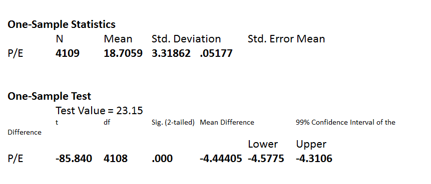
Statistically, you can compare the mean of this sample set with any PE value to check whether its significantly different at a particular confidence level. The default is 95% ( which means you can be wrong 5% of the time). I am comparing it with a 99% confidence level ( ie. there is a chance i may be wrong 1% of the time ). I am comparing todays NIFTY PE - 23.15 with this long term average to check whether it is materially different. Here is the output
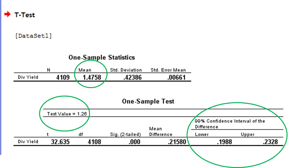
The lower and upper limits denote the band within which the current PE ( 23.15 ) could be said to be within hailing distance of the long term average of 18.71 about 99% of the times i.e 14.13 to 23.02. The current PE is outside of even the most flexible of bands. This could mean two things - we are in extreme BULL territory or a some sort of mini crash is in the offing soon.
Great work! I too had done this using the data from 1995 to 2015, if I remember correctly. The average P/E was about 18 times.
But, another argument is about low levels of earnings. If you see the earning growth in Nifty stocks, it would be 3%-5% over previous 5 years. The statistical analysis says that the current P/E is higher than the average. P/E should get closer to the historical average sooner or later, but the question is whether earnings will recover or the Valuations would decline.
@bheeshma Excellent work buddy but one caution as I belong to this profession, statistics could be misleading if not connected with background information. It would be interesting to see the distribution with temporal lagging nominator and denominator component of P/E to check effect of phenomenon like base effect (my hypothesis is that might be differentiator between a real bubble and perceived bubble studying historical patterns). That reminds me about a chapter on late parag parikh’s book to get a simpler sense of valuation attractiveness by comparing short , medium n long term market cap growth rate vs EPS growth . Anyway, personally I believe in looking at specific stock irrespective of markets until there are multiple signs of bubble market
P/E has most of the information. Adding variables or using other proxies does not yield much. The core of these studies is mean reversion and P/E is the best indicator of the richness of valuation and excellent proxy for understanding mean reversion.
No. Unlike P/E, P/B and P/S are not do not stand on their own as indicators of valuation.
P/B = P/E * E/B = P/E * RoE; RoE is not an indicator of valuation but performance. P/E is the indicator of valuation in P/B.
Similarly, P/S = P/E * E/S = P/E * Net Profit Margin; again Net Profit Margin is not an indicator of valuation but performance.
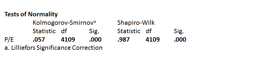
Heres a fun fact, for those statistically inclined. The distribution fails both the commonly used tests of normality ( if the “Sig” value is less than 0.05 then the distribution is not normal), implying that the distribution is not normally distributed.
However, both these tests fail to recognize the fact that P/E multiples in the indian stock market follow a multimodal distribution i.e they are a mixture of three normal distributions ( hence we consider them as one giant normal distribution for simplicity purposes & these tests dont understand that and go haywire)
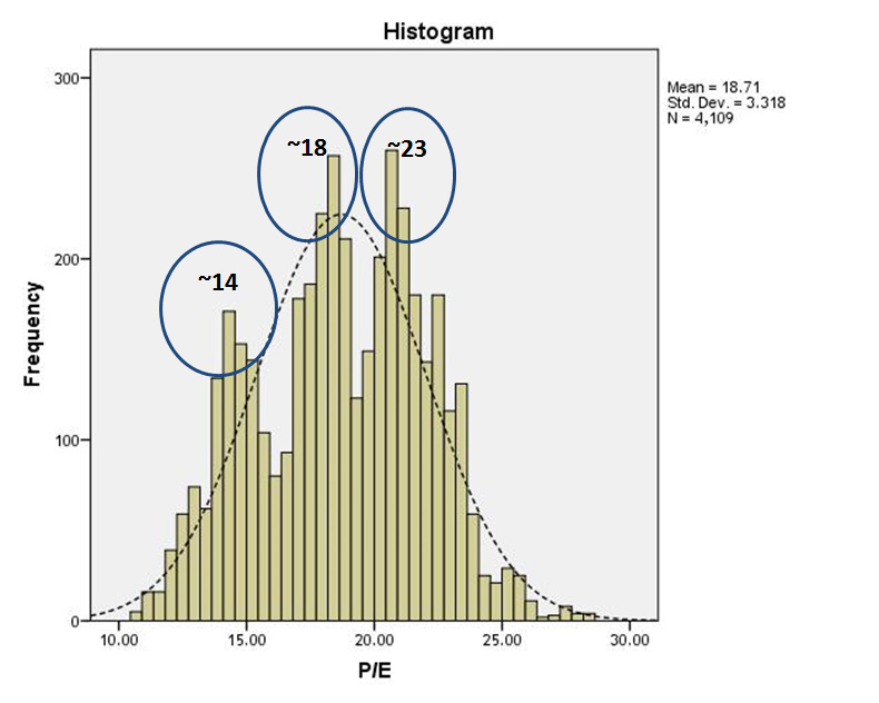
Take a look the PE distribution has 3 distinct peaks ( or modes ) - 14, 18 and 23 ( i have just eyeballed them)
I cant be sure, but i would liken them to the three phases of a cycle of greed and fear. In the fear phase the PE’s are normally distributed with a mean of ~14, in the second phase the PE is normal at ~18 and the third phase PE’s are normally distributed with the mean of ~23.
Right now with a PE of 23.15, i think greed is slowly beginning to gather momentum, which is good news for those who like doing momentum trades and for value investors - its probably time to be cautious.
By that logic, sugar stocks at high PE, low price to sales 2 years back were expensive… And are cheap today with low pe and higher price to sales. While the stocks are up 10x…they have moved from expensive to cheap as per pe ratio.
Similarly, as per PE valuation model, psu banks were very cheap in 2007/2010 with low pe and high price to book, but were expensive in Feb 2016 with very high pe and low price to book. Though the price to sales, and price to book was at multi year low in feb 16- when sbi was at 150.
Similarly, fertiliser stocks in June 2016 with high pe but decade low price to sales, and price to book were very expensive, but were cheap in 2010 with low pe and high price to sales. Applies to metals, psu banks, sugar, fertilisers, tyres and many many other sectors.
PE may not be a correct method of valuation. Think again!
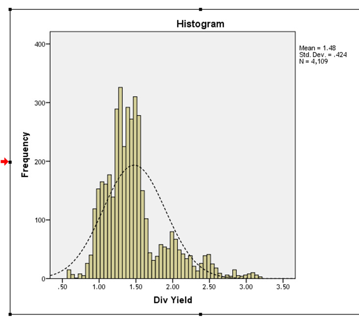
Coming back , to get a sense of whether the market is overheated we need to compare today’s Div yield with the long term average of the dividend yield and see whether it departs significantly ( as least statistically ) from it. As on 13/02/2017 the NIFTY dividend yield was 1.26. Here is the output
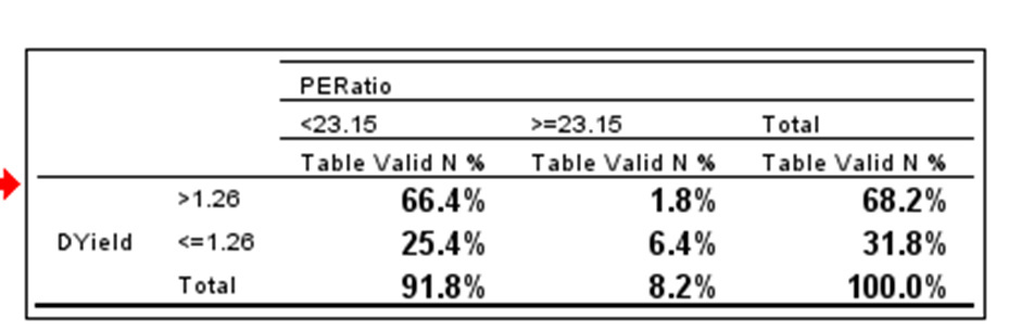
P/E has been 23.15 or above only about 8.2% of the times in the last 16-17 years and Div Yield has been less than 1.26 about 31.8% of the times. Jointly they have been >23.15 & <1.26 , only 6.4% of the times in the last 16 years. Both multiples jointly have moved into uncharted territory.
A great series of posts on statistical evidences, @bheeshma. Interested investors may review historical (10Y), monthly P/E, P/B and Div yield values here: https://www.stableinvestor.com/2017/02/state-of-indian-stock-markets-january-2017.html
The values show that market has been in orange/red zone (P/E >21) for quite some time during last 24-25 months since January 2015, and if we combine your charts, this seems to be a case for “overheated” markets. Interesting times ahead…
A low P/E ratio means that market is valuing each dollar of E at low levels. P/E of 5 means that at current valuations given by the market, each dollar of current earnings is being valued at 5 dollars. By saying that the company is cheap at a P/E of 5, one is saying that the market is wrong and I am right. Nothing moves expensive to cheap or the other way around according to the P/E ratio. Things are cheap or expensive according to the human judgment.
Firm performance is a valuable information however it is not an information of valuation. Rather than multiplying P/E with performance measures like Net Margin and then trying to interpret the product (P/S), we can look at the valuation indicator (P/E) and performance indicator (E/S) separately. Jin rishton ko hum samajhte nahin, unko aapas me kyon uljhana!
Academicians focus more on dividend yields in such studies. However, dividend yield is also related to P/E ratio, and adds dividend smoothing to it.
D/P = D/E * E/P = Payout Ratio / PE Ratio
There are many reasons for firms to declare smoother dividends than net profits. One way to look at this is that firms manage Payout Ratio to achieve dividends that are smoother than earnings. That leads to the difference between the behaviour of dividend yield and P/E ratio. If we divide Dividend yield into the two components and analyze them separately, we get some additional information over PE ratio but not much. That is, most of the information in Dividend Yield is already baked in PE ratio.
Thanks for the statistics post. Could you please let us know if you used the StudentT distribution while coming up with the correlation matrix (>=23.15 and <=1.26)?
The reason I ask is, from time immemorial, humans have been simplifying distributions towards Normal-distribution; including the revered Black Scholes Merton model - to get closed form solutions. And we all know that human greed and fear (in stock markets) is hardly ‘normal’ in any sense.
So I would take this quantitative evaluation, with a pinch of caution. Qualitatively, I still can not see why the markets have not discounted a spate of bad news; the not-so-great earnings after demonetization, Feds (proposed) hikes, RBI’s move towards neutral stance, having a not-so-sound-man at the wheels (in America). May be it is momentum as you have indicated in another post.
But as I know, markets will continue to remain irrational, longer than I can try to remain rational; but my tendency has been to move more into cash at this time than other occasions.
Hi, this is not a correlation matrix. Its a simple crosstab
A Normal distribution models a random variable. A random variable is one which bounces around its “true” value in an apparent random fashion. For e.g fuel mileage is a random variable. your cars “true” mileage may be 12 but on a daily basis the actual mileage will fluctuate randomly around 12. If you believe that P/E multiples fluctuate randomly around a “true” P/E multiple then you can use normal distributions as an added input in your investing decisions. the P/E distribution for the indian stock market is certainly normal distributed but its a multi modal normal distribution (analysing multi modal distributions is incredibly complicated and formal statistical software packages dont even have options for them). The rules concerning multi modal normal distributions are different so one cant simplify beyond a point. Having said that, normal distributions are incredibly useful and very practical.
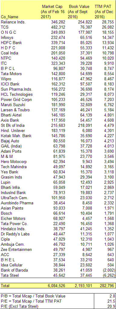
What Krishnaraj has pointed out here is absolutely correct. Published P/E and P/B ratios are significantly different from those calculated using numbers from each of the companies in the index. Any decisions based on these numbers will also be incorrect.
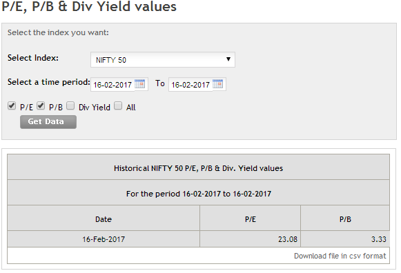
As per my calculation, current PE is 21 and not 23 as reported by NSE. My numbers are taken from consolidated results wherever available. Different is even bigger for p/b. My calculation shows P/B ration of 2.8 against 3.33 reported by NSE. Although I have not considered flee flat factor in this calculation, it would not make so much difference. Previously I calculated Nifty P/E after adjusting for free flat factor and there was a similar difference.
Personally I consider P/B to be better indicator of market valuation (especially when you are comparing current ratio with long term averages) as earnings are volatile and can have one-time items which needs to be adjusted.
Thanks for analogy regarding P/E to the mileage. Unfortunately, I do not agree that P/E distribution is ‘normally (or multi modal) distributed’. The basis of normal distribution, as I believe, is IID - independently and identically distributed. I believe, that Earnings are not ‘independent’ of each other. Academicians and exponents generally tend to simplify aspects to fit models - which of course is not entirely incorrect; but it is not the reality as well.
(My belief is that all companies endeavor to smooth out earnings and rarely do report exact numbers each quarter)
Of course contrarian views are welcome; after all it is a belief.
Your statistics certainly help place a perspective that the market is in or wandering towards un-chartered territories .
Stock returns may not be normally distributed. Normal distributions are symmetrical. But, we cannot have lower than -100% returns but may have higher than 100% returns. So, the distribution is closer to lognormal than normal and that is what academicians prefer in general. T distributions have fatter tails than normal, but stock prices have even fatter tails. If this was not complicated enough, the P/E is a ratio where we the two components, P and E, have different distributions. There is no point in trying to find the exact distribution of P/E ratio for the purpose of our posts. People gave up analyzing distributions of returns in the 1980s, it didn’t yield much. The exact specification of distribution in Bheeshma’s setting is needed to get correct confidence level value. The exact confidence interval is not the main point but more like splitting hair. We can look at the histogram that he made and see that P/E ratios are way higher than the average and quite into the right tail of the distribution. I would say that is the basic point.
What may help is looking at all the times P/E was 23 and seeing if all these times markets collapsed. If I remember correctly a few times bull runs followed rather than a collapse of the stock market. If true, that raises the question whether earnings would catch up to bring P/E ratios closer to past averages or prices would decline.
If you read The Black Swan or other books or articles by Nassim Nicholas Taleb, he makes a very strong case against forcefully fitting a Gaussian bell curve (or any other linear regression models for that matter), where it is fundamentally not meant to be fitted. The markets are one example, in general all cases which are derivatives of human activities (economy, markets, inflation, society, etc) are extremely ill suited to Gaussian models.
A case in point is the CAPE ratio which has been high in the US for so long that it is not really useful for making investment decisions (caveat: recent past performance not an indicator of future).
The point being, we need to look at these numbers as empirical evidence but they do not lend themselves to theorization. There’s no law which says that our limited statistical data is sufficient for formulating a theory and broadly speaking, human endeavours are fundamentally not amenable to formulaic representation leading to predictions.
I can’t put all the stuff in a reply but I strongly urge folks to read The Black Swan by Nassim Nicholas Taleb. It is truly an eye opener.
(Note: The Gaussian models are great for hard sciences like physics which are independent of human activities)