The management remuneration is higher than similar companies, but I wanted to see the trend of remuneration.
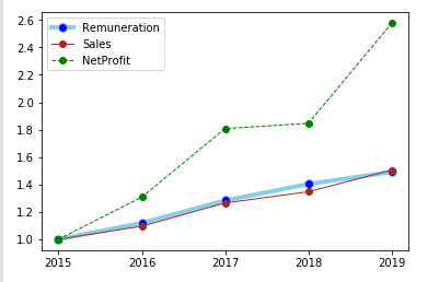
When I chart the past 5 years Sales, Net Profit and total management remuneration (from Annual reports) after baselineing them, I see that the remuneration is rising in line with Sales.
We can also see the company is becoming more profitable (margin expansion).
Disc: Not invested.

Here is the source code:
import pandas as pd
import matplotlib.pyplot as plt

data = {
    'Remuneration':[5.76, 6.44, 7.39, 8.08, 8.59],
    'Sales':[732, 802, 926, 986, 1102],
    'NetProfit':[26, 34, 47, 48, 67],
    'Year':['2015', '2016', '2017', '2018', '2019']
}

df = pd.DataFrame(data, columns = ['Remuneration', 'Sales', 'NetProfit',  'Year'])
df.Remuneration = df.Remuneration / df.Remuneration.min()
df.Sales = df.Sales / df.Sales.min()
df.NetProfit = df.NetProfit / df.NetProfit.min()

# multiple line plot
plt.plot(  'Year','Remuneration', data=df, marker='o', markerfacecolor='blue', markersize=8, color='skyblue', linewidth=4)
plt.plot(  'Year','Sales', data=df, marker='o', color='brown', linewidth=1)
plt.plot(  'Year','NetProfit', data=df, marker='o', color='green', linewidth=1, linestyle='dashed')
plt.legend()
plt.draw()


