Great Tool! It would be awesome if you could add historical ROE chart also and allow the user to see Historical PE, PB & ROE at the same time. This would be similar to Factset or Bloomberg.
Hi Ishaan, it looks neat! Thanks for sharing. One observation though - price chart doesn’t seem to consider the face value, i.e. split from 10 to 2, and it is showing as a big fall is price when split happened, which seems deceiving.
We have developed a quantitative tool for stock selection which has pretty good back tested performance (over 14 times in 10 years or so after paying capital gains, and transactions costs of 30 bps while buying and selling). The algorithm trades only once a quarter and uses debt allocations as well in some quarters. It uses both fundamental and quantitative data available up to the re-balance date. Would love to get the feedback of ValuePickrs on the algorithm.
We have a live graph for you to study the historical portfolios and returns over any period against the NIFTY and the Birla Sun Life MNC fund (which I think has best 10 year performance of all the non-sector based mutual funds - around 5.8 times in 10 years - and even in the sector based funds only 1 pharma fund has beaten this.)
Hello Utkarsh ji - Sorry did not see this post earlier. The list of investors is now updated till Q3 FY 2017. Q4 lists are coming out this month and the next and those will be updated as they show up.
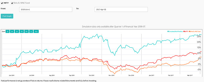
To update the forum readers about how this long term investing algorithm has performed after the launch, I thought I should share an image of the relative performance between the NIFTY, Birla sun life MNC fund and the algo since the day it went live:
From Jun 1 2016 till 3 Apr 2017 the quant portfolio is up 28%, the NIFTY is up 13%, and the Birla Sun Life MNC Fund is up 8%.
Would love to hear comments of the group on whether you believe the quant methods will survive the test of time.