Many of us prefer not to remain fully-invested at all times i.e. sit on some cash; deploy it when market offers very strong buy signals. Key point is - What is “Strong buy signal”? NIFTY P/E below a certain limit (say 15) is one such indication. Depressed earnings of many NIFTY50 companies and consolidated v/s standalone earnings issue make this not so practical indicator in current market. Other such indicator is MCAP-to-GDP ratio. Believe there are more indicators, however will focus on MCAP-to-GDP ratio for this post.
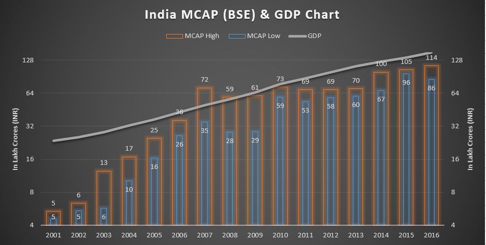
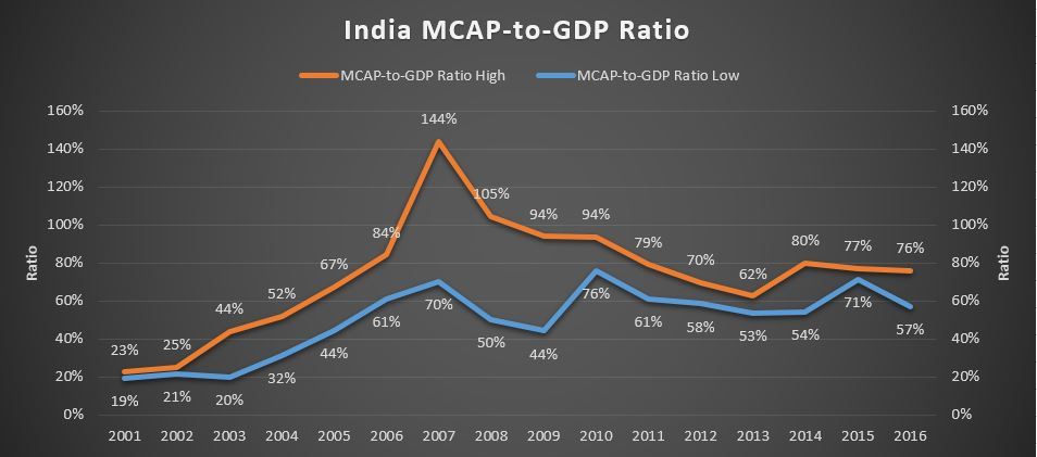
If we look at the MCAP-to-GDP ratio graph below, we note that in the last 10 years, the market has strong floor around 55% (barring couple exceptions). The market bottomed in August 2013 at 53%. It bottomed again in February 2016 at 58%. I have been using 55-60% range as a guide for general deploy-cash strategy; this has worked for me.
That said, there are always some stock-specific exceptions. Many times we come across a new quality stock trading at reasonable valuation. In such situation, I usually go ahead and deploy 50% quota for that particular stock (in couple chunks). Then wait for MCAP-to-GDP buy level to deploy other 50% quota. One of the limitation - Some years like 2015 keep you waiting and waiting without hitting the buy level.
It is a very simple model. See if it makes sense. Feel free to share your thoughts. Or any other entry model you use.
Hey, what about exit model? Will discuss if and when market is close to an extraordinary high valuation (not there currently I believe).
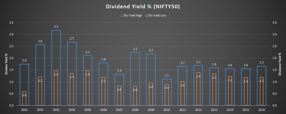
My limited experience and analysis says that buying, when the market is making new lows but market-wide dividend yield (DY) is still high (>1.6), is profitable. If the DY goes >2, I would probably sell my house and buy everything I can get. IMHO, DY is a much better indicator for rebound than market-wide PE or PB levels. When DY goes below 1, I would probably sell all my holdings.
Another indicator to watch out for is INDIAVIX. If it goes north of 30, you should get ready for a rebound, on either side (high or low).
I think a combination of fundamental index (DY) and behavioural index (INDIAVIX) is a pretty good signal to buy / sell.
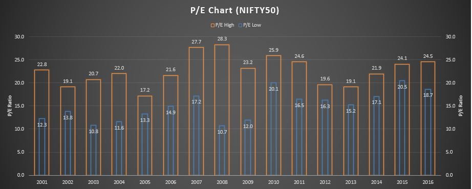
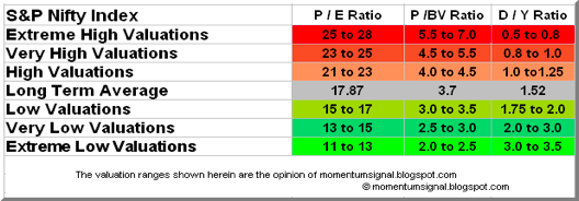
This NIFTY50 P/E has standalone v/s consolidated numbers issue. See Nifty PE after all earnings have been declared for more details. Market has traded at >17 P/E for last 3 years. If waited for <17, then would have missed Feb 2016 and Jan-Feb 2014 entry points.
Thanks @vasuadiga for highlighting >1.6 Dividend Yield level. Seems usable in current market. Curious - How do you calculate market-wide Dividend Yield? The above chart is for NIFTY50 Div Yield.
Between 21- 25 you can reduce equity alllocation ( say from 80% to 50% ) . It all depends upon your risk profile .
In my case equity allocation never exceeds 90% of my pf even when PE is 11 or P/b is 2 or div yield is > 3%
In a bull market, when GDP grows at rate X, MC grows at rate > X
In a bear market, when GDP falls at rate Y, MC falls at rate > Y
In a bull rally, you may hardly find opportunities if you stick to particular low level.
Also, future may not repeat history. So, MC may not touch 60% of GDP at all.
I remember Warren buffett talking about MC/GDP. This ratio will go up if businesses in a country does well irrespective of overvaluation or undervaluation.
US now has MC to GDP at 125%. Still it is rallying due to earnings
Happy if it works for you.
Rather than use it to time your entry, you should use it to increase or decrease equity allocation. Higher the dividend yield, greater should be your equity allocation and vice versa. You can use NSE Nifty or BSE 500 dividend yield as a proxy for market-wide DY. Links to both are provided above.
You should ignore my selling house comment in my previous post. As @kb_snn rightly pointed out, its never wise to go all-in with equity allocation irrespective of market levels. A healthy cash to equity ratio is required to ensure adequate sleep. Warren Buffett himself perceives cash as a “call option” with no expiration date or strike price. Cash combined with courage in a crisis is priceless.
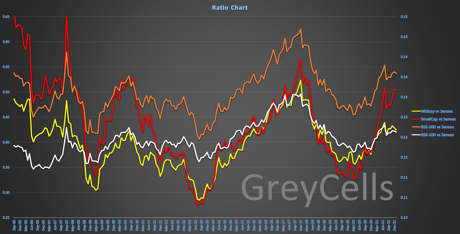
A little unrelated way to look at markets (oversold or over-brought)
It is Ratio charts of different indexes vs Nifty.
Mainly if the Midcap vs Sensex (yellow line) goes above 0.5 (left hand horizontal axis) then it is a risky zone and one needs to be cautious on deploying new ideas especially in midcaps…
If the Smallcap vs Sensex (red line) goes above 0.55 (left hand horizontal axis) then it is a risky zone and one needs to be cautious on deploying new ideas especially in midcaps…
The BSE500 and BSE100 vs Sensex lines are for reference only and their Y axis is on the right hand side.

 e th
e th